Widgets
Every widget is a plain Python call that compiles to a Workpeg.h(type, props,
children) node and renders to a real DOM element styled by
pegment. This page is the visual
catalog — a quick-reference table of the whole set, then grouped screenshots
with the code that produced them, and finally the
full widget reference (every signature and keyword).
Quick reference
Widgets fall into three groups — Layout (arrange other widgets, mostly invisible), Display (show content), Interactive (take input) — and differ in two ways worth scanning for:
- Children — multi takes many positional children, single takes exactly one (opt. = the child is optional), none is a leaf with no children.
- Stylable — ✓ accepts a per-widget
style={...}override; ✗ has no surface of its own, so wrap it in aContainerto style.
| Widget | Group | Children | Stylable | What it does |
|---|---|---|---|---|
Column |
Layout | multi | ✗ | Vertical stack of children |
Row |
Layout | multi | ✗ | Horizontal arrangement of children |
Stack |
Layout | multi | ✗ | Layers children on top of each other |
Wrap |
Layout | multi | ✗ | Flows children, wrapping to new lines |
GridView |
Layout | multi | ✗ | Fixed-column grid |
ListView |
Layout | multi | ✓ | Scrollable list (static or lazy) |
Table |
Layout | multi | ✓ | Rows × cells grid |
TableRow |
Layout | multi | ✗ | A row of Table cells |
Container |
Layout | single (opt.) | ✓ | Box — padding, colour, radius, size, child alignment |
Center |
Layout | single | ✗ | Centres its child |
Align |
Layout | single | ✗ | Anchors its child (nine positions) |
Padding |
Layout | single | ✗ | Insets its child (EdgeInsets-style) |
SizedBox |
Layout | single (opt.) | ✗ | Fixed-size box / spacer; forces the child's size |
Expanded |
Layout | single | ✗ | Fills a share of a Row/Column's free space |
Flexible |
Layout | single | ✗ | Takes up to a share (loose fit) |
Spacer |
Layout | none | ✗ | Flexible empty gap |
Positioned |
Layout | single | ✗ | Places a child by px offsets inside a Stack |
AspectRatio |
Layout | single | ✗ | Constrains a child to an aspect ratio |
ConstrainedBox |
Layout | single | ✗ | Min/max width & height |
FractionallySizedBox |
Layout | single | ✗ | Sizes as a fraction of the parent |
Transform |
Layout | single | ✗ | CSS transform (rotate / scale / translate) |
LimitedBox |
Layout | single | ✗ | Caps size only when unconstrained |
IntrinsicWidth |
Layout | single | ✗ | Sizes to the child's natural width |
IntrinsicHeight |
Layout | single | ✗ | Sizes to the child's natural height |
FittedBox |
Layout | single | ✗ | Scales / fits a child (BoxFit) |
Offstage |
Layout | single | ✗ | Hides a child without removing its slot |
Resizable |
Layout | single | ✗ | Drag-resize a child's width (min/max, persisted by key) |
Divider |
Layout | none | ✓ | A thin separating rule (horizontal or vertical) |
ListTile |
Layout | multi | ✓ | A standard list row — leading · title/subtitle · trailing, tappable |
Text |
Display | none | ✓ | Text with variants (heading / muted / caption) |
Locale |
Display | none | ✓ | A translated string from Translations, flips on language switch |
Image |
Display | none | ✓ | An image (src, fit, radius, lazy) |
Logo |
Display | none | ✓ | The Peg's CDN brand logo (variant, OS-aware theme) |
GravatarImage |
Display | none | ✓ | An email's Gravatar, with a coloured initials fallback |
CameraView |
Display | none | ✓ | A live, tap-to-start camera preview (getUserMedia) |
ScreenShare |
Display | none | ✓ | A live, tap-to-start screen-share preview (getDisplayMedia) |
Video |
Display | none | ✓ | A <video> player (controls, poster, autoplay/loop/muted), or a live stream (src_object) |
Audio |
Display | none | ✗ | Plays a live stream's sound (src_object), with no controls |
FileView |
Display | none | ✓ | View an uploaded file's contents — text, or a hex dump for binaries |
Code |
Display | none | ✓ | Monospace code — a <pre><code> block or inline chip, optionally copyable |
Markdown |
Display | none | ✓ | Renders a Markdown string as rich text — injection-safe (never innerHTML) |
HtmlView |
Display | none | ✓ | Safely renders untrusted HTML + CSS (e.g. an email) — never runs JS |
Icon |
Display | none | ✓ | A vector icon (Tabler set) — inherits text colour, sizes to 1em |
Dot |
Display | none | ✓ | An 8px currentColor circle — a status or "live" marker, alone or inside a toggle |
Spinner |
Display | none | ✓ | An indeterminate loading ring (CircularProgressIndicator) |
Progress |
Display | none | ✓ | A linear progress bar — determinate (value) or indeterminate |
Badge |
Display | single | ✓ | A count/dot — standalone or floated over a child |
Chip |
Display | none | ✓ | A compact tag — tappable, removable (on_delete), or selected |
Tag |
Display | many | ✓ | The design's badge — 13 tones, 3 sizes, 3 fills, and named slots |
Pill |
Display | none | ✓ | The design's filter tag — a rounded button, selected marks it pressed |
Canvas |
Display | ops | ✗ | 2D drawing surface — declarative ops (Rect/Circle/Ellipse/Arc/Line/Path/CanvasImage/CanvasText), interactive freehand (strokes/on_change), and pointer events (on_move/on_click/on_drag/on_wheel/…) |
Button |
Interactive | none | ✓ | Clickable button (variant, disabled, full_width) |
Link |
Interactive | none | ✓ | Navigation link |
TextInput |
Interactive | none | ✓ | Single-line text field |
Input |
Interactive | any | ✓ | Field container — fuses its children into one control |
Adornment |
Interactive | none | ✓ | Inert text fused into a field (the $) |
Demarcation |
Interactive | none | ✓ | The hairline between two fused parts |
Dropdown |
Interactive | none | ✓ | A picker fused into a field, either side |
PhoneInput |
Interactive | none | ✓ | Country picker · hairline · number |
MoneyInput |
Interactive | none | ✓ | Currency symbol · amount · currency picker |
LinkInput |
Interactive | none | ✓ | Protocol · hairline · URL |
CardInput |
Interactive | none | ✓ | Network mark · card number |
DateInput |
Interactive | none | ✓ | A date typed a part at a time — month · day · year in the locale's order; on_change gets "2025-12-16" once it is whole |
TimeInput |
Interactive | none | ✓ | A time typed a part at a time — hour · minute · AM/PM, optional seconds and zone; on_change gets "14:30" |
DateTimeInput |
Interactive | none | ✓ | The design's Date & Time field — both; on_change gets "2025-12-16T14:30" |
TextArea |
Interactive | none | ✓ | Multi-line text field |
MarkdownEditor |
Interactive | none | ✓ | Rich Markdown editor that edits like a page (slash menu, block handles, bubble toolbar) — a CDN bundle over a <textarea> fallback; gives back Markdown text |
FileUpload |
Interactive | none | ✓ | A click/drop file picker with a built-in preview |
Checkbox |
Interactive | none | ✓ | Boolean tick box |
Switch |
Interactive | none | ✓ | The design's toggle — 3 sizes, an optional description line |
ToggleButton |
Interactive | multi | ✓ | A button that stays pressed — its content is its children (icon, text, dot, in any order) |
ToggleGroup |
Interactive | multi | ✓ | Toggle buttons fused into one segmented pill — owns the selection (value=, one or multiple) or only groups them |
CalendarDatePicker |
Interactive | none | ✓ | A month of days to pick from — one day or several (multiple), with bounds, disabled days and marker dots; on_change gets an ISO date. Its title opens a year view, and day_builder draws each day's own content |
CalendarDateRangePicker |
Interactive | none | ✓ | A range of days to pick, across one to three months under one pair of arrows (months), drawn as a band; on_change gets {"start", "end"}, and range_length makes each press a fixed span |
YearPicker |
Interactive | none | ✓ | A grid of years to pick one from, three to a row, every year in the bounds; on_change gets the year as a whole number |
TimePicker |
Interactive | none | ✓ | A time of day on a wheel of hours, minutes (stepped by minute_interval), optional seconds and AM/PM, in the locale's 12 or 24 hours; on_change gets "14:30" once the wheel comes to rest |
DateSegments |
Interactive | none | ✓ | The parts a date or time field is typed into, standalone, as calendar.html's time pill, or fused into an Input |
ButtonGroup |
Interactive | multi | ✓ | Buttons fused into one bar, a hairline between each pair — a row of actions (each button keeps its own on_click); the variant, size and rounded it sets reach every button that sets none, and "tertiary-gray" is a family only a group draws |
CalendarCard |
Layout | multi | ✓ | The card a composed date picker sits in — the calendar's own chrome around any widgets, a column (ButtonGroup rows span it) or a row; a field's time wheel opened inside it dims it |
Form |
Interactive | multi | ✗ | Groups validated Fields; gates on_submit(values) on validity |
Field |
Interactive | single | ✗ | A labelled, validated input inside a Form (validators=[…]) |
Select |
Interactive | none | ✓ | Dropdown |
RadioGroup |
Interactive | none | ✓ | Single-choice radios |
Slider |
Interactive | none | ✓ | Numeric range |
Draggable |
Interactive | single | ✗ | Makes a child draggable |
DropTarget |
Interactive | single | ✗ | A drop zone (on_drop) |
Tooltip |
Interactive | single | ✗ | Hover bubble around a child (placement, theme, auto-flip) |
Modal |
Interactive | single | ✗ | A dialog over a dimmed backdrop, shown while open (Esc / backdrop closes) |
Menu |
Interactive | multi | ✗ | A dropdown — a trigger plus a panel of items (opens top/bottom/left/right; lazy builds on first open) |
Tabs |
Interactive | multi | ✗ | A tab bar plus the active panel (Tab(label, content); self-contained or controlled) |
Wizard |
Interactive | multi | ✓ | A wizard — numbered progress plus the current step's panel (Step(label, content)) |
ChatInput |
Interactive | none | ✓ | An AI-chat-style composer — contenteditable, Enter sends, optional live Markdown (markdown=True), injection-safe |
EditableText |
Interactive | none | ✓ | Edit in place — a contenteditable that fills its parent, so it fits a table cell; injection-safe |
GestureDetector |
Interactive | single | ✗ | Recognises tap / double-tap / long-press / swipe on any child |
Dismissible |
Interactive | single | ✗ | Swipe-to-dismiss a row (on_dismissed(direction), optional background) |
FutureBuilder |
Async | none | ✗ | Runs a one-shot awaitable (http.* / workpeg.* / any promise) and renders its loading / error / done states |
StreamBuilder |
Async | none | ✗ | Subscribes to a Server-Sent Events stream and rebuilds as messages arrive |
Gallery
Each screenshot below is the exact render of the snippet beside it. Code is trimmed to the widget itself (the demos wrap each in a card for a uniform shot).
Boxes & surfaces
Container
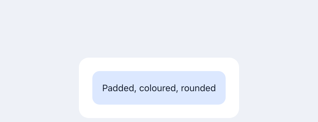
A box around an optional child — padding, color, a background image,
radius, width/height, and child alignment. The one layout widget that is
itself stylable.
API ›
Card (variant)
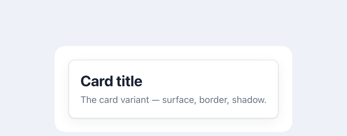
Container(
    Column(
        Text("Card title", variant="heading"),
        Text("The card variant — surface, border, shadow.", variant="muted"),
        gap=4,
    ),
    variant="card", padding=18,
)
variant="card" gives a Container the pegment surface, border and shadow.
API ›
Text & media
Text
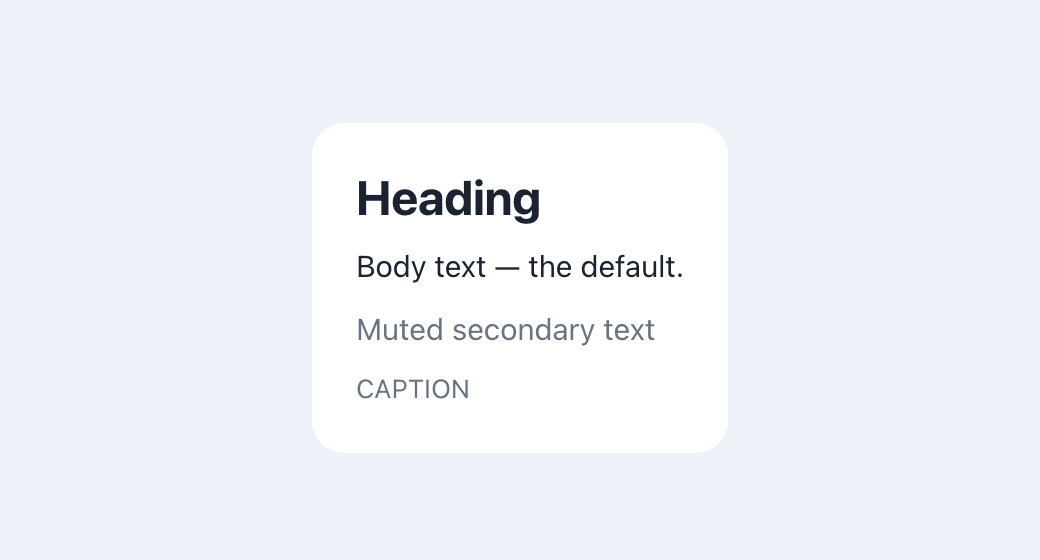
Column(
    Text("Heading", variant="heading"),
    Text("Body text — the default."),
    Text("Muted secondary text", variant="muted"),
    Text("CAPTION", variant="caption"),
    gap=8,
)
A run of text; variant selects the type style. API ›
Locale
A translated string. Declare your messages once with Translations on the
Router (or a single App), then render a token with Locale:
class MyApp(Router):
    translations = Translations(
        en={"greeting": "Hello, {name}", "items": "{count} items"},
        fr={"greeting": "Bonjour, {name}", "items": "{count} articles"},
        default="en",
    )
    routes = [...]

class Home(App):
    name = State("Ada")
    def build(self):
        return Locale("greeting", values={"name": self.name})
The active language follows the user's workspace choice — the language picker
in Settings — falling back to the browser's language and then to default.
If the chosen language is not one you supplied, your default is used, so
you only translate the languages you support. Switching the language
re-renders every Locale in place, with no reload.
Resolution for a token: the active language → the default language →
fallback → the token itself, so a gap degrades to something readable. Values
are inserted with textContent, never as markup, so a catalogue entry can
never inject HTML. variant styles it on the same ladder as Text. API ›
One language for the whole workspace. The choice lives under a single key
(wps.locale) that the workspace chrome, your app, and the Workpeg AI surface
all read, so picking a language in Settings flips everything at once — the
sidebar and top bar, your Locale content, and the AI chat — with no reload.
The chrome ships translated into nine languages (English, French, Spanish,
Italian, Arabic, Hebrew, Chinese, Hindi, Swahili); your catalogue translates
whatever subset you choose, and untranslated tokens fall back to English. For
right-to-left languages (Arabic, Hebrew) the document dir flips to rtl
automatically.
You rarely change the language yourself — the workspace Settings picker
drives it, and everything follows. An app that ships its own language control
can trigger the same workspace-wide switch from JavaScript with
WorkpegScaffold.setLocale(tag) (a BCP-47 tag; unknown tags fall back to the
default). See the scaffold/ and playground/ example homes for Locale in
use.
Image
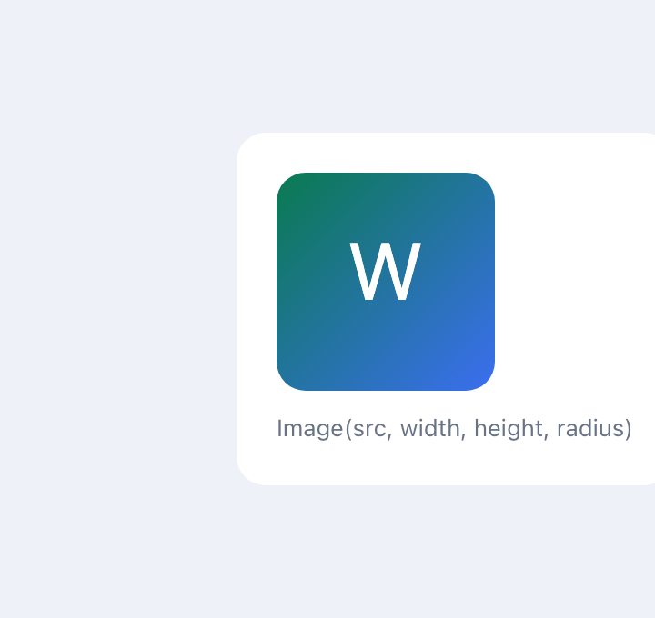
An <img> with fit (object-fit), radius, alt and lazy loading.
API ›
Video
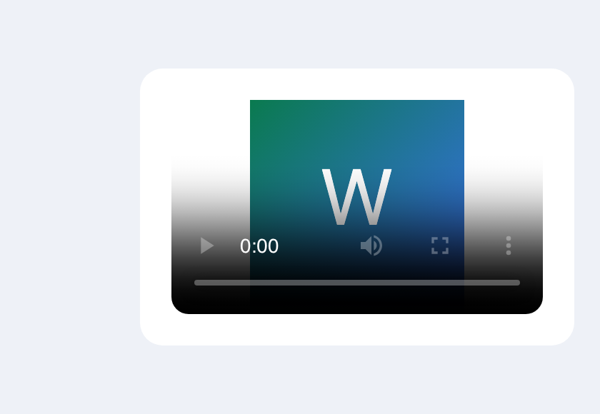
A <video> player — like Image, but for video: controls, poster, and
autoplay / loop / muted flags (autoplay forces muted + inline). Given
src_object= in place of a URL, it shows a live camera or a call, and
Audio plays a call's sound.
API ›
Code
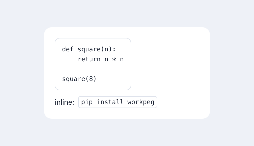
Code("def square(n):\n    return n * n")        # a <pre><code> block
Code("pip install workpeg", inline=True)        # inline <code> chip
Monospace code, shown verbatim (set as textContent, never parsed as HTML). A
block preserves whitespace and scrolls; inline=True is an inline chip.
API ›
HtmlView
Safely renders untrusted HTML + CSS — tables, inline style=, <font>,
<style> blocks — and never runs JavaScript: it's rebuilt from a
tag/attribute allowlist (createElement + textContent, never innerHTML), so
<script>, on*=, javascript: URLs and CSS expression()/url() are
dropped, and <style> CSS is scoped to the view. Unlike Markdown, it renders
real HTML rather than showing it as literal text.
API ›
Icon
A vector icon from the Pegment set (Tabler Icons).
It draws with the current text color (so it blends with its surroundings) and
sizes to 1em by default; size (px) and color override. The icon stylesheet
is loaded from cdn.workpeg.com, automatically and only when a build uses an
Icon. API ›
Graphics
Canvas
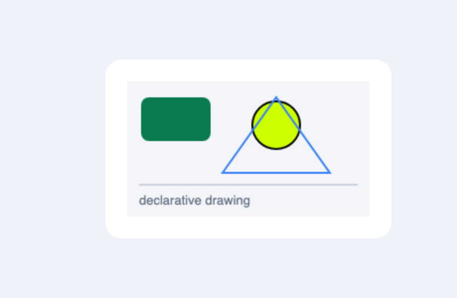
Canvas(
    Rect(x=14, y=16, w=70, h=44, fill="#0a7a4f", radius=8),
    Circle(x=150, y=44, r=24, fill="#ccff00", stroke="#0a0a0a", width=2),
    Path(points=[[96, 92], [150, 16], [204, 92]], stroke="#3b82f6", closed=True),
    Line(x1=12, y1=104, x2=232, y2=104, stroke="#cbd2dc", width=2),
    CanvasText("declarative drawing", x=12, y=124, fill="#687385"),
    width=244, height=136, background="#f3f5f9",
)
A 2D drawing surface painted from declarative ops (Rect / Circle / Line /
Path / CanvasText) — coordinates and colours may be reactive, so a
state-driven canvas redraws like any widget.
API ›
Buttons & links
Button
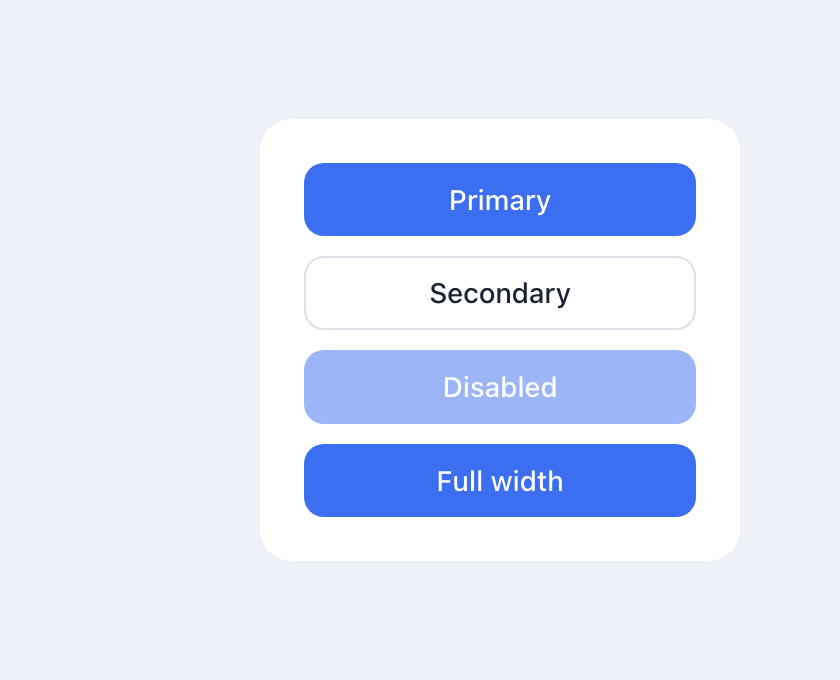
Column(
    Button("Primary", on_click=self.go),
    Button("Secondary", on_click=self.go, variant="secondary"),
    Button("Disabled", on_click=self.go, disabled=True),
    Button("Full width", on_click=self.go, full_width=True),
)
on_click is a self.method reference or a lambda; variant, disabled and full_width
shape it. API ›
ToggleButton
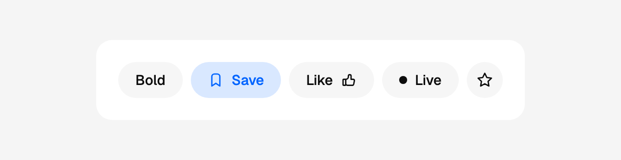
Row(
    ToggleButton(Text("Bold"), selected=self.bold, on_change=self.set_bold),
    ToggleButton(Icon("bookmark"), Text("Save"),
                 selected=self.saved, on_change=self.set_saved),
    ToggleButton(Text("Like"), Icon("thumb-up"),
                 selected=self.liked, on_change=self.set_liked),
    ToggleButton(Dot(), Text("Live"), selected=self.live, on_change=self.set_live),
    ToggleButton(Icon("star"), label="Favourite",
                 selected=self.fav, on_change=self.set_fav),
    gap=8,
)
A button that stays pressed. One widget, five looks: the content is its
children, in the order written, and a lone Icon is drawn square (and needs
label=). API ›
ToggleGroup
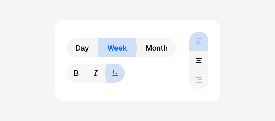
Row(
    Column(
        ToggleGroup(
            ToggleButton(Text("Day"), value="day"),
            ToggleButton(Text("Week"), value="week"),
            ToggleButton(Text("Month"), value="month"),
            value=self.span, on_change=self.set_span, label="Period",
        ),
        ToggleGroup(
            ToggleButton(Icon("bold"), label="Bold", value="bold"),
            ToggleButton(Icon("italic"), label="Italic", value="italic"),
            ToggleButton(Icon("underline"), label="Underline",
                         value="underline"),
            value=self.marks, on_change=self.set_marks, multiple=True,
            allow_empty=True, variant="ghost", label="Text style",
        ),
        gap=12,
    ),
    ToggleGroup(
        ToggleButton(Icon("align-left"), label="Left", value="left"),
        ToggleButton(Icon("align-center"), label="Centre", value="center"),
        ToggleButton(Icon("align-right"), label="Right", value="right"),
        value=self.align, on_change=self.set_align,
        direction="vertical", label="Alignment",
    ),
    gap=24,
)
Toggle buttons fused into one pill. With value= the group owns the
selection — one value, or a list with multiple=True — like Flutter's
SegmentedButton. API ›
Accordion
Accordion(
    AccordionItem("How secure is Workpeg?", Text("Very."), icon="shield"),
    AccordionItem("What about privacy?",    Text("Also very.")),
)
Rows that expand — Flutter's ExpansionPanelList. Self-contained like
Tabs: clicking a header opens it and the runtime tracks what is open, so
there is nothing to wire up. API ›
Link
Client-side navigation to another route (no full reload). API ›
Form inputs
TextInput
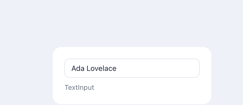
A controlled single-line field; type switches to email/number/date/etc.
API ›
TextArea
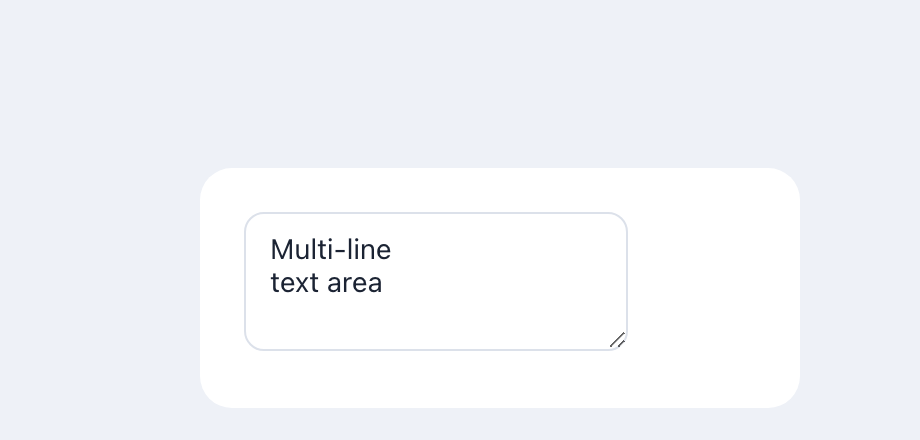
A controlled multi-line field. API ›
MarkdownEditor
A rich Markdown editor that edits like a page — / opens a block menu, a
toolbar floats over a selection; on_change receives Markdown text.
API ›
FileUpload
A click-or-drop file picker. on_select(files) receives a list of
{"name", "size", "type", "url"} dicts (url is a local blob: object URL,
revoked automatically on navigation); with preview=True (default) it also
renders image thumbnails / file cards itself. max_size (MB) rejects larger
files via on_error.
API ›
Checkbox
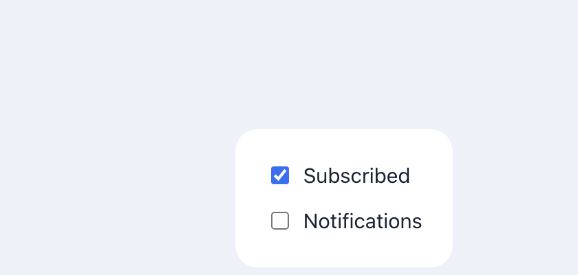
A boolean toggle with an optional label. API ›
Select
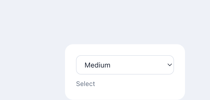
Select(options=["Small", "Medium", "Large"], value=self.size,
       on_change=self.set_size, label="Size")
A picker over a list of options. It is a field whose control is the
picker, so it takes the same label / hint / message / status / size as
Input and renders them identically.
API ›
RadioGroup
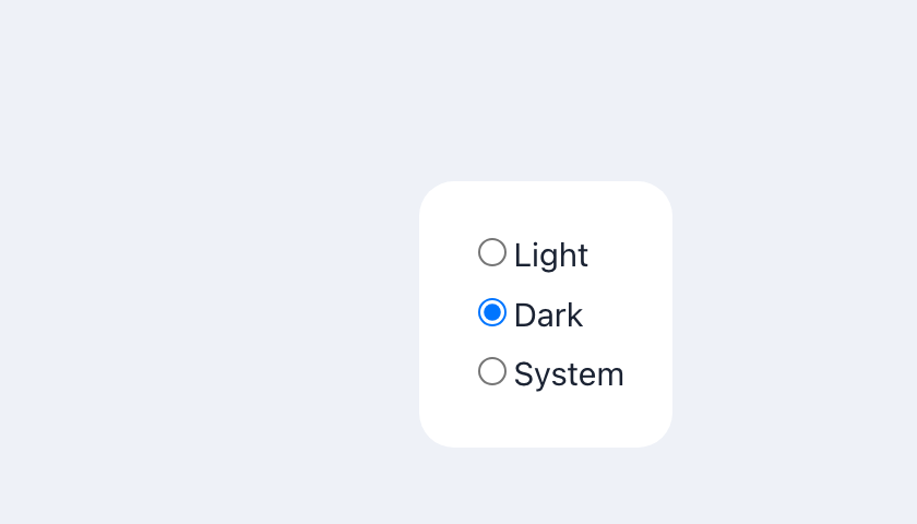
Single choice from a set of radios. API ›
Slider
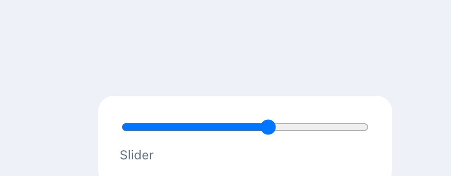
A numeric range input. API ›
CalendarDatePicker
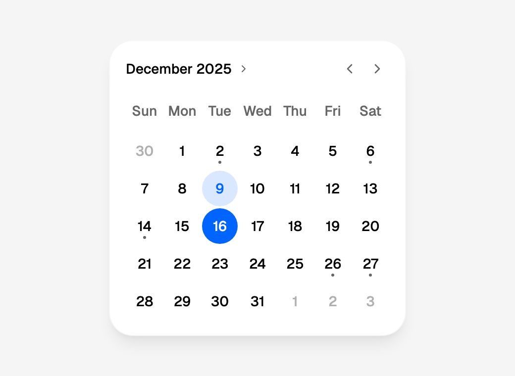
CalendarDatePicker(value=self.day, on_change=self.set_day,
                   markers=self.busy_days, disabled_weekdays=[6, 7])
A month of days to pick from, as the design's calendar card. on_change
gets the day as an ISO string ("2025-12-16"), or the sorted list with
multiple=True; the arrows move the month without re-rendering the page,
and the grid is one Tab stop with the date picker's
keys (arrows, Home/End,
PageUp/PageDown). Its title opens the year view, a grid of years to jump
to; initial_calendar_mode="year" opens on it. months=2 or 3 shows
that many side by side, and day_builder=lambda day: … draws each day's
own content, an event count or a price, in place of its number (Customising
days). Dates and calendars ›
CalendarDateRangePicker
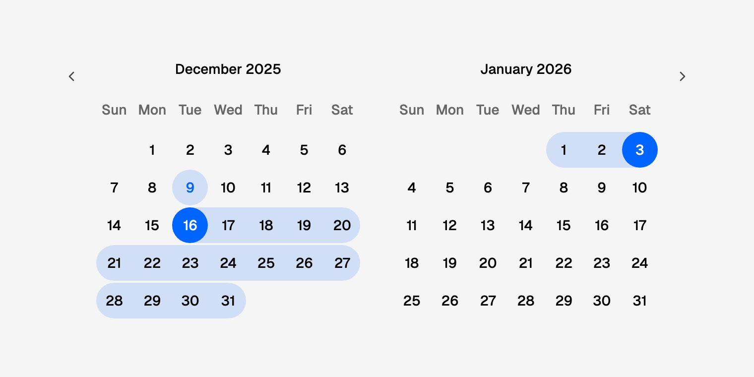
Two days and every day between them, as the design's range. The first
press starts a range ({"start": "2025-12-16", "end": None}), the next
ends it on that day or a later one, and a band joins the two across rows
and months, with the days up to the one hovered or focused previewed
while it is open. range_length=7 makes every press a week. Inside a
Field, required refuses a range that is not finished. Ranges ›
YearPicker
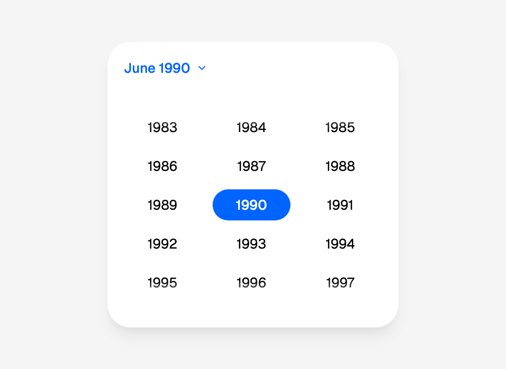
YearPicker(value=self.year, on_change=self.set_year,
           first_date="1950-01-01", last_date="2030-12-31")
The calendar's year view on its own, without the header: every year in
the bounds, three to a row in a box that scrolls. on_change gets the year
pressed as a whole number (2019), and inside a Field it is the field's
value. Year view and YearPicker ›
TimePicker
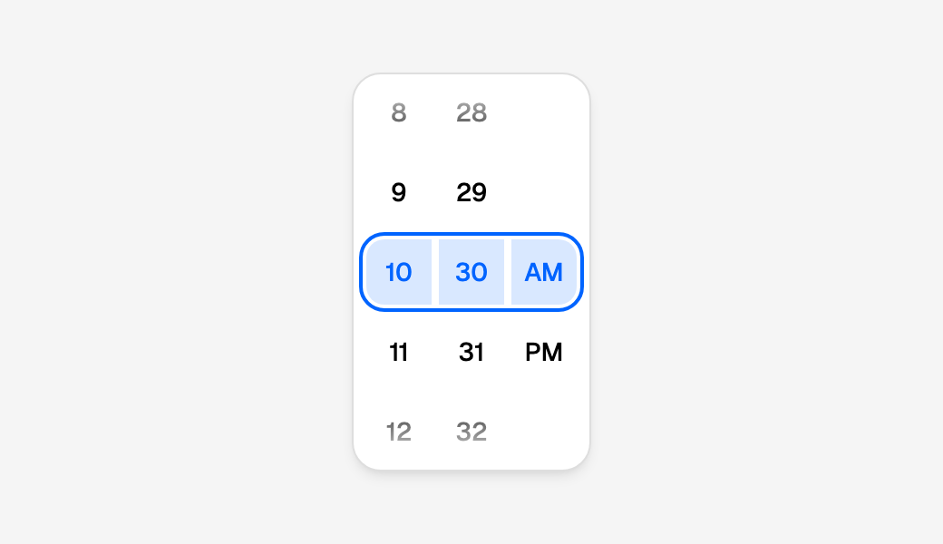
TimePicker(value=self.at, on_change=self.set_at,
           minute_interval=15, first_time="09:00", last_time="17:30")
The calendar's time wheel: a column each for the hours, the minutes and,
on a 12-hour clock, AM/PM, scrolled, flicked, pressed or keyed under a
fixed ring. on_change gets the time in 24 hours ("14:30", or
"14:30:15" with seconds=True) once the wheel comes to rest, never on
every scroll; first_time and last_time rule cells out, and a wheel
left outside them rests on the nearest time inside. TimePicker ›
DateInput, TimeInput and DateTimeInput
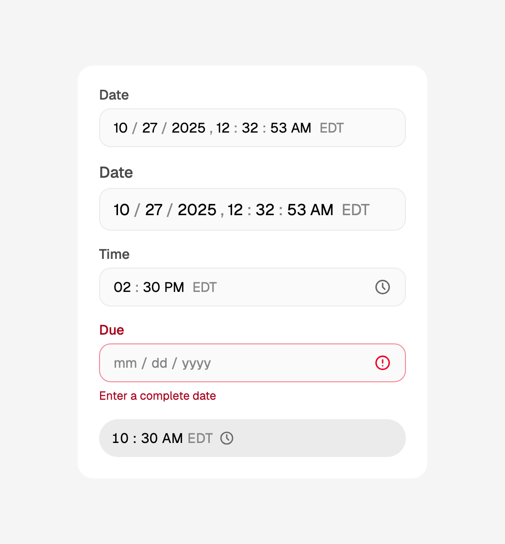
DateTimeInput(value=self.when, on_change=self.set_when, label="Date",
              seconds=True, show_zone=True, locale="en-US")
A date, a time or both, typed a part at a time into the field system's
box: each part takes its digits and moves on by itself, in the order the
locale writes them, and ↑ ↓ step it. on_change gets an ISO string once
the value is whole and inside its bounds ("2025-12-16T14:30"), and None
once if it stops being one; left half typed, the field says so in its
message row, and a Form will not submit it. A press on the month or the
day opens the field's calendar and a TimeInput's clock its time wheel
(a press on a DateTimeInput's time, which has no clock); on a phone
each is a bottom sheet. The parts on their own are DateSegments, which
fuses into an Input you write out.
Date and time fields ›
Collections
ListView
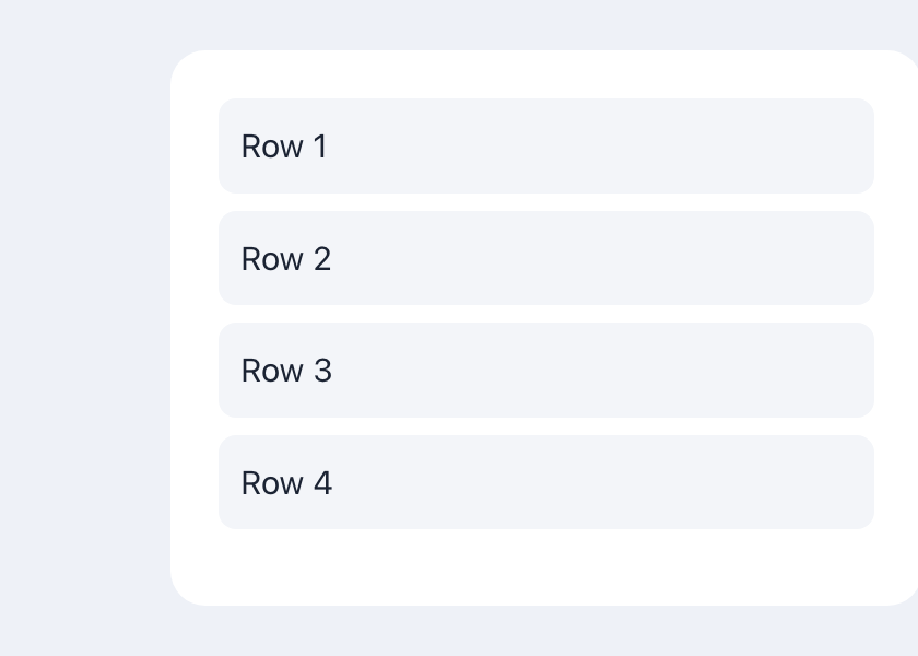
ListView(
    Container(Text("Row 1"), padding=10, color="#f3f5f9", radius=8),
    Container(Text("Row 2"), padding=10, color="#f3f5f9", radius=8),
    # …static children, or a lazy builder for long lists
    gap=8,
)
A scrollable list — pass children directly, or a lazy builder for long data. API ›
GridView
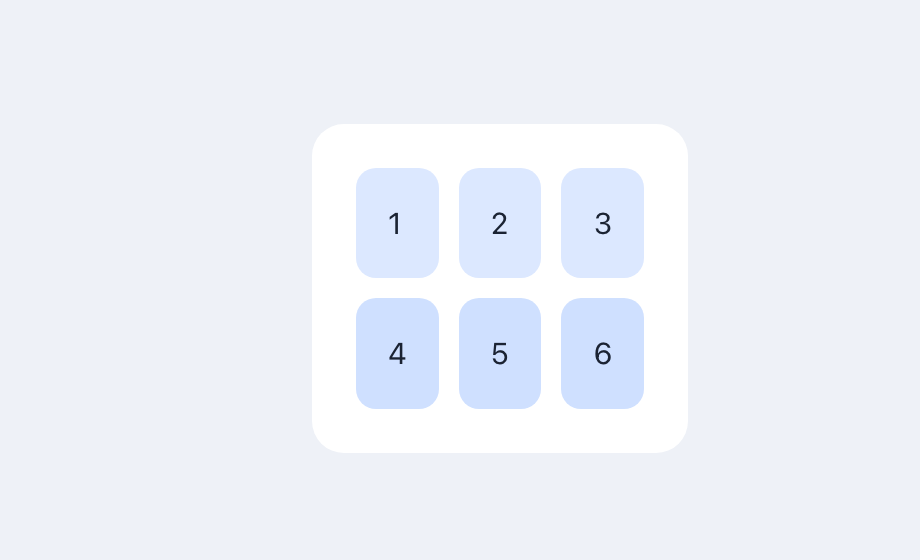
GridView(
    *[Container(Text(str(i)), padding=16, color="#dce8ff", radius=10)
      for i in range(1, 7)],
    columns=3, gap=10,
)
A fixed-column grid. API ›
Table
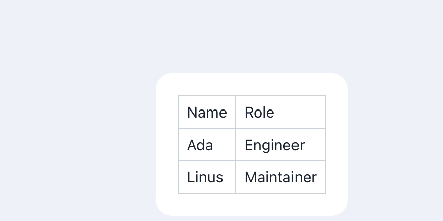
Table(
    TableRow(Text("Name"), Text("Role")),
    TableRow(Text("Ada"), Text("Engineer")),
    TableRow(Text("Linus"), Text("Maintainer")),
    border=1,
)
Rows of cells; Table and its TableRows. API ›
Stacking & wrapping
Stack + Positioned
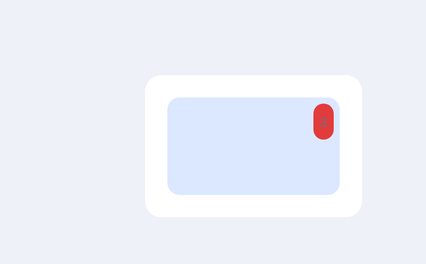
Stack(
    Container(width=170, height=96, color="#dce8ff", radius=12),
    Positioned(Container(Text("3"), padding=6, color="#e23b3b", radius=20),
               top=6, right=6),
    alignment="center",
)
Layers children; wrap one in Positioned to pin it by edge offsets.
API ›
Wrap
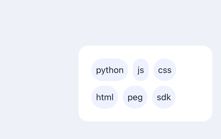
Wrap(
    *[Container(Text(t), padding=8, color="#eef2ff", radius=20)
      for t in tags],
    spacing=8, run_spacing=8,
)
Lays children in a line, wrapping to the next when they overflow. API ›
Flex & alignment
Row / Column alignment
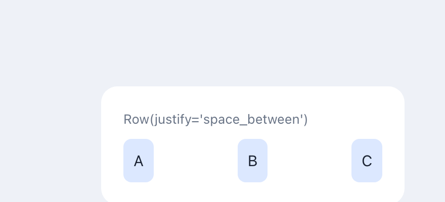
Row/Column share Flutter-style align, justify, main_axis_size, gap
and scroll keywords. API ›
Expanded & Spacer
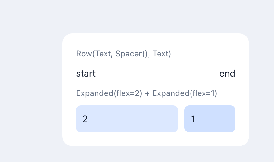
Row(Text("start"), Spacer(), Text("end"))            # pushed to the ends
Row(Expanded(a, flex=2), Expanded(b))                # 2 : 1 of the free space
Flex children weight how a Row/Column divides its free main-axis space.
API ›
Drag & drop
Draggable / DropTarget
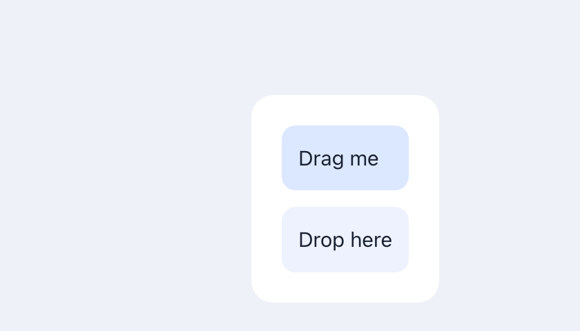
Draggable(Container(Text("Drag me"), padding=12, color="#dce8ff", radius=10),
          data="x")
DropTarget(Container(Text("Drop here"), padding=12, color="#eef2ff", radius=10),
           on_drop=self.on_drop)
Draggable carries data; the matching DropTarget receives it in on_drop.
API ›
Overlays
Modal
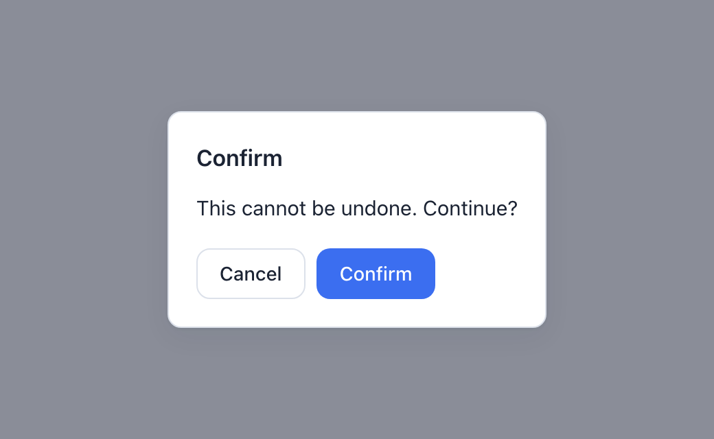
Modal(
    Column(Text("This cannot be undone. Continue?"),
           Row(Button("Cancel", on_click=self.close, variant="secondary"),
               Button("Confirm", on_click=self.confirm), gap=8)),
    open=self.show, on_close=self.close, title="Confirm",
)
A dialog over a dimmed backdrop, shown while open is truthy; a backdrop click
or Esc calls on_close. (Its companion toast(...) shows transient
notifications.) API ›
Widget reference
Every widget in full — props, behaviour, and the compiled output.
Keywords every widget takes
Alongside each widget's own props, all of them accept:
| Keyword | |
|---|---|
key |
A stable identifier. May be dynamic (key=f"row-{item.id}") |
visible |
False hides the widget. Takes an expression: visible=self.expanded |
visible still builds the widget and hides it, so it toggles cheaply but
does not skip work. To not build a subtree at all, branch in build():
Text("Details", visible=self.expanded)   # built, hidden with CSS

if self.expanded:                        # not built at all
    return Details()
Outlet is the exception: it is a routing slot rather than a rendered box, and
takes no keywords.
Stylable widgets additionally accept style={...},
a title tooltip, and the interaction events (on_focus, on_key, …).
Layout widgets
Layout widgets arrange other widgets. They render nothing visible themselves.
Column(*children)
A vertical stack of widgets.
Children are passed as positional arguments. Column and Row share a set of
Flutter-style flex keywords for laying their children out:
| Keyword | Flutter equivalent | Values | Effect |
|---|---|---|---|
align |
crossAxisAlignment |
start · center · end · stretch · baseline |
Cross-axis alignment. For a Column the cross axis is horizontal; for a Row it's vertical — so Row(..., align="stretch") makes children fill the row's height (a full-height sidebar) |
justify |
mainAxisAlignment |
start · center · end · space_between · space_around · space_evenly |
Main-axis distribution |
main_axis_size |
MainAxisSize |
max (default) · min |
min hugs the children instead of filling the axis |
gap |
— | int (px) | Space between children (overrides the theme default) |
scroll |
scroll views | auto · scroll · visible · hidden |
Scroll the main axis when content overflows; the box fills its parent's main extent so there's a fixed area to scroll within |
Each compiles to an inline style that overrides pegment's defaults, so a single widget controls its own layout. A full-height sidebar + scrollable main panel:
Row(
    sidebar,                          # fills the row's height (align="stretch")
    Expanded(Column(*body, scroll="auto")),   # the rest, scrolls on its own
    align="stretch",
)
Row(*children)
A horizontal arrangement of widgets — same signature and flex keywords as
Column (align, justify, main_axis_size, gap, scroll).
Center(child)
Centers a single child both horizontally and vertically within the available space — like Flutter's Center.
Center(Text("You are here"))

Center(
    Column(
        Text("Welcome"),
        Button("Start", on_click=self.start),
    )
)
Center takes exactly one child. Inside a Column it stretches to fill the remaining space, so a lone Center(...) returned from build() centers its child in the viewport.
Align(child, *, alignment="center")
Positions a single child within the space it occupies — like Flutter's Align. alignment is one of the nine snake_case anchors:
Align(Text("top right"), alignment="top_right")
Align(Text("middle"))                              # default: "center" (= Center)
| left | center | right | |
|---|---|---|---|
| top | top_left |
top_center |
top_right |
| center | center_left |
center |
center_right |
| bottom | bottom_left |
bottom_center |
bottom_right |
Align takes exactly one child and, like Center, stretches to fill the remaining space so it has room to position within. Center(x) is exactly Align(x, alignment="center").
Single-child widgets share one shape. A built-in single-child widget (
Center,Align,Padding) and a custom single-child component both take their child as the one positional widget argument — see child slots under components.
Padding(child, *, all, horizontal, vertical, top, right, bottom, left)
Insets a single child — Flutter's Padding with EdgeInsets-style keywords (px integers). Pass all for every side, horizontal/vertical for an axis, or a per-side value; the more specific wins (per-side > axis > all > 0):
Padding(Text("hi"), all=8)
Padding(card, horizontal=16, vertical=8)
Padding(child, all=8, top=20)        # 20 on top, 8 on the other three sides
At least one keyword is required (a Padding with no inset is a no-op).
SizedBox(child=None, *, width, height)
A box with a fixed width and/or height (non-negative px integers) — Flutter's SizedBox. The child is optional: with no child it's the canonical spacer, a fixed gap in a Row/Column.
SizedBox(Text("boxed"), width=120, height=40)
Row(Text("a"), SizedBox(width=24), Text("b"))      # 24px horizontal gap
Column(Text("x"), SizedBox(height=12), Text("y"))  # 12px vertical gap
At least one of width/height is required. It renders flex: 0 0 auto, so it keeps its size inside a flex parent.
width/height also accept infinity — Flutter's double.infinity, imported from workpeg.ui — meaning fill the parent (CSS 100%):
from workpeg.ui import infinity

SizedBox(Center(Text(label)), width=infinity)   # stretch to the parent's width
Container's width/height take infinity too. Note it fills its direct parent's content box, so to stretch something whose wrapper shrinks to content (an inline-block like a Menu), wrap the wrapper — SizedBox(Menu(…), width=infinity) — not the thing inside it.
Like Flutter's SizedBox, it forces its child to the box's size (constraints flow down): the child fills the dimension(s) you set, overriding the child's own preference. So SizedBox(Button("Go"), width=500) is a 500px-wide button — no per-widget width needed. (To make just a button fill its row, Button("Go", full_width=True) is the shortcut.)
Container(child=None, *, padding, margin, width, height, color, background, radius, alignment)
A composite box around a single (optional) child — a pragmatic subset of Flutter's Container. Combines several single-child concerns into one node:
Container(Text("card"), padding=12, color="#eef", radius=8)
Container(width=80, height=80, color="tomato")            # a coloured box
Container(child, padding=8, alignment="bottom_right")     # align the child
Container(child, background="https://…/hero.jpg")         # cover image
| Keyword | ||
|---|---|---|
padding / margin |
int px | Uniform inner/outer space. For per-side insets, wrap in Padding |
width / height |
int px | Fixed size |
color |
CSS color string | Background colour |
background |
URL string | Background image (cover-fit, centred). Scheme-allowlisted and the url(...) is built by the runtime, so it's injection-safe — unlike a raw style value, where url(...) is blocked |
radius |
int px | Rounded corners |
alignment |
anchor | Position the child within the box (the nine Align anchors) |
Expanded(child, *, flex=1) · Flexible(child, *, flex=1) · Spacer(*, flex=1)
Flex children — they weight how a Row/Column divides its free main-axis space (Flutter's Expanded/Flexible/Spacer).
Row(Expanded(left), Expanded(right, flex=2))   # right gets 2/3 of the width
Row(Text("start"), Spacer(), Text("end"))      # pushed to the two ends
Expandedfills its share tightly (flex: <flex> 1 0%).Flexiblemay take less than its share — loose fit (flex: <flex> 1 auto).Spaceris flexible empty space (no child).
flex is a positive integer weight (default 1); shares divide in proportion.
Stack(*children, alignment="top_left") · Positioned(child, *, top, right, bottom, left, width, height)
Stack layers its children on top of each other (Flutter's Stack). Non-positioned children overlap, aligned by alignment (the nine anchors); wrap a child in Positioned to place it by px offsets from the Stack's edges:
Stack(
    Container(width=120, height=60, color="#dce8ff", radius=8),
    Positioned(Text("●"), top=4, right=8),     # a badge in the corner
    alignment="center",
)
Positioned takes one child and at least one of top/right/bottom/left/width/height (integer px). Under the hood the Stack is a single-cell CSS grid (children overlap, aligned), and a Positioned child is position: absolute relative to the Stack.
ListView(*children, **style) — scrollable list
A scrollable list of widgets, inspired by Flutter's ListView. Two modes:
Static mode builds every child up front (like Flutter's ListView(children: [...])) — right for short lists:
Builder mode (ListView.builder) is lazy — items are built on demand from item_builder(index) and only the visible window is rendered, so lists of tens of thousands of rows stay fast:
ListView.builder(
    item_count=10_000,
    item_builder=lambda i: Text(f"Row {i}"),
    item_extent=40,
    height=400,
)
item_count can be a literal or a state reference — the list resizes reactively:
class Feed(App):
    total = State(50)

    def load_more(self):
        self.total += 50

    def build(self):
        return Column(
            ListView.builder(
                item_count=self.total,
                item_builder=lambda i: Text(f"Item {i} of {self.total}"),
                item_extent=40,
                height=400,
            ),
            Button("Load more", on_click=self.load_more),
        )
The item_builder lambda takes exactly one argument — the item index. Inside the lambda body the index works anywhere expressions do: f-strings, arithmetic, ternaries (lambda i: Text(f"{'even' if i % 2 == 0 else 'odd'} row {i}")).
Inline dynamic children — widget comprehensions
For a small list that doesn't need virtualization, spread a list comprehension straight into any multi-child container (Column, Row, Wrap, GridView, Stack). It lowers to items.map(...) and the result is flattened into the children — mixable with static children, supports if filters and enumerate, and the loop variable is in scope for the element (so a per-item button can target its own item):
Column(
    Text("Cart"),                                  # static sibling
    *[
        Row(
            Text(item["name"]),
            Button("✕", on_click=lambda: self.remove(item["id"])),
        )
        for item in self.items
        if item["qty"] > 0                          # optional filter
    ],
    Text(f"{len(self.items)} items"),
)
Use a widget comprehension for short, fully-rendered lists; reach for ListView.builder when the list is long enough that virtualization matters. A comprehension supports a single for clause.
Styling and alignment props (both modes):
| Prop | Default | Description |
|---|---|---|
height / width |
– | Viewport size — px int or CSS string. Builder mode defaults to 400 tall (virtualization needs a bounded viewport) |
item_extent |
40 (builder) |
Fixed main-axis size of each item in px. Drives the virtualization math in builder mode |
gap |
8 |
Space between items in px |
padding |
– | CSS padding inside the viewport |
align |
"stretch" |
Cross-axis alignment: "start", "center", "end", "stretch" |
direction |
"vertical" |
"vertical" or "horizontal" (scrolls sideways) |
reverse |
False |
Lay items out from the end — item 0 nearest the bottom (or right) edge, like a chat log |
How lazy rendering works: the runtime renders a sizer element whose height equals item_count × (item_extent + gap), so the scrollbar reflects the whole list — but only the items intersecting the viewport (plus a 4-item overscan on each side) exist in the DOM. Scrolling re-windows: items leaving the viewport are dropped, items entering it are built by calling the compiled item_builder. A 100,000-row list keeps roughly 20 DOM nodes alive. Scroll position survives state-driven re-renders.
GridView(*children, columns=2, gap=8, padding=None)
Arranges children into a grid of columns equal-width tracks — like Flutter's GridView.count. Children flow top-to-bottom into the tracks (CSS Grid).
| Keyword | Default | |
|---|---|---|
columns |
2 |
Number of equal columns (a positive integer) |
gap |
8 |
Space between cells, in px |
padding |
– | CSS padding around the grid |
Wrap(*children, spacing=8, run_spacing=8, direction="horizontal")
Lays children in runs, wrapping to the next line when the current run is full — Flutter's Wrap. Good for tag/chip lists.
| Keyword | Default | |
|---|---|---|
spacing |
8 |
Gap between children within a run, in px |
run_spacing |
8 |
Gap between runs, in px |
direction |
"horizontal" |
"horizontal" (wrap downward) or "vertical" (wrap sideways) |
cross_alignment |
– | Where children of different sizes sit within their run: "start", "center" or "end" (Flutter's WrapCrossAlignment). Left out, each child stretches to the run's height, as before. A literal |
Constraint & transform widgets (single-child)
| Widget | Keywords | Effect |
|---|---|---|
AspectRatio(child, ratio=…) |
ratio (positive number) |
Sizes the child to a width : height ratio (CSS aspect-ratio). ratio=1.78 ≈ 16:9 |
ConstrainedBox(child, …) |
min_width / max_width / min_height / max_height (px ints) |
Constrains the child's size (CSS min/max-width/height); at least one |
FractionallySizedBox(child, …) |
width_factor / height_factor (0–1) |
Sizes the child to a fraction of the available space (width: <factor·100>%) |
Transform(child, …) |
rotate (deg), scale, translate_x / translate_y (px) |
Applies a CSS transform; e.g. Transform(child, rotate=15) |
Sizing & visibility widgets (single-child)
| Widget | Keywords | Effect |
|---|---|---|
IntrinsicWidth(child) |
— | Shrinks the child to its natural width (CSS width: max-content) |
IntrinsicHeight(child) |
— | Shrinks the child to its natural height (CSS height: max-content) |
LimitedBox(child, …) |
max_width / max_height (px ints) |
Caps the child's size (CSS max-width/max-height); at least one |
Offstage(child, offstage=…) |
offstage (bool, default True) |
Hides the child but keeps it mounted, so its state survives (CSS display: none). offstage may be a state expression, so it toggles reactively: Offstage(child, offstage=self.hidden) |
FittedBox(child, …) |
fit (contain default / cover / fill / fit_width / fit_height / scale_down / none), alignment (an anchor) |
Scales the child to fit the box. Needs real layout, so a runtime ResizeObserver measures and applies a transform: scale(…) — the box must get a size from its parent for there to be room to scale into |
Table(*rows, border=0) · TableRow(*cells)
A simple table — TableRow(...) children laid out in equal columns (CSS grid).
TableRow is author-time grouping: the compiler flattens the rows into the grid
(row-major), so every row must have the same number of cells, and TableRow is
valid only as a direct child of Table. border (px, default 0) draws
gridlines.
The header and the rows may come from a helper method. A method whose
every return is a widget is inlined where it is called, so a header shared
by several tables is written once — and its cells are still counted literally
when the page compiles, which is how the table knows its column count:
def head(self):
    return TableHeader(TableCell(title="Name"), TableCell(title="Email"))

def row_for(self, r):
    return TableRow(TableCell(title=r["name"]), TableCell(title=r["email"]))

def build(self):
    return Table(self.head(), *[self.row_for(r) for r in self.people])
The helper takes parameters, and they may be loop variables: the call's arguments are substituted into its body and parsed where you wrote the call. See Core concepts for what a helper is and is not.
A bar above, a bar below. toolbar= puts a strip across the top of the
table and footer= one across the bottom. Each takes any widget, so a title
and a search box go in the first and pagination in the second:
Table(
    TableHeader(TableCell(title="Name"), TableCell(title="Email")),
    *[TableRow(TableCell(title=p.name), TableCell(title=p.email))
      for p in self.people],
    toolbar=Row(Text("Recent deployments"), TextInput(value=self.q,
                                                      on_change=self.set_q)),
    footer=Row(Button("Previous"), Button("Next"), gap=8),
)
All four combinations work — both bars, either one, or neither — and the frame moves with them. With a bar present the border and the rounded corners belong to the card that wraps all three, because two boxes each drawing an edge is a double line at every corner. With neither, the table's own frame is the rounded thing.
They are keywords rather than child widgets on purpose. A table's cells are
one flat row-major list whose row boundary is arithmetic, so a bar arriving
as a child would shift every cell one column — and a TableFooter sitting
beside TableHeader would read as an HTML <tfoot>, which is a different
thing entirely.
sortable, search, page_size
Filled bars, for the cases the slots above make you build by hand:
sortable makes every column header a sort control. search adds a filter
box (a string sets its placeholder). page_size adds a pager with a
"Showing 1–25 of 312" count. Each creates the bar it needs, so neither
toolbar= nor footer= is required — and if you pass one anyway, the
control joins it.
They compose in one direction: the filter narrows, the sort orders what is left, the pager shows a slice of that. Any other order gives a pager whose page count changes as you type, or a sort that only orders the page you can see. Searching or sorting returns to page one.
These are view operations over rendered text, because that is all a
table has — the cells are one flat list with nowhere to hang an underlying
value. A column is compared as numbers or as dates only when every
non-empty cell reads that way; one stray n/a makes it a text column,
which sorts predictably rather than scattering the rows that failed to
parse. An empty cell sorts last in both directions, because "no value" is
not a small value. To sort by something the table doesn't show, sort in
Python before building the rows.
A third click on a header clears the sort and restores the authored order —
otherwise there is no way back to it. The sort arrow is drawn from
aria-sort, so the picture and what a screen reader is told are the same
state. Headers are keyboard-reachable; the pager disables at the ends
rather than disappearing, which would move everything under it.
Rows can come from data, with a spread comprehension — the same form
Column(*[...]) takes, and usually with a static header row in front:
Table(
    TableRow(Text("Name"), Text("Score")),                       # header
    *[TableRow(Text(r["name"]), Text(r["score"]))                # from state
      for r in self.players if r["active"]],
    border=1,
)
How many rows there will be is unknown until render; how many cells each has
is not, because the TableRow inside the comprehension is a literal call. That
is what lets the table know its column count at compile time, and why a bare
*self.rows cannot work — there is no TableRow in it to count. A dynamic row
whose width disagrees with the header is rejected at compile time, like any
other mismatched row.
Layout class hierarchy. Layout widgets share two extension bases:
SingleChildLayout(one child —Align/Padding/Container/…, andCenter, which is anAlignfixed to center) andMultiChildLayout(many children —Column,Row,Stack,Wrap,GridView). The flex children (Expanded/Flexible) share aFlexChildbase. The compiler treats them as two families — single-child widgets take one positional child (the same shape a custom component's slot uses), multi-child widgets take many.
Display widgets
Display widgets present content.
Text(value)
Displays text. Supports plain strings, bare expressions, and f-strings that reference state fields or the current URL via location.
Text("Hello, World")                          # static
Text(self.title)                              # bare state reference
Text(self.count * 2)                          # bare expression
Text(f"Count: {self.count}")                  # reactive state reference
Text(f"Hello, {self.name}!")                  # multiple state refs
Text(f"{location.pathname} not found")        # current URL path
Text(f"Count: {self.count} at {location.pathname}")  # mixed
Text(f"Next: {self.count + 1}")               # full expressions
Text(f"{'even' if self.count % 2 == 0 else 'odd'}")  # ternaries too
Both bare values and f-string interpolations accept any supported expression: state references, location.<prop>, arithmetic, comparisons, ternaries, numeric builtins (abs/min/max/float/int/round/pow), and math.* calls/constants. Unsupported constructs (lists, lambdas, arbitrary function calls) raise UnsupportedSyntaxError.
Three style keywords, each independent of the others:
| Keyword | Values | |
|---|---|---|
variant |
display, title, heading, subheading, body, caption, label, muted, code |
The type style (size, line height) |
tone |
default, muted, success, warning, danger, info |
Semantic colour; follows light/dark |
weight |
regular, medium, semibold, bold |
Font weight, overriding the variant's |
Text("Payment failed", tone="danger", weight="semibold")
Text("Saved", tone="success")
Text("Totals", variant="heading", weight="bold")
variant="muted" and tone="muted" are different things — the first is a type
style, the second a colour — and may be combined. A value outside these sets is
refused at compile time rather than passed through, since an unrecognised one
would render as no styling at all.
Locale(token)
A translated string. Looks token up in the Peg's Translations catalogue in the active language and renders it as text. Keyword arguments: fallback, values, variant.
class MyApp(Router):
    translations = Translations(
        en={"greeting": "Hello, {name}", "cart": "{count} in cart"},
        fr={"greeting": "Bonjour, {name}", "cart": "{count} au panier"},
        default="en",          # used for a language you did not translate
    )
    routes = [...]

Locale("greeting")                              # "Hello" / "Bonjour"
Locale("greeting", values={"name": self.name})  # fills {name}
Locale("cart", values={"count": store.count})   # any expression
Locale("greeting", fallback="Hello")            # if the token is missing
Locale("title", variant="heading")             # same type styles as Text
The parameters:
| Name | Type | Default | Description |
|---|---|---|---|
token |
str |
— | The message key to look up in Translations. |
fallback |
str |
"" |
Text to show when the token is in no language. |
values |
dict |
{} |
Values interpolated into {name} placeholders; each may be any supported expression. |
variant |
str |
"body" |
Type style, the same ladder as Text (heading, caption, muted, …). |
The active language is the user's workspace choice (the Settings language picker, shared across the whole session), then the browser's language, then the catalogue's default. A language you did not translate falls back to default — you support only the languages you list. Calling Workpeg.setLocale(tag) (which the picker does) re-renders every Locale in place.
Token resolution: active language → default language → fallback → the token itself. Messages are set with textContent, never innerHTML, so a catalogue entry cannot inject markup. Language codes are en or pt_BR; default must be one of the languages you declared (or it defaults to the first).
Image(src, *, width, height, fit, alt, radius, lazy)
Renders an <img>, inspired by Flutter's Image. The first positional argument is the source URL; fit is the CSS-object-fit analogue of Flutter's BoxFit.
Image("https://example.com/cat.jpg", width=240, height=160)   # basic
Image("/avatar.png", width=48, height=48, radius=24, alt="You")  # rounded
Image("/banner.jpg", width=320, height=180, fit="contain")     # letterboxed
Image(f"/photos/{self.id}.jpg", alt=f"Photo {self.id}")        # reactive src
A path starting with / comes from your project's public/ folder, which does
not take SVG: see What public/ can hold.
| Option | Type | Default | Maps to |
|---|---|---|---|
src |
str / f-string / state | — (required) | img.src |
width |
int (px) or CSS string | auto | style.width |
height |
int (px) or CSS string | auto | style.height |
fit |
cover · contain · fill · none · scale_down |
cover |
style.object-fit |
alt |
str / f-string / state | "" |
img.alt |
radius |
int (px) or CSS string | none | style.border-radius |
lazy |
bool | True |
loading="lazy" / "eager" |
src and alt accept dynamic values (f-strings, state references), so an image can change reactively. The rest are compile-time constants — an invalid fit or an unknown keyword fails the build, not the browser.
Best practices are built in: alt is always emitted (use alt="" to mark a decorative image), images are lazy-loaded and decoding="async" by default, and the element is display: block to avoid the inline-image baseline gap. Note that, like Flutter's BoxFit.cover/fill, a non-contain fit can crop or stretch the image — set explicit width/height for predictable framing.
A picture that does not arrive (a 403 or 404, an unreachable host, a URL the scheme check refuses, an empty src) leaves an empty box and draws nothing in it. Browsers otherwise disagree: Chromium draws a broken-image glyph, WebKit a hollow grey box, and Firefox paints the alt text, which spills past the box over whatever sits beside it.
Row(Image(flag_url, width=20, height=15, alt="Senegal"),   # blank 20×15 if it fails
    Text("+221 77 123 45 67"), gap=8)
- The box stays. The
widthandheightyou gave are kept, so nothing around the image moves. A dimension you did not give is0, which is what every browser gives an image while it is still loading, so an unsized image that fails takes no space. Give both sizes to an image that sits in a line of text or a table cell. - The
altstays on the element, so a screen reader still announces it, and analt=""image stays decorative. - A failed URL is not requested again for ten seconds. Re-renders in that time show the empty box without fetching the URL, so a page that re-renders on every keystroke does not ask the host once per key. After it, the next render asks again, so a picture that failed for a moment — a 503, a blip offline, a thumbnail generated after the page asked for it — shows without a reload. Dropdown option images use the same list, and a flag that failed in a country picker is not fetched again for the life of the page, by the picker or by the table beside it.
- The element is the same
<img>, so anything attached to it stays:title=,on_mouse_enter=, a wrappingTooltip, its cell in aStack. Itssrcbecomes a transparent blank and it gains the classpg-image--missing.
Logo(*, variant, theme, width, height, fit, alt, radius, lazy)
The Peg's brand logo from the Workpeg CDN — you never pass a URL (or a namespace), it's built for you. The Peg namespace is resolved automatically from the serving host (*.<namespace>.workpeg.com, then the peg-namespace <meta>) — the same namespace workpeg.* sends as its header — so a Logo always shows the current Peg's own brand. The CDN path is /pegs/<namespace>/assets/logo/<variant>-<theme>.svg.
Logo()                                  # this Peg, primary mark, auto theme
Logo(variant="secondary", height=22)    # the secondary mark
Logo(theme="dark")                      # force the dark-background art
| Option | Type | Default | Notes |
|---|---|---|---|
variant |
primary · secondary |
primary |
Which uploaded mark |
theme |
light · dark · automatic |
automatic |
automatic follows the OS (prefers-color-scheme) and swaps the art live |
all of Image's |
— | — | width/height/alt/fit/radius/lazy + style (everything except src) |
theme="automatic" renders a <picture> with both the light and dark art, so the browser picks — and re-picks live as the OS toggles — with no JS. light/dark render a single <img> of that art. fit defaults to contain (a logo is never cropped). It's a plain native <img>/<picture>, so the browser fetches and caches it like any image; if the logo hasn't been uploaded (the file fails to load), it's simply hidden — no broken image, no warning. See the CDN asset structure for where logos live.
GravatarImage(email, *, initials, bg, color, width, height, fit, radius)
An avatar that resolves an email to its Gravatar,
falling back to a coloured initials tile when there's none. It carries the
same image attributes as Image (width, height, fit, radius, alt) and
adds the avatar bits.
GravatarImage(user.email, initials="TA")                     # circle, default colours
GravatarImage(self.email, initials=self.initials,           # branded fallback tile
              bg="#5b6472", color="#ffffff", width=64)
GravatarImage("nobody@example.com", initials="AB", radius=10)  # rounded square
| Option | Type | Default | Notes |
|---|---|---|---|
email |
str / f-string / state | — (required) | Hashed (MD5) in the browser to find the Gravatar |
initials |
str / f-string / state | "" |
Shown when there's no Gravatar (set via textContent) |
bg |
CSS colour | #dce1ea |
Background of the initials tile. A value that could fetch or escape (url(), image-set(), ;, ...) is a compile error as a literal, and falls back to the default when it arrives at runtime |
color |
CSS colour | #1b2333 |
Initials text colour, held to the same check as bg |
width / height |
int (px) or CSS string | 40 / = width |
The avatar box (square by default) |
radius |
int (px) or CSS string | circle (50%) |
Override for a rounded square |
fit |
cover · contain · … |
cover |
object-fit of the photo |
alt |
str / f-string / state | "" |
Accessible label |
The initials render immediately; the runtime requests the Gravatar with
d=404 (so a missing one returns 404 rather than a placeholder) and overlays it
only once it loads — a 404 just leaves the initials in place, so there's never a
broken-image flash. email/initials/bg/color/alt may be dynamic; sizing
is constant. Circular by default — pass radius for a rounded square.
Video(src, *, width, height, controls, autoplay, loop, muted, poster, radius)
A <video> player — Image, but for video. The first positional argument is the
source URL; src and poster (a placeholder frame) may be dynamic.
Video("/clip.mp4", width=480)                                  # controls on
Video(f"/lessons/{self.id}.mp4", poster="/thumb.jpg")          # reactive src
Video("/bg.mp4", autoplay=True, loop=True, muted=True)         # silent loop
| Option | Type | Default | Maps to |
|---|---|---|---|
src |
str / f-string / state | — (required) | video.src |
width / height / radius |
int (px) or CSS string | auto | style.* |
controls |
bool | True |
native playback controls |
autoplay |
bool | False |
autoplay (forces muted + inline — browser policy) |
loop |
bool | False |
video.loop |
muted |
bool | False |
video.muted |
poster |
str / f-string / state | none | video.poster (frame shown before play) |
The element is display: block and caps at max-width: 100%. Browsers only
allow autoplay for muted, inline videos, so autoplay=True sets both for you.
A live stream: src_object
src_object= takes a stream handle from workpeg.ui.rtc, in
place of src: your own camera from media_devices.get_user_media(...), or the
other side of a call. Give exactly one of src and src_object.
from workpeg.ui import App, Button, Column, State, Video
from workpeg.ui.rtc import media_devices


class Preview(App):
    camera = State(None)

    async def start(self):
        self.camera = await media_devices.get_user_media(
            {"audio": True, "video": True})

    def build(self):
        return Column(
            Video(src_object=self.camera, muted=True, width=320, radius=8),
            Button("Start camera", on_click=self.start),
        )
- It plays at once, inline, with no controls unless you pass
controls=True. Mute your own camera (muted=True), or you hear yourself. Nonedraws an empty video, sized as you asked, so a page can lay out a call before its stream arrives.- A state write does not restart it. The page keeps a stream's element by
the stream, so a timer or a keystroke elsewhere leaves the call playing, and
so does a view appearing or going beside it: a self-view turned on ahead of
the call, a participant who leaves a grid (a
Columnor aListView.builder), a spotlight unpinned. Nokey=is needed for that, on theVideoor on aComponentthat shows it. Two widgets of one stream (a large view and a thumbnail) each show it, each in its own element with its own flags and size. A widget that is given another stream starts it fresh. - Inside a
ListView.builder, a stream has one element perVideoorAudioin your code, whichever item shows it, so a participant can move to another item without a restart. So show a stream in one lazy item at a time: one shown by two lazy items through the sameVideo(the sameComponent, say), in one list or two, appears in the last of them. mutedis where it starts. Someone who unmutes a call with itscontrolskeeps it unmuted when the page renders again.- It takes
muted,controls,width,height,radius,key,visibleandstyle.poster,autoplayandloopare a URL's, and a build refuses them besidesrc_object. A tooltip (title=) or a handler (on_double_click=and the other interaction events) goes on aContaineraround theVideo: the stream's element is kept across renders, so one on it would be added again each time, and a build refuses it. ATooltip, aResizableor aDismissible'sbackgroundaround a stream is fine: each adds to the stream's element once and follows what the latest render says, so a hover shows one tooltip however often the page renders. - Only a stream is shown. A literal (
src_object="https://...", a number, a list or a dict) does not build: a URL goes insrc. A value worked out on the page that is not a live stream, such as a URL kept in state or a single track, shows nothing, and never breaks the page. - The page that captured a camera turns it off when it is left, and closes its connections, so leaving a call hangs up. A shell kept across its child routes keeps its call.
The browser's half is the SDK's rtc.js, which a build ships only to a peg whose
pages use workpeg.ui.rtc. A peg without it can still lay out Video(src_object=None),
which stays empty.
Audio(*, src_object, key, visible)
Plays a stream's sound: an <audio> that starts at once and shows nothing, with
no controls. Use it for a call whose video you do not show, or beside a muted
Video of the same stream.
src_object is a stream handle, or None to play nothing; it takes nothing
else but key and visible. Like a stream Video, it keeps its element across
renders, so the call is not interrupted when the page renders again.
FileView(src, *, mode="auto", height=360, max_bytes=262144, radius=None)
View the contents of an uploaded file in a scrollable monospace pane — text
decoded as UTF-8, or a classic offset/hex/ASCII dump for binaries. The common
src is the object URL a FileUpload hands back for the user's
own file (a blob: URL, allowed here even though Link rejects it); src may
be dynamic (state / f-string).
class Inspector(App):
    url = State("")
    def picked(self, files): self.url = files[0]["url"]   # the blob object URL
    def build(self):
        return Column(
            FileUpload(on_select=self.picked),
            FileView(self.url, height=420) if self.url else Text("Upload a file"),
        )
| Option | Type | Default | Behaviour |
|---|---|---|---|
src |
str / f-string / state | — (required) | the file URL to read |
mode |
"auto" / "text" / "hex" |
"auto" |
auto sniffs text vs binary; text decodes UTF-8; hex is a hex dump |
height |
int (px) | 360 |
max height of the (scrolling) pane |
max_bytes |
int | 262144 |
cap on how much is read (the rest is noted) |
radius |
int (px) | none | corner rounding |
Why it's safe. The runtime fetches the same-origin blob, decodes/dumps the
bytes, and sets the result with textContent — never as HTML, so nothing in
the file is parsed or executed (a hex dump is generated from raw bytes; text is
shown literally). The URL scheme is re-checked at runtime (blob: / http(s) /
relative only — javascript:/data: are dropped). It's a content viewer:
format-specific rendering (a PDF page, an image's EXIF, …) is something you'd
build on top from the file bytes.
Code(text, *, inline=False, copyable=False)
Source code or preformatted text in a monospace font. The default is a scrolling
<pre><code> block that preserves whitespace and newlines; inline=True is
an inline <code> chip. The text may be dynamic, and is set as textContent —
shown verbatim, never parsed as HTML — so it can't inject markup or scripts.
Code("def hello():\n    return 'hi'")          # a code block
Code(f"pip install {self.pkg}", inline=True)   # inline snippet
There is no syntax highlighting (that would mean shipping a highlighter); the
text is rendered literally. For an inline monospace word inside a sentence, drop
a Code(..., inline=True) into a Row with the surrounding Text.
copyable=True
Puts a copy button in the block's corner:
It needs no handler. The widget already holds the text, so asking for one
would mean writing the snippet down twice and letting the two drift. The
button reads the rendered <code> at click time rather than a value captured
when the page was built, so a re-render that changes the code cannot leave a
button copying the old one.
It reports itself for two seconds after a copy — a tick, an aria-label of "Copied", and a colour — because a clipboard write is otherwise completely silent and a button that does nothing visible reads as broken.
The button is hidden until the block is hovered or something inside it takes focus: a permanent one sits on the first line of code, which is where the eye starts reading. Keyboard users reach it by focus, so it is never unreachable.
Ignored for inline=True — there is no corner to put it in.
Markdown(text)
Renders a Markdown string as formatted rich text. The single positional text
may be dynamic (state / route / arithmetic), so messages re-render reactively. It
supports a practical subset: headings (#–######), **bold**, *italic* /
_italic_, inline `code`, [label](url) links, bulleted (- / * / +)
and numbered lists, > blockquotes, fenced ``` code blocks, and ---
horizontal rules.
Markdown("## Notes\n\n**bold**, `code`, and a [link](/docs)\n\n- one\n- two")
Markdown(self.message)                         # dynamic — re-renders with state
Injection-safe by construction. The renderer never touches innerHTML — it
builds the DOM by creating elements and setting textContent / text nodes, so
any raw HTML in the source (<script>…, <img onerror=…>) renders as literal
text, never as a node. Link URLs are sanitised: only http:, https:,
mailto:, tel:, and relative URLs are kept; a javascript: (or other-scheme)
href is dropped. This pairs with ChatInput
to build an AI-style chat composer.
HtmlView(html)
Renders untrusted HTML + CSS safely — its use case is showing an email body
(or any HTML you don't control) without giving it a way to run code. The single
positional html may be dynamic (state / f-string), so the view re-renders when
the source changes.
class Inbox(App):
    body = State("")                       # an HTML email body fetched from your API

    def build(self):
        return HtmlView(self.body)
Where Markdown renders a markup language and shows raw HTML as literal text,
HtmlView parses real HTML — tables, inline style=, bgcolor, <font>,
and <style> blocks — and renders it.
It never runs JavaScript of any kind. The document is rebuilt node by node
from a tag/attribute allowlist using createElement + textContent (never
innerHTML, and the browser's HTML parser is never invoked), so everything
executable is excluded by construction:
<script>,<iframe>,<object>,<embed>,<form>/inputs,<svg>/<math>and other active/foreign tags are dropped (with their subtree).on*=event-handler attributes are never copied.href/srcare scheme-checked — onlyhttp(s),mailto,tel, relative URLs, and (for images)data:image/<raster>survive;javascript:,data:text/html, etc. are dropped. External links gettarget="_blank"+rel="noopener noreferrer".- CSS — both inline
style=and<style>blocks — is sanitised:url(),expression(),behavior,-moz-bindingand@importare stripped, and<style>selectors are scoped to the view, so an email's CSS can't leak out and restyle your app.
Unknown tags are unwrapped (their text content is kept); HTML entities are
decoded. Images render via <img> and are capped to the view's width.
Icon(name, *, size, color, weight)
A vector icon from the Pegment icon set — a fork of
Tabler Icons. Icons render at the
2px default weight; say "shield-lock:thin" for the lighter 1.5px outline or
"shield-lock:bolder" for the heaviest 2.5px. Rendered
as <i class="ti ti-<name>"> and styled by the icon stylesheet, which draws each
glyph with the current text color (a CSS mask, so it inherits its
surroundings) and sizes it to 1em — so an icon sitting next to text just lines
up:
class Toolbar(App):
    def build(self):
        return Row(
            Button(Row(Icon("plus"), Text("New"), gap=6), on_click=self.new),
            Icon("search"),
            Icon("settings", size=20),
            Icon("alert-triangle", size=24, color="#e23b3b"),
            gap=12, align="center",
        )
| Option | Type | Default | Notes |
|---|---|---|---|
name |
str | — | Tabler name without the ti- prefix ("arrow-left", "brand-github"); append -filled for a filled variant ("heart-filled"), and/or a stroke-weight suffix — "shield-lock:thin", "shield-lock:bolder" (numeric :1.5, :2, :2.5 also work) — which wins over weight=. Validated at compile time |
size |
int / str | 1em |
The icon box in px (sets --icon-size) |
color |
str / state | inherits | Overrides the inherited text colour |
weight |
thin / 2 / bolder |
2 |
Stroke width — three weights, and the 2px default is the base .ti-<name> mask itself (so a plain <i class="ti ti-home"> straight off the CDN renders it; no modifier class). thin (or 1.5) adds ti-thin for the lighter 1.5px outline, bolder (or 2.5) adds ti-bolder for the heaviest 2.5px. A :weight suffix on name overrides this |
key |
str | — | Stable id |
The icon stylesheet lives on cdn.workpeg.com and is linked automatically, and
only when a build actually renders an Icon — so apps that use no icons never
load it. Browse the full set at
design.workpeg.com/icons.html.
Dot(*, color)
A small filled circle — the 8px status dot a toggle and Button(dot=True)
draw — as a widget of its own, so it can sit among any children:
ToggleButton(Dot(), Text("Live"), selected=self.live, on_change=self.set_live)
Row(Dot(color="var(--color-success-500)"), Text("Online"), gap=6)
It is drawn in currentColor, so by default it takes the colour of what it
sits in — the label grey of a resting toggle, the blue of a selected one.
color= fixes it: a literal is checked against the
CSS value deny-list when the page is
compiled, and a value from state again when it renders, where an unsafe one
leaves the dot in currentColor. style= can resize it
(style={"width": "6px", "height": "6px"}).
It is decorative and hidden from screen readers, so the text beside it has to say what it means — "Live", not a green dot alone.
| Option | Type | Default | Notes |
|---|---|---|---|
color |
str / state | currentColor |
Any CSS colour; keyword only — Dot("red") is refused |
style |
dict | — | CSS overrides |
key |
str | — | Stable id |
Canvas(*ops, width=300, height=150, background=None, strokes=None, on_change=None, on_move=None, pen_color=None, pen_width=None)
A 2D drawing surface, painted declaratively — you list draw ops, and the runtime replays them onto the <canvas> 2D context on every render. There is no imperative ctx.* API and no JS to write, so a canvas is just another reactive widget: its ops read from State, so the drawing updates when the state does. The op coordinates and colours may be dynamic (state / route / arithmetic); the canvas size and background are compile-time constants. Add strokes + on_change to make it an interactive freehand surface (see below).
width/height are the logical drawing space (your ops use these coordinates). The bitmap is backed at the display's devicePixelRatio, so a canvas is crisp on HiDPI/retina screens; the context is pre-scaled, so you never deal with the ratio. It's responsive too — the CSS width is the logical width with height: auto and max-width: 100%, so the canvas shrinks to fit a narrow container with its aspect ratio preserved (pointer coordinates are mapped back to logical space automatically).
Canvas(
    Rect(x=10, y=10, w=80, h=50, fill="#0a7a4f", radius=8),
    Circle(x=self.cx, y=60, r=self.r, stroke="#e23b3b", width=2),
    Line(x1=0, y1=0, x2=300, y2=160, stroke="#888"),
    Path(points=[[20, 140], [120, 24], [220, 140]], stroke="#3b82f6", closed=True),
    CanvasText(f"r = {self.r}", x=20, y=120, fill="#1b2333", font="16px sans-serif"),
    width=300, height=170, background="#ffffff",
)

# One op per value — a bar chart straight from a State list:
Canvas(*[Rect(x=i * 24, y=140 - v, w=18, h=v, fill="#0a7a4f")
         for i, v in enumerate(self.bars)], width=320, height=150)
The draw ops:
| Op | Required | Optional |
|---|---|---|
Rect |
x, y, w, h |
fill, stroke, width (line), radius |
Circle |
x, y, r |
fill, stroke, width |
Ellipse |
x, y, rx, ry |
fill, stroke, width, rotation (radians) |
Arc |
x, y, r, start, end (radians) |
fill, stroke, width, closed (→ a fillable pie wedge) |
Line |
x1, y1, x2, y2 |
stroke (default black), width |
Path |
points (list of [x, y]) — or subpaths |
fill, stroke, width, closed, smooth (curve through the points), rule |
Path (compound) |
subpaths (list of {"pts": [[x, y], …], "closed": 0\|1}) |
rule ("evenodd" / "nonzero"), fill, stroke, width — fills every subpath as one shape so holes can be carved (a glyph or logo outline) |
CanvasImage |
src (1st positional), x, y, w, h |
— |
CanvasText |
text (1st positional), x, y |
fill, font, align, fit_width (px — scale the run horizontally to span this width; for text positioned with one font's metrics but drawn in a substitute) |
This stays inside the no-injection rule: the op vocabulary is fixed (no arbitrary JS), fill/stroke/background colour literals are checked against the same deny-list as style={} (no url(), expression, javascript:, …), and CanvasText is rasterised onto the canvas — nothing enters the DOM. Ops are valid only inside Canvas(...); an unknown op, a missing required value, a stray keyword, or an unsafe colour fails the build.
CanvasImage draws a picture onto the canvas (distinct from the Image widget — nothing enters the DOM). Its src is checked against an image allow-list — http(s), a relative path, blob: (a user upload), or a data:image/ URI; javascript:, data:text/html, and the like are rejected. The image loads asynchronously and the canvas repaints once it's ready, so a slow/missing image just leaves a gap rather than throwing.
Op styling. Every op also takes these optional styling props:
| Prop | Type | Effect |
|---|---|---|
opacity |
0–1 |
the op's overall alpha |
dash |
list of px | a dashed stroke pattern, e.g. dash=[6, 4] |
shadow |
colour | a drop-shadow colour (with shadow_blur, shadow_x, shadow_y) |
Gradient fills. fill and stroke accept a gradient as well as a colour string — a plain dict, so it's just data:
Rect(x=0, y=0, w=200, h=80, fill={
    "linear": [0, 0, 200, 0],                 # x0, y0 → x1, y1
    "stops": [[0, "#22d3ee"], [1, "#4f46e5"]],
})
Circle(x=60, y=60, r=40, fill={
    "radial": [60, 60, 40],                    # cx, cy, r (or x0,y0,r0,x1,y1,r1)
    "stops": [[0, "#fde68a"], [1, "#f59e0b"]],
})
Canvas styles can't execute code (an invalid colour is simply ignored by the 2D context), so gradient colour data needs no sanitising — unlike a CSS style={} value.
Group — transform a set of ops. Wrap ops in a Group to translate (x, y), rotate (radians), and scale them together — handy for a sprite, a labelled marker, or anything you position/rotate as a unit:
Canvas(
    Group(
        Circle(x=0, y=0, r=12, fill="#4f46e5"),
        CanvasText("3", x=-3, y=4, fill="#fff"),
        x=self.px, y=self.py, rotate=self.angle, scale=1.5,
    ),
    width=400, height=300,
)
Children keep their own local coordinates (drawn relative to the group origin) and the transform is isolated to the group. scale is a number (uniform) or [sx, sy]. Groups may contain a comprehension/spread of ops, and may nest.
Interactive freehand — strokes + on_change. Add an on_change handler and the canvas becomes a drawing surface (a signature pad, a sketch box). The runtime owns the pointer: it captures each pen stroke, draws it live, and on stroke-end hands your handler the updated strokes — a plain list of polylines, [[[x, y], …], …] — which you keep in State. The canvas paints whatever strokes you pass back, so State stays the source of truth: clearing is strokes = [], undo is dropping the last stroke. pen_color (a safe colour) and pen_width (a positive number) style the pen.
class Pad(App):
    strokes = State([])                       # list of polylines
    def draw(self, s): self.strokes = s       # the runtime hands back point data
    def clear(self): self.strokes = []
    def build(self):
        return Column(
            Canvas(width=480, height=180, background="#fafafb",
                   strokes=self.strokes, on_change=self.draw,
                   pen_color="#111827", pen_width=2.5),
            Button("Clear", on_click=self.clear, variant="secondary"),
        )
Crucially this is still injection-free: nothing the app supplies runs on the canvas, and nothing the canvas captures is code — only [x, y] numbers cross the boundary (coerced on the way in, ignored if malformed on the way out). The same strokes= (without on_change) renders a captured signature read-only — e.g. stamping it back onto a document. Mixing is fine: static *ops paint first, the freehand strokes on top.
Continuous pointer — on_move. Add an on_move handler and the canvas reports the [x, y] point under the pointer on every move (no button needed) — for hover and aim, e.g. a paddle that follows the mouse. A bare move needs no pointer capture (unlike a drag), so it keeps working even when a state change re-renders the whole page each frame; it fires directly per pointermove (the browser already coalesces those to the display refresh) with a same-point dedupe. As with freehand, only [x, y] numbers cross the boundary.
class Aim(App):
    y = State(0)
    def track(self, p): self.y = p[1]        # follow the pointer's y
    def build(self):
        return Canvas(Rect(x=8, y=self.y, w=10, h=60, fill="#22d3ee"),
                      on_move=self.track, width=300, height=180)
Pointer events. Beyond freehand and hover, the canvas exposes the full set of pointer callbacks — each hands the app plain data, never code:
Canvas(
    *self.shapes,
    on_click=self.place,         # tap → place something at the point
    on_double_tap=self.open,
    on_long_press=self.context,  # press-and-hold in place
    on_press=self.grab, on_drag=self.move_it, on_release=self.drop,
    on_wheel=self.zoom,          # scroll → a [dx, dy] delta
    on_leave=self.hide_cursor,
    width=480, height=320,
)
on_click / on_double_tap / on_long_press / on_press / on_release / on_drag all report a [x, y] canvas point; on_wheel reports a [dx, dy] scroll delta (and prevents page scroll). The discrete events (click, double-tap, wheel, press, release, leave) fire once, so they survive a re-render. on_drag and on_long_press span a gesture (down → move/hold), so they can be interrupted if the canvas re-renders mid-gesture — fine for a canvas that only repaints in response to them.
| Keyword | Type | Purpose |
|---|---|---|
strokes |
dynamic (a State list) |
the polylines to paint, [[[x, y], …], …] |
on_change |
handler | fired with the updated strokes when a pen stroke ends |
on_move |
handler | the [x, y] point on every pointer move (hover/aim) |
on_click / on_double_tap / on_long_press |
handler | a [x, y] point on tap / double-tap / press-and-hold |
on_press / on_release / on_drag |
handler | a [x, y] point on pointer down / up / move-while-pressed |
on_wheel |
handler | a [dx, dy] scroll delta (page scroll suppressed) |
on_leave |
handler | the [x, y] point as the pointer exits the canvas |
on_frame |
handler | a per-frame dt (ms) — a vsync animation loop (see below) |
pen_color |
safe colour literal | pen colour (default near-black) |
pen_width |
positive number | pen thickness (default 3) |
Animation — on_frame. Add an on_frame handler for a requestAnimationFrame game loop: it's called once per frame with the delta-time dt (ms since the last frame). Advance your animation state by dt and the canvas repaints. It's a single loop (re-renders never spawn more than one), it auto-pauses when the tab is hidden, and it's torn down on navigation — like set_interval, but vsync-aligned. Use dt so motion is frame-rate independent, and no-op in the handler when you want to pause.
Crucially, each frame repaints only the canvas — the rest of the page is not re-rendered. So the page's buttons, inputs and other widgets stay live and responsive while the canvas animates (a Pause button, a capture, etc. keep working mid-animation), with no 60fps DOM churn. Trade-off: state an on_frame handler changes that's drawn outside the canvas refreshes on the next ordinary render, not every frame — so keep per-frame state in the canvas's ops.
class Bounce(App):
    x = State(20); vx = State(0.12); running = State(True)
    def tick(self, dt):
        if not self.running:
            return
        nx = self.x + self.vx * dt
        if nx < 0 or nx > 300: self.vx = -self.vx
        self.x = max(0, min(300, nx))
    def build(self):
        return Canvas(Circle(x=self.x, y=50, r=10, fill="#4f46e5"),
                      on_frame=self.tick, width=320, height=100)
Export — capture + on_export. To save what's on the canvas (a signature, a generated chart), bind capture to a value and add on_export. When capture changes to something truthy, the runtime exports the canvas as a PNG data: URL and calls on_export(url). It fires once per distinct value — toggle capture back to False in the handler (or set a fresh token) to request again:
class Saver(App):
    shot = State(False)
    png = State("")
    def export(self): self.shot = True            # request a capture
    def saved(self, url): self.png = url; self.shot = False
    def build(self):
        return Column(
            Canvas(*self.ops, capture=self.shot, on_export=self.saved,
                   width=400, height=300),
            Button("Download", on_click=self.export),
            # self.png is a data: URL — hand it to an Image, a download Link, etc.
        )
The export is deferred to a microtask so it never re-enters the current render. (The PNG is at the device-pixel resolution, so retina captures are high-res.)
Interactive widgets
Interactive widgets respond to user input. They render semantic elements
(<button>, <a>, <input>, <label>) for built-in accessibility, and
Button/Link take an aria_label for icon-only controls
(Button("✕", aria_label="delete") → aria-label="delete"). Image always
emits alt.
Button(label, on_click=handler)
A clickable button. label is dynamic (f-strings, state, loop refs — like Text).
on_click is either a self.<method> reference or a lambda that calls a
method — use the lambda to pass a payload, so a per-row button can target its own
row:
Button("Increment", on_click=self.increment)        # method reference
Button("+5",        on_click=lambda: self.add(5))    # method with an argument

# Per-row delete inside a list — the lambda closes over the row, so each
# button removes only its own item:
ListView.builder(
    item_count=len(self.todos),
    item_builder=lambda i: Row(
        Text(self.todos[i]["title"]),
        Button("✕", on_click=lambda: self.remove(self.todos[i]["id"])),
    ),
)
The lambda compiles to an inline arrow that closes over the surrounding loop
variables and the instance, so the right row is captured at build time. The
called method can take any number of arguments (self.move(src, dst)).
action= is the declarative alternative to on_click, for a click that
does one ordinary thing:
Button("Reports",  action=NavigateAction("/reports"))
Button("Reset",    action=SetStateAction("count", 0))
Button("+",        action=IncrementStateAction("count"))       # or (…, 5)
Pass one or the other, not both. RunFunctionAction is refused: it names a
function to resolve at runtime and a compiled app has no registry to resolve it
in — call the method directly with on_click=self.<method>.
The field an action names is held to what self.<field> = v is held to: it has
to be a field of this class, it cannot be a method, and it cannot be named after
something every JavaScript object inherits.
Families
variant= picks one of nine design-system families. Each is a .btn--<family>
class the global stylesheet targets — the Python names it, the runtime applies
it, and no CSS is generated per Peg.
| Family | Reads as | error= |
|---|---|---|
primary |
filled brand | yes |
secondary-color |
filled brand-secondary | yes |
secondary-gray |
filled neutral | — |
outline-gray |
outlined neutral | yes |
outline-color |
outlined brand | — |
ghost-gray |
no fill, neutral label | yes |
ghost-color |
no fill, brand label | — |
link-gray |
inline, neutral label | yes |
link-color |
inline, brand label | — |
error=True layers the critical treatment on top, and has a defined appearance
on the five marked above. On the other four it is inert — the button renders as
though it were never passed. That is the design system's decision, not an
unfinished stylesheet.
Seven older names still work and are not deprecated: secondary,
tertiary, ghost, secondary-ghost, text and link are the same designs
under their previous names, sharing one rule body with their new twin, so both
render identically and neither can drift from the other.
| Older name | Same as |
|---|---|
secondary |
secondary-color |
tertiary |
outline-gray |
ghost |
ghost-gray |
secondary-ghost |
ghost-color |
text |
link-gray |
link |
link-color |
Making one your own
A family is a starting point, not a fixed design. Two hooks extend it, and neither generates CSS or JavaScript:
Triggers — on_click, action, and disabled decide what a press does.
Style — style= overrides any declaration, per state. The dict and its
keys must be written out literally, but each value may be an expression, so
a button can be themed from state:
Button("Publish", on_click=self.publish, variant="outline-color")

Button(
    "Brand",
    on_click=self.go,
    style={
        "background": self.brand,                       # from State
        ":hover": {"background": self.brand_hover},
        ":disabled": {"opacity": "0.5"},
    },
)
The states are :hover, :active, :focus, :focus-visible, :disabled
and :rest — :rest being the one to reach for when a resting value has to
beat a state the family already sets. Every family carries the matching
attribute rules, so these work on all nine.
For styling from a stylesheet instead, every button also carries
pg-button and pg-button-<variant>, which the design system leaves empty
for exactly this.
A button hugs its label (natural width) by default. Other keywords:
variant (Pegment's .btn--<variant> — e.g. "secondary"), disabled,
aria_label, and full_width=True to fill its container — Flutter's
SizedBox(width: infinity, child: button) shortcut. To pin a button to an
exact width, wrap it: SizedBox(Button("Go"), width=500). Any other keyword is
rejected at compile time (so a typo like width=500 directly on Button
errors with a hint, instead of being silently ignored).
Accordion(AccordionItem(title, content), …)
A stack of expandable rows. Each AccordionItem is author-time grouping
only — valid solely as a direct child of Accordion(...), the same way
Tab is only valid inside Tabs.
The title is a string or a widget, and that is the point of the design. A plain label covers the common case; a widget covers the rest, because a real header is usually an icon and some text and sometimes a badge:
AccordionItem("Shipping", Text("Free over $50."))
AccordionItem(Row(Icon("code"), Text("Compiler"), Badge(3)), Column(...))
icon= is the shorthand for the ordinary case, and it is not the same
as putting an Icon inside a title widget: the icon slot is what the
panel's indentation lines up against, so the shorthand keeps the content
aligned under the title and a title-widget icon deliberately does not.
Per item: icon, open=True to start expanded, disabled=True to make
one row inert while the rest keep working.
Variants and indicators
| Keyword | Values |
|---|---|
variant |
"default" · "elevated" |
indicator |
"chevron" (default) · "double" · "circle" · "plusminus" |
separators |
True (default) · False |
exclusive |
False (default) · True — opening one closes the others |
The chevron rotates on open. Circle and plus/minus deliberately do not — they morph instead.
The shipped accordions
Presets are the base with arguments already chosen, so there is one widget, one renderer and one rule set behind all of them. Each only sets defaults, so a caller can still override anything — including the thing the preset presets.
ElevatedAccordion(...)    # variant="elevated"
PlainAccordion(...)       # separators=False
ExclusiveAccordion(...)   # exclusive=True
Extending the default
A design-system default is a starting point. The accordion's fixed numbers
are CSS custom properties, so one instance can be retinted from style=
with no stylesheet and no new widget argument:
ElevatedAccordion(
    AccordionItem("Tighter", Text("...")),
    style={
        "--pg-accordion-radius": "6px",
        "--pg-accordion-pad-block": "10px",
        "--pg-accordion-pad-inline": "14px",
    },
)
The tunable properties are --pg-accordion-max-width, -radius,
-pad-block, -pad-inline, -header-gap, -panel-pad and
-panel-gap. -panel-pad is horizontal only: the space above the open
panel is -panel-gap, drawn as a pseudo-element rather than padding so
that the panel still collapses to nothing when it closes. The two
padding values sit on the header button rather than the row, so growing
them grows the click target with them — the whole row is the target, which
is what -pad-inline also shifts the open panel by to keep it aligned. Ordinary CSS works too, per
state — style={":hover": {...}} — and every row carries pg-accordion
and pg-accordion-<variant> for styling from a stylesheet.
For a controlled accordion, pass value (a list of open indices) and
on_change, which is called with the indices now open.
Link(content, href=url)
An anchor (<a>) tag. content is either a text label or a widget
child; href is the destination URL.
A text content and href are dynamic — like Text/Image, they accept
f-strings, state references, route params, and expressions, so a link target can
be computed (e.g. prev/next from a [page_number] route param):
Link("Open docs",   href="https://workpeg.com")
Link("GitHub",      href="https://github.com", target="_blank")
Link("next →",      href=f"/pages/{int(route.page_number) + 1}")   # computed
Link(f"Page {self.page}", href=f"/p/{self.page}")                 # from state
Pass a widget as the first argument to wrap it in the anchor — the whole thing becomes one click target (useful for logo links, cards, icon+label rows):
Link(Row(Image("/logo.png", height=22), Text("Home")), href="/")
Link(Card(Text(post["title"]), Text(post["excerpt"])), href=f"/posts/{post['id']}")
| Argument | Required | Description |
|---|---|---|
content |
yes | Visible text (string, f-string, expression) or a widget child |
href |
yes | Destination URL (string, f-string, or expression) |
target |
no | Browser target ("_blank" to open in new tab) — a plain string |
icon |
no | Leading Tabler icon name, placed before the label/child |
href is scheme-allowlisted at render: only http:/https:/mailto:/tel:
and scheme-less (relative, anchor, query) URLs are followed — a javascript:,
data:, or other-scheme destination (e.g. built from untrusted state) is
dropped to an inert #, so a link can't be coerced into running script. The
same gate guards navigate(...) and reload(...).
Input(*children, label, hint, message, status, size, value)
The field container. It takes children in the order they sit and fuses them into one control:
class Checkout(App):
    iso = State("NG")
    phone = State("")
    countries = State([{"value": "NG", "label": "Nigeria", "meta": "+234"},
                       {"value": "SN", "label": "Senegal", "meta": "+221"}])

    def set_iso(self, v):
        self.iso = v

    def set_phone(self, v):
        self.phone = v

    def build(self):
        return Input(
            Dropdown(self.countries, value=self.iso, on_change=self.set_iso),
            Demarcation(),
            TextInput(value=self.phone, on_change=self.set_phone),
            label="Phone number",
            hint="We only text about deliveries",
        )
The options are State (or a list written inline), not a module-level
COUNTRIES = [...]: a module-level name is inlined only when it is a plain
scalar — a string, a number, a bool — so a list there is an unknown name and
does not compile.
There is no leading or trailing slot to choose between and no limit of one per side — the order is the layout. The container owns the label above and the hint or message below, so every composition gets them without asking for them.
| Prop | Type | Default | Notes |
|---|---|---|---|
label |
str / state | — | Sits above the box |
hint |
str / state | — | Sits below; replaced by message when there is one |
message |
str / state | — | Validation prose; takes the status colour |
status |
"error" / "success" |
— | One axis — see below |
size |
"md" / "lg" |
"md" |
40px / 44px; everything fused in scales |
gap |
int | per composition | Space between fused parts |
disabled |
bool | False |
Wins over status |
value |
str / state | — | The whole field's value, for a surrounding Field |
label, hint and message take a string, an f-string, a State field or a
Component's own prop, and render each as text.
A screen reader hears them too. An Input with a label is a group
named by it, and its first text control — the TextInput, or the control a
library builds — carries the same name, so the number box of a phone field
is announced as "Phone number" rather than as a blank edit field. The label
points at that control with for, so clicking it puts the caret there. A
Dropdown inside keeps the name it already has ("Senegal, SN, +221"),
which says what was picked. The hint or message describes the group and
that same control (aria-describedby); an Input with no text control
lends it to its first button instead. With status="error" the text
control is marked aria-invalid. A control that already carries a name of
its own keeps it, and an Input with no label is not a group.
The parts that fuse in
Each is an ordinary widget, passed as a child.
| Widget | What it is |
|---|---|
Icon(name) |
Any glyph. Sizes with the field. |
Dropdown(options, value=, on_change=, search=, trigger=) |
A picker, with its panel. The country one and the currency one are this, on different sides. |
Adornment(text) |
Inert text — not editable, no tab stop. Greys out until the field is filled. |
Demarcation() |
The hairline. A widget rather than a flag, because where it goes is a composition decision. |
Image(...) |
A mark that keeps its own colours, unlike an icon. |
TextInput(...) |
The control. A child like the rest. |
The shipped libraries
The same container with known children, which is why they are libraries rather than components — nothing in the stylesheet knows any of them by name.
PhoneInput(value=…, on_change=…, country="NG", countries=self.countries)
MoneyInput(value=…, on_change=…, currency="NGN", currencies=self.currencies)
LinkInput (value=…, on_change=…, protocol="https://")
CardInput (value=…, on_change=…, brand="mastercard")
| Library | Children |
|---|---|
PhoneInput |
Dropdown · Demarcation · control |
MoneyInput |
Adornment · control · Dropdown |
LinkInput |
Adornment · Demarcation · control |
CardInput |
Image · control |
DateInput, TimeInput, DateTimeInput |
DateSegments of the date, the time or both (see Date and time fields) |
They take everything Input takes. Write the composition out with Input
when you want different children — a phone field with no hairline, or a
picker on the other side.
The picker's panel
Dropdown opens one panel, and it is the same panel wherever it is used —
the design draws three and, measured, they are one shell. Options are
{"value": …, "label": …} dicts, or plain strings when the two are the
same:
Dropdown(
    [{"value": "NG", "label": "Nigeria"},
     {"value": "US", "label": "United States", "meta": "+1"}],
    value=self.iso, on_change=self.set_iso,
    search=True,        # the filter row, worth it past a couple of dozen
)
on_change receives the value, not the label. A picker at the end of a
field opens against the field's right edge rather than starting at the far
left of a box whose control it sits at the end of.
An option dict can carry more than a value and a label:
| Key | What it does |
|---|---|
value |
What on_change receives, and what value= selects — never matched by the search |
label |
The row's text; defaults to the value |
code |
A short identifier drawn small and muted right after the label — an ISO code, a currency code, a language tag |
meta |
Trailing text — a dialling code, a count, a shortcut |
desc |
A second line under the label |
image |
A leading picture, by URL — a flag |
icon |
A leading Tabler icon |
dot |
A leading status dot: True, or a tone ("warning", "critical", "neutral") |
avatar |
Leading initials |
keywords |
Extra text the search matches but the row never shows |
disabled |
Shown, not pickable |
divider / section |
A separator / a heading — neither is an option |
One leading marker, chosen in the order image, icon, dot, avatar.
An option carrying an image and an icon shows the image. The image URL goes
through the same check as every other image the runtime draws: https:,
http:, blob:, a relative path and data:image/… are accepted, and anything
else — javascript:, data:text/html, a data:video an image cannot show —
draws no image at all, and the option falls back to its icon, dot or
avatar instead of to an empty slot. The picture has an empty alt,
because the label beside it already names the option; only an option with
no label and no value text lets the picture speak, and then it says the
value. It sits in a 20 × 15 box (24 × 18 at size="lg") — the 4:3 of most
flags — scaled with object-fit: contain, so a flag of another shape is
letterboxed rather than cropped.
A picture that fails to load is replaced. Left to the browser, a failed
image is an empty gap in Chromium and a hollow grey-bordered box in Firefox
and Safari — in every row and on the button, whenever the image host is
down or answers 403. Instead, the option falls back to its icon, dot or
avatar if it has one, and otherwise to an empty box the size of the
picture, with nothing drawn in it, so its label stays in line with the rows
whose pictures arrived. A URL that failed is not requested again while the
page is open, however often it re-renders.
code belongs to the name. It is drawn in the same small, muted type as
the meta, but right after the label — Senegal SN — rather than at the far
edge beside the meta, on every row and on the button. It is text, escaped
like the label, and the search matches it. An empty string draws nothing.
What the button shows
The button shows the chosen option, and trigger= decides how much of it.
It is a literal, "full" (the default) or "compact", decided when the page
compiles — a State field, an f-string or an expression is refused.
trigger= |
The button | A long name |
|---|---|---|
"full" |
marker, label, code, meta, chevron — [flag] Senegal SN +221 ⌄ |
the label ellipsises |
"compact" |
the same without the label — [flag] SN +221 ⌄, or USD ⌄ for an option with only a code |
nothing to cut |
The list is the same in both: every row keeps its marker, label, code and meta. Compact drops the label only when something is left to show; an option with no marker, no code and no meta keeps its label, since a button that is only a chevron tells nobody what was chosen.
Only the label gives way. The marker, the code, the meta and the chevron
never shrink; the label alone does, and ellipsises — British Indian Oc… —
so a long name cannot push the code or the dialling code out of the button.
In an Input, the control beside a picker keeps a floor,
--pg-field-control-min, which is min(calc(6em + 24px), 40%): room for six
characters' worth of number plus a TextInput's own padding, and never more
than 40% of a narrow field such as a table cell. Measured in a field the
width of a 360px phone less 16px gutters, Senegal shows whole (146px from
flag to chevron) beside a 115px number box, and British Indian Ocean
Territory — the longest name among the regions a phone number can be
dialled in — gives way to 153px from flag to chevron so the number keeps
108px. To change the floor, set the property through the Input's style=:
style={"--pg-field-control-min": "160px"}.
The same holds where the field's parent sizes itself to its content — a
Container(style={"maxWidth": "720px", "margin": "0 auto"}), which in the
app's column is only as wide as what it holds. Neither the number box nor
the picker's name asks for a minimum width there: the number box would
otherwise ask for its browser's twenty characters (194px in Chromium, 225px
in Firefox) and the name for the whole of itself, and a 360px phone scrolled
sideways: 411px wide for a Nigeria field in Chromium, and 549px with
British Indian Ocean Territory beside it, whose name was never cut at all.
On a phone the field now fits the screen with the same floor and the same
truncation as above; on a desktop it is as wide as before. In a table
cell a field asks for its content again — an auto-layout table sizes its
columns from exactly that — so a table short of room scrolls in its frame
with every value readable, rather than squeezing a text box to nothing.
The accessible name is the whole thing, in both modes. The button's
aria-label is the full label, then the code, then the meta —
"Senegal, SN, +221" — however much of the label is on screen, and when a
compact button shows none of it. Truncation is paint only. The code is read
out rather than hidden: it restates the label, which costs a listener two
letters, but a voice-control user says what they see, and on a compact
button what they see is SN +221 — the name has to contain those words
(WCAG 2.5.3, Label in Name). The flag's alt is empty and the chevron is
hidden, so neither adds noise. With nothing chosen the button shows its
placeholder, muted, and carries no aria-label of its own: the
placeholder is its name.
The fill covers what the picker owns. Beside a control, a picker's fill
runs from the field's inner edge to the hairline, top to bottom, with the
field's own rounded corner at the edge — on hover, on keyboard focus, and
while its list is open. It borrows the field's padding and the hairline's
margin as its own padding, so nothing inside the field moves; the sides are
logical, so in a right-to-left page the fill mirrors with the field. A
Select, whose picker is the whole control, fills the whole field instead,
and so does a picker alone in an Input of its own. In the list, the
hovered row, the row the arrow keys are on and the chosen row fill it from
border to border; the arrow keys' row also carries an inset ring, in
--color-border-strong so it shows against that fill in both themes,
because the chosen row has the same fill (and a tick) and the two must stay
told apart. Each part of the list is inset by --pg-dropdown-inset (16px),
which a panel can override through its field's style=.
The field's side padding is --pg-field-pad-x (14px), and it is the knob
to turn: style={"--pg-field-pad-x": "6px"} on the Input moves the
padding and a picker's fill together. A raw padding in style= moves the
padding alone, and the fill, which borrows the variable's width, no longer
meets the edge.
A country-code field
A complete phone field, with a flag for every country from the Workpeg CDN
(https://cdn.workpeg.com/flags/4x3/<code>.svg, lowercase ISO codes). The
option list is built by a method rather than in build(), which may only
branch and return:
class Contact(App):
    iso = State("SN")
    number = State("")
    regions = State([
        {"iso": "SN", "name": "Senegal", "dial": "221", "also": ""},
        {"iso": "CI", "name": "Côte d’Ivoire", "dial": "225",
         "also": "Cote d'Ivoire, Ivory Coast"},
        {"iso": "NG", "name": "Nigeria", "dial": "234", "also": ""},
    ])

    def set_iso(self, v):
        self.iso = v

    def set_number(self, v):
        self.number = v

    def countries(self):
        return [
            {"value": r["iso"], "label": r["name"], "code": r["iso"],
             "meta": f"+{r['dial']}", "keywords": r["also"],
             "image": f"https://cdn.workpeg.com/flags/4x3/{r['iso'].lower()}.svg"}
            for r in self.regions
        ]

    def build(self):
        return Input(
            Dropdown(self.countries(), value=self.iso, on_change=self.set_iso,
                     search=True),
            Demarcation(),
            TextInput(value=self.number, on_change=self.set_number,
                      placeholder="77 123 45 67"),
            label="Phone number",
        )
The button reads [flag] Senegal SN +221, and typing 221, +221, sn,
senegal or — for Côte d’Ivoire — ivory finds the row. Where the field is
narrow, trigger="compact" gives the same list behind a shorter button:
Input(
    Dropdown(self.countries(), value=self.iso, on_change=self.set_iso,
             search=True, trigger="compact"),
    Demarcation(),
    TextInput(value=self.number, on_change=self.set_number),
)
The SDK playground runs this field live on its Phone field page
(playground/pages/phone_page.py, served at /phone-field by
workpeg ui serve playground): both trigger shapes over thirteen regions,
search by dialling code, the field inside a Form submitting its E.164
value, and image on pictures that are not flags.
The search row matches, case-insensitively, the label, the description,
the code, the meta and the keywords — so 221 finds Senegal by its dialling
code, sn by its ISO code, and ivory finds a row labelled Côte d’Ivoire
whose keywords say "Ivory Coast". It never matches the value. A
value is what on_change receives, and in a real list it is usually an id
nobody sees: in a picker keyed by UUID, matching it made every hex letter a
hit, so a found rows with no "a" in their name and c0ffee found one
named nothing like it. A value worth finding a row by is one the row
shows — put it in code or meta — and one it does not show goes in
keywords. A plain-string option is still found by its text, which is its
label.
While a query is typed, a section heading shows only when a row under it
does, and a divider only when there are shown rows on both sides of it —
so an emptied group leaves no heading over nothing and no doubled line.
Clearing the query brings them all back, and a query that matches nothing
shows the "No matches" line alone. The panel keeps the width it opened
with, so filtering out the longest row does not draw it in under the
pointer.
The search row's placeholder and its "No matches" line are English unless
the Peg's
Translations catalogue supplies the tokens
dropdown.search and dropdown.no_matches. Keep English the default and
give the tokens in the other languages. A catalogue whose only language is
fr makes French the default, and every visitor whose language is not in
the catalogue then gets French:
translations = Translations(
    en={},
    fr={"dropdown.search": "Rechercher", "dropdown.no_matches": "Aucun résultat"},
    default="en",
)
Only one picker is open at a time, and it closes on a second click, on
Escape (which returns focus to the button), and on a click anywhere else.
Inside a Modal or beside a Drawer, Escape closes the list alone and
leaves the dialog open. Tab and Shift+Tab close it too, from the button,
so focus moves on to the control beside the picker (or the one before it)
and nothing is picked. The arrow keys move through the list and Enter
picks — skipping anything the search row has filtered out, so Down never
walks through options that are not on screen. The keys belong to the list
only while focus is in it or on its button: a key typed in another control
closes the list and does what it does there. A pick returns focus to the
button too, so the next Tab moves on to the control beside it rather than
starting again from the top of the page. With nothing highlighted, Enter
in the search row does nothing: it never submits a Form the picker sits
in. Pointer hover and the keyboard's row share one fill; the keyboard's row
also carries the inset ring described above, so it stays distinct from the
chosen row.
Focus belongs to the row, not the cell
A field draws no border when you click into it — that would restate
what the caret already says, and in a table, where a field sits in every
cell, it turns typing into a flicker of borders. Instead the whole row goes
active through :focus-within, which is also why it needs no per-cell
rule: it does not care whether the focused thing is an input, an
EditableText, a picker or a button.
Keyboard focus still draws, and only keyboard: :focus-visible matches a
Tab and not a click, so arriving by keyboard — where there is no caret to
look at until it lands — has something to follow.
Error and success are one mechanism
Input(TextInput(...), status="error",   message="That address has no domain.")
Input(TextInput(...), status="success", message="That address is reachable.")
The same trailing slot, the same border, the same message row — a colour
and a glyph apart. Not two booleans: those admit a both-true state that
means nothing. disabled wins over either, because a field somebody cannot
correct should not shout at them.
TextInput(*, value, on_change, on_submit, placeholder, type, …)
A single-line text field (<input>), inspired by Flutter's TextField. Bind
value to a State field and update it from on_change for a two-way binding:
class Form(App):
    name = State("")

    def set_name(self, value):       # handlers may take the event value
        self.name = value

    def build(self):
        return Column(
            TextInput(value=self.name, on_change=self.set_name,
                      placeholder="Your name"),
            Text(f"Hello, {self.name}!"),
        )
| Option | Type | Default | Notes |
|---|---|---|---|
value |
str / f-string / state | "" |
Controlled value, bound to state |
on_change |
self.<method> / lambda |
— | Called with the typed text on every keystroke |
on_submit |
self.<method> / lambda |
— | Called with the value when Enter is pressed |
placeholder |
str / f-string / state / prop | "" |
Greyed-out hint text; like value, it can follow state, so a component can pass its own hint down |
type |
text · password · number · email · search · tel · url · date · time · datetime-local |
text |
Input type |
disabled |
bool | False |
|
autofocus |
bool | False |
Focus on mount |
key |
str | — | Stable id for focus matching across re-renders |
The date / time / datetime-local types render the browser's native
picker; on_change receives an ISO-ish string ("2026-06-16" for date,
"14:30" for time). Pair them with the clock sentinel (below) to format or
compare the result.
Because a re-render rebuilds the DOM, the runtime preserves which input had focus and where the caret was, so a controlled input keeps focus and cursor position while you type.
Handler arguments. on_change/on_submit deliver the typed value, so the
handler method takes one parameter: def set_name(self, value): .... A method
used directly as an event handler receives the event value (its first
parameter); a method can declare any number of parameters and have the rest
supplied when it's called explicitly — self.move(src, dst) or
on_click=lambda: self.move(a, b).
Checkbox(*, checked, on_change, label, disabled, key)
A checkbox (<input type="checkbox">), inspired by Flutter's Checkbox. Bind
checked to a State field and update it from on_change — which receives the
new boolean — for a two-way binding. With a label the input is wrapped in a
<label>, so clicking the text toggles it too:
class Prefs(App):
    subscribed = State(False)

    def set_sub(self, value):        # the handler receives the new checked
        self.subscribed = value

    def build(self):
        return Column(
            Checkbox(checked=self.subscribed, on_change=self.set_sub,
                     label="Subscribe to the newsletter"),
            Text(f"subscribed: {self.subscribed}"),
        )
| Option | Type | Default | Notes |
|---|---|---|---|
checked |
bool / state | False |
Controlled — a literal, or bound to a State field |
on_change |
self.<method> / lambda |
— | Called with the new boolean when toggled |
label |
str / f-string / state | "" |
Optional clickable caption; dynamic like Text |
disabled |
bool | False |
|
key |
str | — | Stable id |
Switch(*, checked, on_change, label, description, size, disabled, key)
An on/off toggle — Flutter's Switch, and the design system's toggle
(toggle.html). The same controlled shape as Checkbox (a checked
binding and on_change(new_bool)), rendered as the design's own
<button class="toggle" aria-pressed>. The optional label is set with
textContent, never innerHTML.
aria-pressed is both the accessible state and what the stylesheet reads,
so there is no second styling attribute that could disagree with it.
A switch is a setting that applies the moment it flips. For a button that
stays pressed — Bold in a toolbar, a filter, one choice of a segmented
control — use a ToggleButton.
| Keyword | Values |
|---|---|
size |
sm · md (default — the base rule, emits no class) · lg |
description |
a second line under the label |
A description makes it the design's full field: the control aligns to
the top of the text rather than floating between two lines, and both lines
dim together when the toggle is disabled.
Switch(checked=self.save, on_change=self.set_save,
       label="Remember me",
       description="Save my login details for next time.")
Clicking anywhere in the row toggles it — the label and the description included. That is one listener on the outer element rather than one per part, so a click on the control itself is not counted twice.
Extending the default
The fixed numbers are custom properties, so one instance can be retinted or
resized from style= with no stylesheet:
Switch(checked=self.on, on_change=self.flip, label="Retinted",
       style={"--pg-toggle-track-on": "#7C3AED"})
The tunable properties are --pg-toggle-track-on, --pg-toggle-knob,
--pg-toggle-field-gap and --pg-toggle-duration.
Note for anyone styling this from a stylesheet. It used to render an
<input type="checkbox"> with pg-switch classes; it now renders the
design's .toggle / .toggle-field. pg-switch is still on the root
element as a hook for your own CSS, but it no longer paints anything.
Select(*, options, value, on_change, disabled, key)
A picker, inspired by Flutter's DropdownButton. options is a list of strings
— a literal or a State field, so the choices can change reactively. Bind
value to state and update it from on_change (which receives the picked
value) for a two-way binding:
class Picker(App):
    colour = State("green")

    def set_colour(self, value):     # receives the selected option
        self.colour = value

    def build(self):
        return Column(
            Select(options=["red", "green", "blue"], value=self.colour,
                   on_change=self.set_colour, label="Colour"),
            Text(f"colour: {self.colour}"),
        )
What an option can carry
An option is a string, or a dict. Beyond value and label it takes a
marker (icon, dot or avatar), a right-aligned meta, and a desc
that puts a second line under the label — the design's rich row:
{"value": "deep", "label": "Deep research", "icon": "bolt",
 "desc": "Comprehensive analysis with sources"}
Two entries are not options at all but structure, so one comprehension can build a grouped menu:
| Entry | Renders |
|---|---|
{"section": "Research"} |
an uppercase heading |
{"divider": True} |
a separator rule |
Neither is pickable, neither is focusable, and neither is matched by
search=True — but while a query is typed each shows only when there is a
row it still heads or separates, and both come back when the query is
cleared. {"disabled": True} on a real option greys it and removes
its click handler, so it cannot be picked either.
A desc is matched by search=True along with the label — someone
filtering "Deep research / Comprehensive analysis" is as likely to type a
word from the sentence as from the name.
Select(options=[
    {"section": "Research"},
    {"value": "deep", "label": "Deep research", "icon": "bolt",
     "desc": "Comprehensive analysis with sources"},
    {"divider": True},
    {"value": "offline", "label": "Offline", "disabled": True},
], value=self.mode, on_change=self.set_mode, search=True)
The panel's metrics come from the design system's dropdown.html — a 4px
row gap, a 16px corner, a 228px floor and a 40px row. They are tunable per
instance through --pg-dropdown-gap, --pg-dropdown-radius,
--pg-dropdown-min-width and --pg-dropdown-row-height. The radius is its
own property rather than the field's: a floating panel and the box it hangs
off are different surfaces.
A select is a field whose control is the picker — not something
fused beside one, which is what every other composition has. So it takes the
container's whole surface and renders it identically: a select that goes red
goes red the way an email field does, through the same status attribute and
the same message row, not a second code path.
Select(options=self.roles, value=self.role, on_change=self.set_role,
       label="Role", status="error", message="Pick a role to continue.")
It is drawn rather than native. A native <select> could carry none of the
design: no leading marker, no second column, no filter row, and an OS popup that
ignores the stylesheet entirely.
Options that carry more than a name
An option may be a dict instead of a string. The extras ride on the option, so the trigger and the panel row show the same thing without stating it twice:
Select(
    options=[
        {"value": "ada", "label": "Ada Lovelace", "meta": "@ada",
         "avatar": "AL"},
        {"value": "alan", "label": "Alan Turing", "meta": "@alan",
         "avatar": "AT"},
    ],
    value=self.assignee, on_change=self.set_assignee, label="Assignee",
    placeholder="Choose someone",
)
| Key | Notes |
|---|---|
value |
What on_change receives |
label |
What is shown; falls back to value |
meta |
A quiet second column, right-aligned — a @handle, a count |
code |
A short identifier in the same quiet type — USD, en-GB |
icon |
A leading icon, by name |
dot |
A leading status dot, by tone (green, blue, red, amber, grey) — never a colour |
avatar |
Leading initials |
search=True adds a filter row above the list. It earns its keystroke past a
couple of dozen options and is noise below that; a filter that matches nothing
says so rather than showing an empty box.
| Option | Type | Default | Notes |
|---|---|---|---|
options |
list of str / dict / state | — (required) | A plain string is both the value and the label |
value |
str / state | "" |
Controlled selection, bound to state |
on_change |
self.<method> / lambda |
— | Called with the selected value |
placeholder |
str | "" |
Shown while nothing is selected |
label |
str | — | Above the control, like Input |
hint |
str | — | Below it |
message |
str | — | Below it, replacing hint — the status line |
status |
"error" / "success" |
— | One axis, one mechanism |
size |
"md" / "lg" |
"md" |
40px / 44px |
search |
bool | False |
Adds the filter row |
disabled |
bool | False |
|
key |
str | — | Stable id |
RadioGroup(*, options, value, on_change, disabled, key)
A set of mutually exclusive radio buttons — one per option, laid out vertically.
Same options / value / on_change shape as Select (it shares the parser
and generator); pick it over Select when the choices should all be visible:
class Survey(App):
    size = State("m")

    def set_size(self, value):
        self.size = value

    def build(self):
        return Column(
            RadioGroup(options=["s", "m", "l"], value=self.size,
                       on_change=self.set_size),
            Text(f"size: {self.size}"),
        )
The radios in one group share a generated name, so selecting one clears the
others. Columns are the same as Select above (options is required).
For two to five choices drawn as one segmented pill rather than a column of
radios, a ToggleGroup with value= is
the same single choice — and is announced as a radio group too.
TextArea(*, value, on_change, rows, placeholder, …)
A multi-line text field (<textarea>) — the multi-line sibling of TextInput,
with the same value + on_change two-way binding and focus/caret restoration
across re-renders. rows sets the visible height; Enter inserts a newline, so
there is no on_submit:
class Note(App):
    body = State("")

    def set_body(self, value):
        self.body = value

    def build(self):
        return Column(
            TextArea(value=self.body, on_change=self.set_body, rows=5,
                     placeholder="Write a note…"),
            Text(f"{len(self.body)} chars"),
        )
| Option | Type | Default | Notes |
|---|---|---|---|
value |
str / f-string / state | "" |
Controlled value, bound to state |
on_change |
self.<method> / lambda |
— | Called with the text on every keystroke |
rows |
int | 3 |
Visible height in lines |
placeholder |
str | "" |
Greyed-out hint text |
disabled |
bool | False |
|
autofocus |
bool | False |
Focus on mount |
key |
str | — | Stable id for focus matching across re-renders |
MarkdownEditor(*, value, on_change, placeholder, min_height, toolbar, frame, …)
A rich Markdown editor — TextArea's formatted sibling, with the same
value + on_change two-way binding. The person gets a surface that edits
like a page (a block menu on /, hover handles on every block, a toolbar
that floats over a selection — see Writing like a page
below); the app gets Markdown text on every change, and stores Markdown.
Nothing HTML crosses the boundary in either direction:
class Note(App):
    body = State("")

    def set_body(self, markdown):
        self.body = markdown

    def build(self):
        return Column(
            MarkdownEditor(value=self.body, on_change=self.set_body,
                           placeholder="Write a note…", min_height=240),
            Markdown(self.body),
        )
| Option | Type | Default | Notes |
|---|---|---|---|
value |
str / f-string / state | "" |
Controlled Markdown value, bound to state |
on_change |
self.<method> / lambda |
— | Called with the Markdown text on every change |
placeholder |
str | "" |
Greyed-out hint shown in an empty editor |
min_height |
int | 160 |
Minimum height of the editing surface, in px (--pg-mdeditor-min-height) |
toolbar |
"bubble" / "fixed" / False |
"bubble" |
Where the formatting controls live: floating over a selection, fixed above the surface, or nowhere. True is still accepted and means "fixed"; any other string is refused at compile time |
frame |
bool | True |
Draw the textarea-like border and padding. False is the page look: no border, no padding beyond the block-handle gutter, a larger type scale (.pg-mdeditor--frameless on the host) |
disabled |
bool | False |
Inert surface; the handles and every toolbar hide |
autofocus |
bool | False |
Focus on mount |
key |
str | — | Stable id — give one to each editor on a page that repaints partially |
A Notion-style page is the two together:
MarkdownEditor(value=self.page, on_change=self.set_page,
               toolbar="bubble", frame=False, min_height=480, key="page")
How it is delivered. The editing surface is drawn by a standalone
editor.js (Tiptap, MIT) that ships next to the app like ai.js: loaded
from the CDN first, the app's own copy as fallback, injected the first time an
editor mounts. Until it lands — and for good if it never does — a plain
<textarea> inside the same host is the editor, so the value is never out of
reach. Rebuild the bundle with make editor (see tools/editor/).
What cannot get through. Raw HTML inside a value is shown as text and
serialised as text, in both directions; every element the schema does not
know is dropped; link targets are allow-listed to http, https, mailto
and relative paths, in every spelling a browser would still read as a script
URL; and the runtime builds the host with createElement and .value, never
innerHTML. A Chromium test feeds an adversarial corpus through state, the
keyboard and paste and fails on any dialog or dangerous element; the exact
invariants are in tools/editor/CONTRACT.md. A value the parser cannot
handle at all (thousands of nested quotes) does not take the page down: that
editor falls back to its textarea holding the raw text.
Delivery. The editing surface is drawn by a standalone bundle,
editor.js (built from Tiptap, MIT), delivered the
way ai.js and scaffold.js are: fetched from the CDN first, so the
editor improves without an app rebuild, with the copy bundled next to the
app as the fallback, and injected the first time an editor renders so a
page without one never pays for it. Until the bundle lands — and for good if
it never does (offline, a blocked CDN, a tree that has not built it) — a
plain <textarea> inside the same host is the editor: it carries the
value and the placeholder, on_change fires with what is typed, and the
bundle, when it arrives, takes over seeded with the latest text.
Security. The value may be a table row somebody else wrote, so there is
no route from content to script. Raw HTML in the Markdown is shown as text,
never parsed; the editor's schema has no HTML passthrough and no style,
so an element it does not know is dropped at parse; link targets are
allow-listed to http, https, mailto and relative paths at every entry
(typed, pasted, autolinked, the toolbar), and every other scheme —
javascript:, data:, vbscript:, however spelled — is refused; an
image's src goes through its own allow-list (http, https, a relative
path — never data:) at every entry, so a refused image stays the text
that was written. The
runtime builds the host and the fallback with createElement and .value
and never assigns innerHTML anywhere in the editor's subtree. What the
app receives is Markdown text; rendering it is the app's business, and a
round trip through the SDK's own Markdown widget is safe.
Writing like a page
The surface behaves like a page editor, and every piece of it round-trips through Markdown — so nothing that cannot be written as Markdown is offered (no underline, no alignment, no colour):
- The slash menu.
/at the start of an empty paragraph opens a menu of block types below the caret; keep typing to filter it. ↑/↓ move, Enter applies, Backspace past the/closes it, and Esc closes it and keeps the/as text — typing on after an Esc is text, not a query, until a fresh/is typed (as in Notion). The items, in order: Text, Heading 1, Heading 2, Heading 3, Bullet list, Numbered list, To-do list, Quote, Code block, Divider, Table, Image, Link — each with an icon, a label and a line of description. Applying one turns the current block into that type; a divider, table or image is inserted in its place. - Block handles. Hovering a top-level block shows, in the gutter to its
left, a grip (drag it to reorder the block) and a plus (inserts an empty
paragraph below and opens the slash menu). The gutter is
--pg-mdeditor-gutter(36px by default). The handles come with every editable surface whatevertoolbar=says; hidden while disabled. - Placeholders. An empty document shows the widget's
placeholder("Type something…" if none). The empty paragraph the caret is on says "Type / for commands"; an empty heading says "Heading 1", "Heading 2" or "Heading 3"; other empty blocks say nothing. - Markdown as you type.
#,##,###,-,*,1.,[]or[ ](a to-do),>,```and---, each followed by a space, turn the line into that block;**bold**,*italic*,~~strike~~and`code`close into the mark as the last character lands. Tab and Shift-Tab indent and outdent list items; Enter on an empty list item leaves the list; Enter at the end of a heading starts a paragraph; Backspace at the start of a block turns it back into a paragraph, then merges it into the one above. - Blocks. Paragraph, headings 1–3, bullet, numbered and to-do lists,
quote, code block (its language name is kept only when it is one), divider,
table (GFM; while the caret is in a table a small control strip offers add
row above/below, add column left/right, delete row/column/table; a new
table has a header row), image (
;srcmay behttp,httpsor a relative path, neverdata:; inserted from the slash menu or the bubble toolbar through the same inline URL form as a link; rendered at most as wide as the surface, selectable, deleted with Backspace), and link. - The bubble toolbar. With
toolbar="bubble"a toolbar floats above a non-empty selection: bold, italic, strike, inline code and link, then a "Turn into" group — text, H1, H2, H3, bullet, numbered, to-do, quote.toolbar="fixed"keeps the bar above the surface instead (the v1 look: bold, italic, strike, code, H1–H3, lists, quote, code block, link, rule, undo, redo);toolbar=Falsedraws neither. The bubble sits above the selection when there is room and flips below it when there is not (the first line of a framed editor), so it is never clipped by the frame. The link and image URL forms are inline, never awindow.prompt. - Paste. HTML on the clipboard goes through the editor's schema, so
only the nodes and marks it knows survive — an
<img>becomes an image only with asrcthe image gate allows, a<table>a table and a checkbox list a to-do list, each stripped to the attributes the schema names. Plain text that looks like Markdown — a heading, list, quote, fence, emphasis, link or rule at a line start — is parsed by the same Markdown parser as the value, so raw HTML inside it stays text and every link is gated; anything else pastes as plain text. - Keyboard. Mod-B, Mod-I, Mod-E (inline code), Mod-K (link); Mod-Shift-8, 7 and 9 for the bullet, numbered and to-do lists; Mod-Alt-1, 2 and 3 for the headings; Mod-Z and Mod-Shift-Z. Esc closes any menu.
- What the value holds. The document as Markdown, and only the
document: the empty block the caret is parked in below the text (the one
the editor keeps after a heading, a list or a table, or the ones two
Enters at the end leave) is not in the value, so "# Big" is
# Bigand not# Big\n\n. An empty block between two others is the person's spacing and is kept as an line, since a bare blank line would collapse on the way back in.
FileUpload(*, on_select, on_error, accept, multiple, max_size, preview, label, …)
A file picker rendered as a click-or-drop zone wrapping a hidden
<input type="file">. When files are chosen — via the picker or by dragging
them onto the zone — it calls on_select(files) with a list of dicts, one per
file: {"name", "size", "type", "url"}. url is a local blob: object URL
(minted with URL.createObjectURL) — safe to use as an Image
src or to upload, and revoked automatically when you navigate away so it
can't leak. With preview=True (the default) the widget also renders the
selection itself — images as thumbnails, anything else as a name + size card —
so a preview needs no wiring:
class Uploader(App):
    files = State([])

    def chose(self, files):
        self.files = files            # [{name, size, type, url}, …]

    def too_big(self, message):
        toast(message, kind="warning")

    def build(self):
        return Column(
            FileUpload(on_select=self.chose, on_error=self.too_big,
                       accept="image/*", multiple=True, max_size=5),
            Text(f"{len(self.files)} file(s) selected"),
        )
The file name renders via textContent — never markup — so it can't inject.
Nothing is read or uploaded for you; on_select decides what to do with the
selection (e.g. POST each url you've fetched back into a blob).
| Option | Type | Default | Notes |
|---|---|---|---|
on_select |
self.<method> / lambda |
— | Called with the list of selected files |
on_error |
self.<method> / lambda |
— | Called with a message when a file is rejected (e.g. too large) |
accept |
str | — | Standard filter, e.g. "image/*" or ".pdf,.png" |
multiple |
bool | False |
Allow selecting several files |
max_size |
number | — | Max size per file in MB; larger files are rejected |
preview |
bool | True |
Render the built-in thumbnail / file-card gallery |
label |
str / f-string / state | "Choose a file or drop it here" |
Zone prompt text |
height |
int / str | — | Minimum zone height |
radius |
int / str | — | Corner radius |
disabled |
bool | False |
|
key |
str | — | Stable id; keys the cached selection for the built-in preview |
EditableText(*, value, on_change, on_submit, placeholder, multiline, fill)
Edit in place. A contenteditable rather than an <input>, which buys one
thing an input cannot: it takes the size of its container instead of carrying
an intrinsic width. That is what makes it usable in a table cell, where an
<input> refuses to shrink below its own idea of how wide it should be and
forces the whole column wider.
Table(
    TableHeader(TableCell(title="Name"), TableCell(title="Note")),
    *[TableRow(
        TableCell(title=r.name),
        TableCell(EditableText(value=r.note, on_change=self.save_note)),
      ) for r in self.rows],
)
on_change fires as the text changes; on_submit fires on Enter, with
Shift+Enter inserting a newline.
Injection-safe by construction, and it matters more here than in most
widgets: a table cell holds workspace data, so a payload that survived one
edit would be stored and replayed to everyone who later opened the table.
Four vectors, all closed — the element is contenteditable="plaintext-only"
and the attribute is read back, because engines that do not support that
value ignore it silently rather than raising; the value is read and written
with innerText, never innerHTML, in both directions; a paste is
stripped to plain text; and so is a drop, which fires a different event
and would otherwise arrive as live markup.
| Prop | Type | Default | Notes |
|---|---|---|---|
value |
str / state | "" |
Controlled — written as text, never markup |
on_change |
handler | — | Receives the plain text |
on_submit |
handler | — | Enter; Shift+Enter makes a newline |
placeholder |
str | "" |
Shown while empty |
multiline |
bool | False |
Allow wrapping |
fill |
bool | True |
Fill the parent; False sizes to content |
disabled |
bool | False |
Not editable |
key |
str | — | Stable id; keeps the caret across re-renders |
ChatInput(*, value, on_change, on_submit, placeholder, min_rows, max_rows)
An AI-chat-style composer — a contenteditable box that grows with its content,
sends on Enter, and inserts a newline on Shift+Enter. It has the same
value + on_change two-way binding as TextInput, plus on_submit(text)
fired when the user presses Enter. Pair it with Markdown to
render each sent message:
class Composer(App):
    draft = State("")
    messages = State([])

    def set_draft(self, value):
        self.draft = value

    def send(self, text):
        if text:
            self.messages = self.messages + [text]
            self.draft = ""                       # clears the composer

    def build(self):
        return Column(
            *[Markdown(m) for m in self.messages],
            ChatInput(value=self.draft, on_change=self.set_draft,
                      on_submit=self.send, max_rows=6,
                      placeholder="Message… (Markdown ok — Enter to send)"),
        )
Live formatting (markdown=True). Pass markdown=True for Slack-style
formatting as you type: **bold**, `code`, *italic*, # headings,
-/1. lists, > quotes and ``` fences style in place while you write.
The syntax stays visible (the markers are just dimmed), and crucially the value
remains the raw Markdown string — so on_submit and the Markdown widget
round-trip unchanged:
Smart lists. Enter always submits; Shift + Enter adds a newline — and inside a list that newline continues the list, inserting the next marker (ordered numbers increment), so a bullet/numbered list builds itself as you go. Shift + Enter on an empty item exits the list (the marker is dropped); off a list line it's just a plain newline.
ChatInput(value=self.draft, on_change=self.set_draft, on_submit=self.send,
          markdown=True, placeholder="Message… (Markdown formats as you type)")
Injection-safe by construction. By default the box is
contenteditable="plaintext-only", so the browser keeps the content plain text
and strips formatting from pastes; the runtime reads and writes only innerText
(never innerHTML), so no markup can enter. With markdown=True the box must be a
rich contenteditable to hold the styled spans — but HTML is still never
trusted: on every edit the box is rebuilt from its innerText by creating DOM
nodes (never innerHTML), and pastes are sanitised to plain text. So raw HTML
typed in (<script>…, <img onerror=…>) stays inert literal text, and a
[x](javascript:…) link is rendered as plain styled text, never a real link.
| Option | Type | Default | Notes |
|---|---|---|---|
value |
str / f-string / state | "" |
Controlled text, bound to state |
on_change |
self.<method> / lambda |
— | Called with the text on every edit |
on_submit |
self.<method> / lambda |
— | Called with the text on Enter |
placeholder |
str | "" |
Hint shown while empty |
min_rows |
int | 1 |
Minimum visible height in lines |
max_rows |
int | 8 |
Caps the auto-grow height; then it scrolls |
markdown |
bool | False |
Live-format Markdown as you type (value stays raw) |
disabled |
bool | False |
Renders non-editable |
autofocus |
bool | False |
Focus on mount |
key |
str | — | Stable id for caret matching across re-renders |
Slider(*, value, min, max, step, on_change, disabled, key)
A numeric range slider (<input type="range">), inspired by Flutter's Slider.
Bind value to a State field; on_change receives the new value as a number
(the DOM hands over a string — the runtime parses it for you):
class Volume(App):
    level = State(30)

    def set_level(self, value):      # value is a number, not "30"
        self.level = value

    def build(self):
        return Column(
            Slider(value=self.level, min=0, max=100, step=5,
                   on_change=self.set_level),
            Text(f"level: {self.level}"),
        )
| Option | Type | Default | Notes |
|---|---|---|---|
value |
number / state | min |
Controlled value, bound to state |
min |
number | 0 |
Range lower bound |
max |
number | 100 |
Range upper bound |
step |
number | 1 |
Increment |
on_change |
self.<method> / lambda |
— | Called with the new number while dragging |
disabled |
bool | False |
|
key |
str | — | Stable id |
Draggable(child, *, data) and DropTarget(child, *, on_drop)
HTML5 drag and drop, inspired by Flutter's Draggable / DragTarget. Wrap a
widget in Draggable with a string data payload; wrap a drop zone in
DropTarget, whose on_drop is called with that payload when something is
dropped on it:
class Board(App):
    last = State("")

    def take(self, payload):     # the dragged item's data
        self.last = payload

    def build(self):
        return Column(
            Draggable(Text("🍎 apple"), data="apple"),
            DropTarget(Text("basket"), on_drop=self.take),
            Text(f"dropped: {self.last}"),
        )
data is dynamic (state/loop refs), so each item in a list can carry its own id.
on_drop is a self.<method> reference or a lambda for a per-target action —
on_drop=lambda p: self.move(p, slot_id) — which is how you build drag-to-reorder
or move-between-columns.
Nesting and feedback. DropTargets nest: make each item its own drop zone
inside a column-wide one, and the innermost target under the cursor wins
(the drop stops there, so the column doesn't also fire). This is how you make a
list position-aware — dropping onto an item inserts before it, while dropping on
the column's empty space appends. Lay the items out in natural flow (a Column,
not a virtualized ListView.builder) so the gap can actually open.
While a drag is in flight the runtime drives two classes the stylesheet hooks:
pg-draggingon the sourceDraggable, so it dims (the cursor still carries the drag image); removed when the drag ends.pg-drag-overon the oneDropTargetcurrently under the cursor (moved on eachdragover, cleared on drop/end). pegment styles a target that wraps a draggable to open a slight animated gap above itself — the insertion point — usingpaddingso a drop in the gap still counts as that item; a target that doesn't wrap one (a column's empty space) just tints.
Gestures — GestureDetector and Dismissible
Where Draggable is about moving things and Button is a click, these recognise
touch-style gestures on an arbitrary child. They're pointer-based, so the same
code responds to a mouse and to touch.
GestureDetector(child, *, on_tap, on_double_tap, on_long_press, on_swipe_left,
on_swipe_right, on_swipe_up, on_swipe_down)
wraps one child and fires a handler
when it recognises a gesture. Unlike Button/Link, the child can be anything
— a Text, an Image, a whole Container::
GestureDetector(
    Card(item),
    on_tap=self.open,
    on_long_press=self.show_actions,         # press and hold in place
    on_swipe_left=lambda: self.archive(item),
)
Each handler is a self.method reference or a lambda. At least one is required.
on_tap is a quick press-and-release; on_long_press a press held ~0.5s without
moving; on_swipe_* a drag past a small threshold in that direction. When
on_double_tap is set, a lone tap is held back briefly to disambiguate (so a
double-tap doesn't also fire on_tap); without it, on_tap fires immediately. A
swipe handler makes the element claim the gesture (touch-action: none) so the
page doesn't scroll mid-swipe; a tap/long-press-only detector leaves scrolling
alone.
Dismissible(child, *, key, on_dismissed, direction="horizontal", threshold=0.4,
background=None)
is swipe-to-dismiss — the delete-by-swiping list row. Drag the
row past threshold (a fraction of its size) and it slides off and calls
on_dismissed(direction); release short of it and it snaps back::
class Tasks(App):
    items = State([...])

    def remove(self, name):                  # the on_dismissed lambda passes the row
        self.items = [t for t in self.items if t != name]

    def build(self):
        return Column(*[
            Dismissible(
                ListTile(title=t),
                key=f"task-{t}",
                background=Container(Text("Delete"), color="#e23b3b"),
                on_dismissed=lambda direction: self.remove(t),
            )
            for t in self.items
        ])
on_dismissed receives the swipe direction ("left" / "right" / "up" /
"down") — it should remove the item from state (the widget only animates it
out; like Flutter, it reappears on the next render if you don't). To know which
row was dismissed, close over the item in a lambda (as above). direction= limits
which swipes count — "horizontal" (default) · "vertical" · "left" ·
"right" · "up" · "down"; a swipe the wrong way is resisted and snaps back.
background= is an optional widget revealed behind the row as it slides (a red
"Delete" panel, say). key= is required — the row's identity.
Both stay inside the no-injection rule: a handler is always the developer's own method or lambda, never anything derived from user input.
Forms — Form, Field, and validators
You have every input widget; Form turns them into a validated form. It
groups Fields (and any other widgets, e.g. a submit button), validates every
field on submit (and each field on blur), shows per-field errors, and calls
on_submit(values) only when all pass — with a dict of {field name: value}:
from workpeg.ui import (App, State, Form, Field, TextInput, Button,
                        required, email, min_length, matches)

class Signup(App):
    em = State(""); pw = State(""); cf = State("")

    def submit(self, values):          # only when valid; values = {name: value}
        create_account(values["email"], values["password"])

    def build(self):
        return Form(
            Field("email", TextInput(value=self.em, on_change=self.set_em),
                  label="Email", validators=[required, email]),
            Field("password",
                  TextInput(value=self.pw, on_change=self.set_pw, type="password"),
                  label="Password", validators=[required, min_length(8)]),
            Field("confirm",
                  TextInput(value=self.cf, on_change=self.set_cf, type="password"),
                  label="Confirm",
                  validators=[required, matches("password", "Passwords must match")]),
            Button("Create account", kind="submit"),
            on_submit=self.submit,
        )
Field(name, input, *, label=None, validators=[]) wraps one input with a
name (the key in the values dict), an optional label, and a list of
validators. Fields are direct children of the Form. Bind the input to State
for a reactive value, as usual.
Button(..., kind="submit") submits the form (Enter in a text field submits
too). Every other button defaults to kind="button", so it won't submit by
accident.
Validators (from workpeg.ui) are declarative markers — the compiler turns
them into inert JS checks, so no user code crosses into the runtime:
| Validator | Fails when… |
|---|---|
required |
the value is empty |
email |
it isn't a valid email address |
numeric |
it isn't a number |
is_date |
it isn't a real date: see below |
min_length(n) / max_length(n) |
length is out of range |
min_value(n) / max_value(n) |
the number is out of range, or isn't a number |
min_date(iso) / max_date(iso) |
the day is before / after iso, an ISO date like "2000-01-01" |
pattern(regex, message) |
it doesn't match regex |
matches(field, message) |
it doesn't equal another field's value |
required, email, numeric and is_date are used bare — or called, if
you want a message. The rest are always called.
Every rule but required passes an empty value. That is what lets a field
be optional and still validated when filled; add required to make it
mandatory.
Field("sum_insured", TextInput(...),
      validators=[required, min_value(50_000), max_value(10_000_000)])
Field("dob", TextInput(type="date", ...),
      validators=[required, is_date, min_date("1900-01-01")])
min_value / max_value reject a value that isn't a number at all, rather
than letting "abc" through because it compares as neither larger nor
smaller — the bound is the claim being made, and "abc" doesn't satisfy it. A
date bound does the same with text shaped like an ISO date that names no
real day ("2030-02-30"), so a field with bounds and no is_date still
holds. Text that is no date at all ("soon") is left to is_date.
is_date is not called date, so it can't be confused with
datetime.date in a file that imports both.
Dates in a form
The three date rules read a value the same way, and ISO text the same way in every browser and every time zone:
- Text shaped like an ISO date must be a real one. Anything that starts
with a year of four or more digits, signed or not, followed by a hyphen,
a
Tor nothing more, must be a date ("2025-12-16") or a wall-clock date and time ("2025-12-16T14:30", what atype="datetime-local"input gives) that exists."2025-02-30","2025-02-29"and"2025-12-16T25:00"failis_date; the browser's own parser read the first two as 2 and 1 March. So do forms the strict parser does not take: a year or a month on its own ("2025","2025-12"), a signed year ("+002025-12-16"), unpadded parts ("2025-1-5"), a space for theT("2025-12-16 14:30"), and a time with an offset or a fraction ("2025-12-16T14:30Z"), which names an instant rather than a wall-clock time. This is the strict parser thatdatesand the calendar widgets read with. - Digits from another script fail.
"2025-01-01"(full-width) and"٢٠٢٥-01-01"(Arabic-Indic) are refused; one browser read the first as 2001. - Other text is a date if the browser can read it, as before:
"12/31/2025"and"Dec 16, 2025"pass,"31/12/2025"does not. The browser reads it its own way, so an impossible day written like this is still rolled on: Chromium, Firefox and Safari all read"2/30/2025"as 2 March. Ask for ISO text (atype="date"input gives it) when that matters. - The bounds compare whole days, inclusive. A value's time never moves
it across a bound, so
"2025-12-16T23:59"passesmax_date("2025-12-16")and"2025-12-16T00:30"passesmin_date("2025-12-16")in Paris and in New York alike (they compared instants, and gave each city a different answer). Text that is not ISO-shaped counts as the day the browser puts it on, in the viewer's own calendar:"12/16/2025"is the 16th wherever it is typed. - A bound refuses ISO text that names no day. On a field with
max_date("2025-12-31")and nois_date,"2030-02-30"and"2026-12"read "Must be on or before 2025-12-31", as"abc"failsmax_value. Text that is no date at all is left tois_date. - A bound must be an ISO date.
min_date("12/31/2025"),min_date("2025-02-30")andmin_date("2025-12-16T09:00")do not compile:min_date needs an ISO date 'YYYY-MM-DD'; got '12/31/2025'.
Only the first failing rule's message is shown, so put is_date before the
bounds and a value that names no day reads "Enter a valid date":
from workpeg.ui import (App, State, Form, Field, TextInput, Button, Text,
                        Column, is_date, min_date, max_date, required)

class Booking(App):
    arrival = State("")
    booked = State("")

    def set_arrival(self, value):
        self.arrival = value

    def book(self, values):
        self.booked = values["arrival"]

    def build(self):
        return Column(
            Form(
                Field("arrival",
                      TextInput(value=self.arrival, on_change=self.set_arrival,
                                type="datetime-local"),
                      label="Arrival",
                      validators=[required, is_date, min_date("2025-12-16"),
                                  max_date("2025-12-24")]),
                Button("Book", kind="submit"),
                on_submit=self.book,
            ),
            Text(self.booked),
        )
"2025-12-24T22:00" books; "2025-12-25T08:00" reads "Must be on or before
2025-12-24", in every zone.
Each takes an optional message= to override the default error text. Validation
runs the rules in order and shows the first failure. The error renders below
the input — set with textContent, never innerHTML — so neither the
message nor the field value can inject markup. A failing field gets a
data-invalid hook the stylesheet tints.
Custom validators. For a rule the built-ins don't cover, pass a lambda —
lambda value: <error message> or None — or a self.method that returns the
same (handy for a multi-rule check). Either can read your State (e.g. a
list of taken names loaded from the server); return a message string to fail, or
None / "" to pass, and mix it with the built-ins:
class Signup(App):
    taken = State(["admin", "root"])     # could come from an API

    def build(self):
        return Form(
            Field("username", TextInput(value=self.user, on_change=self.set_user),
                  validators=[required,
                              lambda v: "That username is taken"
                              if v in self.taken else None]),
            Button("Continue", kind="submit"),
            on_submit=self.submit,
        )
The same rule as a method (clearer for several checks):
def strong_enough(self, value):
    if len(value) < 8:
        return "At least 8 characters"
    if value == "password":
        return "Too common — pick something else"
    return ""                            # valid

# …
Field("password", TextInput(...), validators=[required, self.strong_enough])
Errors driven by State. Form keeps each field's error in the DOM. When you
want the error to live in State instead — a server-returned error, a
cross-step rule, anything fully reactive — skip the Form wrapper and wire it
yourself: keep an error per field in State, validate in your handler, and show
it with a Text:
class Login(App):
    em = State(""); pw = State("")
    em_err = State(""); pw_err = State("")     # errors live in State

    def submit(self):
        self.em_err = "" if "@" in self.em else "Enter a valid email"
        self.pw_err = "" if len(self.pw) >= 8 else "At least 8 characters"
        if not self.em_err and not self.pw_err:
            self.log_in()

    def build(self):
        return Column(
            TextInput(value=self.em, on_change=self.set_em),
            Text(self.em_err, variant="caption"),      # reactive error
            TextInput(value=self.pw, on_change=self.set_pw, type="password"),
            Text(self.pw_err, variant="caption"),
            Button("Log in", on_click=self.submit),
        )
Use Form for the common declarative case; drop to the manual State pattern
when you need full control over when and how errors appear.
A field made of several controls
A Field reads its value from the first native control inside it — an
<input>, <textarea>, <select> or editable box. For a composite that is
the wrong answer: a phone field fusing a country picker to a number would
submit the bare digits. Give the Input
a value= and the Field reads that instead — for required, for every
validator, and in the values handed to on_submit. Build it in a plain
method, which can loop, so the number is digits only however it was typed:
def e164(self):
    digits = ""
    for ch in self.number:          # "77 123 45 67" is typed with spaces
        if ch in "0123456789":
            digits = digits + ch
    if digits == "":
        return ""
    return f"{self.dial}{digits}"
Field("phone", Input(
    Dropdown(self.countries, value=self.iso, on_change=self.set_iso,
             search=True, trigger="compact"),
    Demarcation(),
    TextInput(value=self.number, on_change=self.set_number),
    value=self.e164(),
), validators=[required, pattern(r"^[+][0-9]{9,15}$", "Enter the whole number")])
The value is text, like every field value. Make it empty when the part that
must be filled is empty, as above — "+221" on its own is not empty, so
required would pass it. The playground's phone page also takes off a
country's trunk prefix ("0803 …" in Nigeria), which E.164 leaves out.
value=None is the same as no value= at all: the Field reads the
control.
Only the control a Field wraps directly answers for it this way — an
Input with value=, or a Select, whose picker has no native control for
the ordinary read to find (so a required Select passes once something is
picked), or a ToggleGroup with value=,
whose buttons hold no value of their own either. A Select beside a text box, in a Row or fused into an Input
that declares no value=, is part of a composite, and the Field reads the
text box, as it always has. When a submit fails, focus lands inside that
Input, on its first text control; an Input made only of pickers focuses
its first button instead. Moving focus between the parts of one field — the
number box to the picker, the picker to its search row — does not validate
it; leaving the field does.
Overlays — Modal and toast
Modal(child, *, open, on_close, title=None, width=None, flush=False) is a
dialog over a dimmed backdrop, shown while open is truthy — keep the flag
in State and flip it. The backdrop is position: fixed, so it's never clipped
by a scroll container; a click on the backdrop (not the card) or pressing
Esc calls on_close. An optional title renders a header.
width (px) widens the card beyond the default — capped to the viewport, so it
stays responsive. flush=True drops the card's inner padding and clips its
overflow, so the child can run media to the rounded edge (a hero image, a
full-bleed header); pad the parts that need it yourself, and overlay controls
(like a close ✕) with a Stack + Positioned:
Modal(
    Stack(
        Row(
            Container(Column(...copy..., Button("Try it", on_click=self.go)),
                      style={"padding": "28px"}),
            Expanded(Image(hero_url, fit="cover",
                           style={"width": "100%", "height": "100%"})),
            align="stretch",
        ),
        Positioned(Button("", icon="x", on_click=self.close, variant="ghost"),
                   top=14, right=14),
    ),
    open=self.show, on_close=self.close, width=680, flush=True,
)
class Page(App):
    show = State(False)
    def open(self):  self.show = True
    def close(self): self.show = False
    def confirm(self):
        self.show = False
        toast("Item deleted", kind="success")

    def build(self):
        return Column(
            Button("Delete…", on_click=self.open),
            Modal(
                Column(Text("This can't be undone. Delete the item?"),
                       Row(Button("Cancel", on_click=self.close, variant="secondary"),
                           Button("Delete", on_click=self.confirm), gap=8)),
                open=self.show, on_close=self.close, title="Delete item",
            ),
        )
open is a reactive condition (any expression); give on_close a method that
sets open back to False (without it, the backdrop/Esc can't dismiss). When
closed the Modal renders nothing — put it anywhere in build().
toast(message, kind="info") is a transient notification — fire-and-forget
from any method. It slides into a corner stack and dismisses itself. message
may interpolate state (an f-string); kind is "info" · "success" ·
"warning" · "danger" and just picks the colour.
def save(self):
    ...
    toast("Saved", kind="success")
    toast(f"Synced {self.count} rows")          # default "info"
Both reuse the safe overlay pattern: a Modal only renders the inert child tree; a toast shows only its (inert) text. No portals to script, nothing injected.
Menu — a dropdown
Menu(trigger, *items, placement="bottom", lazy=False) is a dropdown: a
clickable trigger plus a panel of items (a button menu, an actions list, a
custom picker). No state to manage — clicking the trigger toggles the panel,
and a click on an item, an outside click, or Esc closes it (the runtime wires
it; a click on a form field inside the panel, or a scroll of the panel's own
list, keeps it open — see below). placement is the side the panel opens
toward — "bottom" (default) · "top" · "left" · "right".
Menu(
    Button("Options ▾"),                       # the trigger (no on_click)
    Link("Profile", href="/profile"),          # items: Links, Buttons, Text…
    Link("Settings", href="/settings"),
    Button("Sign out", on_click=self.sign_out),
    placement="bottom",
)

# Items can be spread from a comprehension:
Menu(Button(self.current), *[Link(b["name"], href=f"/{b['uuid']}")
                             for b in self.businesses])
The first child is the trigger, the rest are the items. Give the trigger no
on_click of its own — the Menu owns the open/close. Items work like anywhere
else (a Link navigates, a Button's on_click runs); clicking one closes the
menu. The open panel floats with position: fixed, anchored to the trigger's
viewport rect — so it escapes any overflow: hidden/scrollable ancestor, and a
top/bottom panel whose trigger sits near the right edge flips to
right-align against the trigger rather than overflowing. One caveat: a CSS
transform (or filter) on any ancestor becomes the fixed panel's
containing block and throws it off position — keep transforms off a Menu's
ancestors (animate an inner element instead).
Pass lazy=True to defer building the panel's items until the menu is
first opened — so a FutureBuilder inside only fetches on demand, not on
page load. Use it for a picker whose data isn't worth a network call unless the
user actually opens it (and its loading state finally shows). The panel is built
once, on first open, and kept after — reopening is instant.
Menu(
    Button("Apps ▾"),
    FutureBuilder(future=self.load_apps, key="apps",
                  loading=Spinner(), done=lambda apps: Column(...)),
    lazy=True,                                  # fetch on first open, not on load
)
Menus are filter-friendly. Three behaviours combine so a search field that filters the menu's own list just works — bind the field to a state value and filter the items by it, no special wiring:
- Opening the menu focuses its first text field, ready to type into.
- Clicking a form field inside the panel (or scrolling the panel's own
list) doesn't dismiss it — only an item, an outside click, or
Escdoes. - An open menu survives an in-place re-render: a
TextInputinside it that mutates state (each keystroke re-renders the app) doesn't snap the panel shut — the runtime re-opens it, keeping the input's focus and caret. A navigation (a route change, a business switch) still closes it; only a same-URL re-render is preserved.
class Picker(Component):
    q = State("")
    def on_q(self, v): self.q = v
    def build(self):
        return Menu(
            Button("Pick ▾"),
            TextInput(value=self.q, on_change=self.on_q, placeholder="Search"),
            *[Link(o, href=f"/{o}") for o in self.options
              if self.q.lower() in o.lower()],   # filtered live, menu stays open
        )
Wizard — a wizard
Wizard(Step(label, content), …, value=…, on_change=…) is a numbered
progress bar plus the current step's panel.
Wizard(
    Step("Vehicle", Column(…)),
    Step("Driver",  Column(…)),
    Step("Cover",   Column(…), optional=True),
    value=self.step, on_change=self.go,
)
It is always controlled, unlike Tabs. A wizard step is normally gated
on something the widget cannot see — whether the answers validate, whether a
price came back — so a Wizard that tracked its own position would advance
without the fact that decides it. value and on_change are both required;
omitting either is a compile error rather than a default.
A step is not a tab. Clicking a finished step goes back to it, which is
the point of showing them. Clicking one further ahead does nothing: the
runtime refuses it, and the step is disabled so it is not a tab stop
either. The bar is role="list", not role="tablist" — a tablist promises
arrow-key movement between panels, which is exactly what a wizard refuses.
optional=True on a Step marks it in the bar; it changes no behaviour.
Next and Back are yours
There is no built-in navigation, deliberately:
Row(Button("Back", on_click=self.back, variant="secondary-gray"),
    Button("Continue", on_click=self.next))
A built-in Continue could not know when to disable itself. Form exposes no
validity binding, so it would either always be enabled or duplicate every
validation rule in State — both of which lie about whether the step is
done. Guard in the handler instead:
That is also the shape the compiler wants: disabled= takes a literal or a
State field, not a comparison — disabled=self.at == 0 does not
compile.
Extending
--pg-wizard-gap (panel spacing) and --pg-wizard-marker (circle size)
are settable from style=. Below 640px the bar keeps the current step's
label and hides the rest, because "which step am I on" is the one thing the
row must still answer.
Tabs — a tabbed container
Tabs(Tab(label, content), …, placement="top") is a tab strip plus the
active panel. Each Tab(label, content) is a header label and the content
shown when it's active; only the active panel is visible. No state to manage
by default — clicking a tab swaps the panel via a class change, with no app
re-render (like Menu). placement is where the bar sits — "top" (default) ·
"bottom" · "left" · "right" (left/right give a vertical bar).
Tabs(
    Tab("Overview", Column(Text("Overview", variant="heading"), …)),
    Tab("Details",  Column(…)),
    Tab("Activity", ListView(…)),
)
The two looks
From the design system's tabs.html. variant="primary" (the default) is
the segmented control — a track the selected tab sits on as a pill.
variant="secondary" is the underline — a baseline the row sits on,
with the selected tab marking its own segment of it.
| Keyword | Values |
|---|---|
variant |
primary (default) · secondary |
rounded |
False (default) · True — primary only, there is no track to round on an underline |
size |
md (default — the base rule, emits no class) · lg |
Tabs(Tab("15m", …), Tab("30m", …), Tab("1hr", …), rounded=True)
Tabs(Tab("All", …), Tab("Unread", …), variant="secondary")
What a header can carry
A Tab takes an icon and a badge beside its label, and
vertical=True stacks them over it instead. disabled=True makes one
header inert while the rest keep working.
Tab("Messages", Column(…), icon="message-circle", badge="12")
Tab("Activity", Column(…), icon="activity", vertical=True)
The strip renders both vocabularies on the same elements: pg-tab-bar
/ pg-tab for what the design has no opinion about (the panels, and
placement putting the bar on any side), and tabs / tab for the look.
A page that is not a peg, such as a business's own website, can use .tabs and
.tab with no pg- classes at all — see
the design-system notes
for the same arrangement on the dropdown panel.
Selection is carried by aria-selected, which is both the accessible state
and what the stylesheet reads, so the two cannot disagree.
A primary strip's selection is drawn by one pill that slides between
tabs rather than by each tab painting its own background. It is
progressive: until the runtime has measured a real layout, the selected tab
paints its own pill, so a strip that is never measured shows a correct
selection rather than none. The movement respects
prefers-reduced-motion.
One case does not animate. A controlled strip — one with value and
on_change — rebuilds its DOM on every switch, replacing both the bar and
the indicator, so the pill is placed fresh each time instead of moving from
where it was. The selection is still correct and still lands on the right
tab; it simply appears rather than slides. An uncontrolled strip slides.
Labels may be dynamic (an f-string over state — Tab(f"Inbox ({self.unread})",
…)). For a controlled strip — e.g. to deep-link the active tab to a route or
drive it from elsewhere — pass value (the active index, bound to State) and
on_change (a self.method called with the new index):
class Settings(App):
    tab = State(0)
    def set_tab(self, index): self.tab = index
    def build(self):
        return Tabs(
            Tab("Profile", Profile()),
            Tab("Billing", Billing()),
            value=self.tab, on_change=self.set_tab,   # two-way
        )
When controlled, value drives which tab is active and on_change reports
clicks back to state — so an external control (a button, a route) and the tab bar
stay in sync. Pass both value and on_change for the controlled mode, or
neither to let the runtime track the active tab itself.
Toggle buttons — ToggleButton and ToggleGroup
A ToggleButton is a button that stays pressed — a formatting toolbar's
Bold, a filter, a "save for later". A ToggleGroup fuses several into
one segmented pill, with a hairline between each pair. They are the design
system's toggle group (toggle-group.html), and Flutter's ToggleButtons,
SegmentedButton and IconButton(isSelected:) — see
Coming from Flutter. A toggle button is not the
on/off Switch:
a switch is a setting that applies the moment it flips; a toggle button is a
pressed state, usually one of several in a row.
A toggle's content is its children. The design draws five
configurations — text, icon + text, text + icon, dot + text, and icon only.
In the SDK they are one widget with different children, drawn in the order
you write them. There is no icon=, no icon_position=, no text=:
ToggleButton(Text("Bold"), selected=self.bold, on_change=self.set_bold)
ToggleButton(Icon("bookmark"), Text("Save"),
             selected=self.saved, on_change=self.set_saved)
ToggleButton(Text("Like"), Icon("thumb-up"),
             selected=self.liked, on_change=self.set_liked)
ToggleButton(Dot(), Text("Live"), selected=self.live, on_change=self.set_live)
ToggleButton(Icon("star"), label="Favourite",
             selected=self.fav, on_change=self.set_fav)
Moving the icon after the text is moving a child, not changing a setting,
and anything that is not one of the five works the same way: an Image, a
Tag, two icons, a count in a second Text. The children the toggle
styles take its look unless they set their own — a Text gets its font
and label colour, an Icon its 16px size and the same colour, a
Dot the same colour again — so when a toggle is selected
its text, its icon and its dot all turn blue together.
Icon only is read from the children, not declared. A toggle whose one
child is an Icon is drawn as the design's square, as wide as it is tall —
and so is one whose child is a conditional that is an Icon whichever way
it goes, Icon("star-filled") if self.fav else Icon("star"). With no
text, a screen reader would have nothing to announce, so an icon-only
toggle needs label=, its accessible name; the compiler refuses one
without it. The same goes for any content with nothing to read aloud — a
Dot alone, a Dot and an Icon, two Icons — since an Icon and a
Dot are both hidden from assistive technology. A blank label=" " is no
name. Content built by a comprehension, *[Icon(n) for n in …], is only
known when the page runs, so naming it is yours to remember.
A child hidden with visible=False is not content: with
Text("Save", visible=self.wide) beside an Icon, the toggle is the icon
square while the text is hidden.
A bare string is not content — ToggleButton("Bold") is refused with the
fix, ToggleButton(Text("Bold")). That keeps a single rule, the content
is widgets, in order, with nothing to decide about where a string goes
relative to an icon.
| You want | Reach for |
|---|---|
| An on/off setting that applies at once | Switch |
| A yes/no answer inside a form | Checkbox |
| One of two to five choices, all visible — a segmented control | ToggleGroup(value=…) |
| One of many choices | Select or RadioGroup |
| Several pressed states in one row — a formatting toolbar | ToggleGroup without value=, or with multiple=True |
| A filter tag in a wrapping row | Pill |
A toggle on its own
Standalone, a toggle is controlled, the same shape as a Checkbox:
selected is the state, and on_change receives the new boolean.
class Post(App):
    liked = State(False)

    def set_liked(self, value):          # the new pressed state
        self.liked = value

    def build(self):
        return Row(
            ToggleButton(Text("Like"), Icon("thumb-up"),
                         selected=self.liked, on_change=self.set_liked),
            Text(f"liked: {self.liked}"),
            gap=8,
        )
| Keyword | Type | Default | Notes |
|---|---|---|---|
*children |
widgets | — | The content, in order. At least one |
selected |
bool / state | False |
What it shows; changes come back through on_change |
on_change |
self.<method> / lambda |
— | Called with the new boolean |
value |
literal / state | — | What it stands for inside a managed group |
variant |
"default" · "ghost" |
"default" |
A literal — see Sizes, variants and layouts |
size |
"sm" · "md" · "lg" |
"md" |
A literal |
disabled |
bool / state | False |
Never fires; the arrow keys skip it |
label |
str / state | — | The accessible name. Required for icon only; on a toggle with text it replaces the text as the name, so leave it off there |
style |
dict | — | CSS overrides, with a ":selected" block — see Styling a toggle |
key |
str | — | Stable id |
title= gives it a tooltip, as on any stylable widget. A toggle is always
type="button", so one inside a Form never submits it.
A group that owns the selection
Pass value= and the group holds the selection — Flutter's
SegmentedButton. Each child names itself with value=, and none sets
selected= or on_change=: the group is the one source of truth, and the
compiler refuses a child that tries, naming it.
class Report(App):
    span = State("week")

    def set_span(self, value):
        self.span = value

    def build(self):
        return ToggleGroup(
            ToggleButton(Text("Day"), value="day"),
            ToggleButton(Text("Week"), value="week"),
            ToggleButton(Text("Month"), value="month"),
            value=self.span, on_change=self.set_span, label="Period",
        )
Single-select, the default, hands on_change the value of the button
pressed. Pressing the button that is already selected does nothing, so the
group keeps its one choice — unless allow_empty=True, which lets it be
pressed off and calls on_change(None).
multiple=True makes value a list, and on_change receives the new
list in the buttons' order, not the order they were pressed in. So
["mon", "fri"] is the same value however it was reached, and can be
compared or saved as it is. A value in the list that no button carries is
dropped from the next one. Without allow_empty the last selected button
cannot be pressed off; with it, the group can reach [].
class Schedule(App):
    days = State(["mon"])

    def set_days(self, value):           # always in Mon, Wed, Fri order
        self.days = value

    def build(self):
        return ToggleGroup(
            ToggleButton(Text("Mon"), value="mon"),
            ToggleButton(Text("Wed"), value="wed"),
            ToggleButton(Text("Fri"), value="fri"),
            value=self.days, on_change=self.set_days,
            multiple=True, allow_empty=True, label="Days",
        )
value |
on_change receives |
Pressing the only selected button | |
|---|---|---|---|
| Single-select | one value, or None |
the pressed button's value | ignored — None with allow_empty=True |
multiple=True |
a list | the new list, in button order | ignored — [] with allow_empty=True |
A group may start empty — value=None, or value=[] — without
allow_empty: that keyword only decides whether a choice, once made, can be
taken back. (Flutter asserts on an empty start; there is no reason to
here.)
A value is any literal — a string, a number, a boolean — or comes from
state, and it must be unique among the buttons: True and 1 are different
values, 1 and 1.0 the same. None cannot be one, because it is the
group's own "nothing selected". The buttons can come from a comprehension,
each with its own value — and if that data repeats a value, the group
counts it once (so the last choice still cannot be pressed off, and the
list never holds it twice) and says so once in the browser console:
ToggleGroup(
    *[ToggleButton(Text(p["name"]), value=p["id"]) for p in self.plans],
    value=self.plan, on_change=self.set_plan, label="Plan",
)
A group that only fuses
Leave value= off and the group is visual only — Flutter's
ToggleButtons, where each child has its own isSelected. The buttons are
drawn as one pill, and each is still a standalone toggle with its own
selected= and on_change=. This is the design's formatting toolbar, where
Bold and Italic have nothing to do with each other:
ToggleGroup(
    ToggleButton(Icon("bold"), label="Bold",
                 selected=self.bold, on_change=self.set_bold),
    ToggleButton(Icon("italic"), label="Italic",
                 selected=self.italic, on_change=self.set_italic),
    ToggleButton(Icon("underline"), label="Underline",
                 selected=self.underline, on_change=self.set_underline),
    variant="ghost", label="Text style",
)
on_change, multiple and allow_empty mean nothing without value=, so
passing any of them to a visual group is a compile error that points at the
missing value=, rather than a keyword silently ignored. The same toolbar
can be one managed multiple=True group holding a list — reach for that
when the marks are one piece of state you save together, and for the
visual group when each is its own field.
What a group sets for its buttons. variant and size on the group
apply to every button that does not set its own, so a toolbar says
variant="ghost" once rather than on every button; a button that names its
own keeps it. disabled=True disables every button. Only ToggleButtons
may be children — anything else is a compile error naming the widget — and
a comprehension, an inline conditional and a helper method that returns a
ToggleButton all count. A Component does not: the group hands its
selection, variant and size to each button as it draws it, and a component
draws itself. Return the button from a helper method instead, or make the
whole group the component — see Building your own toggles.
| Keyword | Values | Notes |
|---|---|---|
*buttons |
ToggleButtons |
At least one |
value |
a value, a list, or state | Present at all — even None — makes the group managed |
on_change |
self.<method> / lambda |
Managed only |
multiple |
True / False |
Managed only; a literal |
allow_empty |
True / False |
Managed only; a literal. Default False, as in Flutter |
direction |
"horizontal" · "vertical" |
A literal |
fill |
True / False |
Stretch to the container; the buttons share it evenly |
spaced |
True / False |
A 4px gap and no dividers; each button keeps its own pill |
variant, size |
as on ToggleButton |
The default for every button that does not set its own |
disabled |
bool / state | Disables every button |
label |
str / state | The group's accessible name |
style |
dict | On the group; a --toggle-btn-* token set here reaches every button |
Coming from Flutter
| Flutter | Workpeg | Notes |
|---|---|---|
IconButton(isSelected: fav, icon: …, selectedIcon: …, onPressed: …) |
ToggleButton(Icon("star-filled" if self.fav else "star"), label="Favourite", selected=self.fav, on_change=self.set_fav) |
selectedIcon is a conditional name — the build keeps both icons, and no more. A conditional child, Icon(…) if … else Icon(…), works too and needs label= the same; on_change receives the new boolean |
ToggleButtons(children: […], isSelected: […], onPressed: (i) {…}) |
ToggleGroup(ToggleButton(…, selected=…, on_change=…), …) with no value= |
Each button carries its own state, rather than a parallel list indexed by position |
SegmentedButton(segments: […], selected: {…}, onSelectionChanged: …) |
ToggleGroup(*buttons, value=…, on_change=…) |
|
ButtonSegment(value: v, icon: …, label: …) |
ToggleButton(Icon(…), Text(…), value=v) |
Icon and label are children, so either can come first |
ButtonSegment(enabled: false) |
ToggleButton(…, disabled=True) |
|
ButtonSegment(tooltip: …) |
ToggleButton(…, title=…) |
|
multiSelectionEnabled: true |
multiple=True |
value is a list in button order, not a Set |
emptySelectionAllowed: true |
allow_empty=True |
False by default in both |
showSelectedIcon |
— | Not built in: the selected state is the fill and the label colour. A check mark is a child you add |
direction: Axis.vertical |
direction="vertical" |
|
ToggleButtons(onPressed: null) |
ToggleGroup(…, disabled=True) |
|
selectedColor, fillColor, color |
--toggle-btn-label-selected, --toggle-btn-bg-selected, --toggle-btn-label-default |
Tokens — see Styling a toggle |
style: SegmentedButton.styleFrom(…) |
style={…}, with a ":selected" block |
Sizes, variants and layouts
Three sizes, the same on a toggle and on a group. Every number is the design's; the icon is 16px at all three.
size |
Height | Padding | Gap | Label | Icon only | Divider | Vertical end caps |
|---|---|---|---|---|---|---|---|
"sm" |
32px | 12px | 6px | 14px | 32 × 32px | 14px | 16px |
"md" (default) |
36px | 16px | 8px | 14px | 36 × 36px | 16px | 18px |
"lg" |
40px | 20px | 10px | 16px | 40 × 40px | 18px | 20px |
Two surfaces. Both are a pill (a 999px radius), and they differ only at rest and when disabled:
variant |
At rest | Hovered | Selected | Disabled |
|---|---|---|---|---|
"default" |
a filled neutral pill | a darker neutral fill | a blue label on a 15% blue tint | its own disabled fill, a grey label — the resting fill in light; fainter in dark; one step darker than its neighbours in a light group |
"ghost" |
transparent — the label alone | the same neutral fill | the same as default | transparent, a grey label |
Keyboard focus draws the design's ring — a 2px gap, then a 4px ring — and a
mouse press draws none (:focus-visible). In Windows High Contrast a real
outline marks focus and the system's selection colours — a Highlight
fill under HighlightText — mark the selected state, since that mode drops
the fills both otherwise rely on.
A group's layout:
| Keyword | What it looks like |
|---|---|
| (none) | One horizontal pill hugging its buttons — in a Column, a Field or a Form too, which stretch what they hold: only the two outer ends rounded, flat where buttons meet, a short hairline between each pair. The ends follow the page's direction, so in a right-to-left page the first button is the rounded right end |
direction="vertical" |
A column, as wide as its widest button. Its ends are capped at half the button height — a pill's own curve — because a 999px radius on only two corners balloons into a blob |
fill=True |
Stretches to its container's width, and the buttons share it evenly. A vertical one stretches to the height of a parent that has one |
spaced=True |
No dividers and no shared ground: a 4px gap, every button its own pill, in a row or a column — the design's spaced icon toolbar |
Inside a group, a default toggle's resting fill and the group's ground are
one opaque colour, --toggle-group-bg-default. The light theme's resting
fill is translucent, and a translucent button on a translucent ground would
stack, leaving a lighter seam at every divider.
Mind the ground under a default group. In the light theme
--toggle-group-bg-default is the page canvas's own colour, and in the dark
theme the toggle fills are a card's: so a default group drawn straight on
the light page, or on a dark card, shows its labels and hairlines but no
pill. Put it on a surface, use variant="ghost", or give the group a ground
of its own — style={"--toggle-group-bg-default": "var(--color-bg-default)"}.
The tokens are the design's and are kept as they are; this is with the
design team as a question.
A button hidden with visible=False is left out of its group altogether —
no divider for it, no end cap, no Tab stop, and its value is not the
group's (a managed group's list drops it, as it drops any value no button
shows). Show it again and the group is redrawn with it.
A toggle group in a form
A managed group inside a Field is the field's value, the way an
Input with value= is: required
and every validator read it, and on_submit receives it.
class Signup(App):
    plan = State(None)
    sent = State(None)

    def set_plan(self, value):
        self.plan = value

    def send(self, values):              # {"plan": "pro"}
        self.sent = values

    def build(self):
        return Form(
            Field("plan", ToggleGroup(
                ToggleButton(Text("Free"), value="free"),
                ToggleButton(Text("Pro"), value="pro"),
                ToggleButton(Text("Team"), value="team"),
                value=self.plan, on_change=self.set_plan, label="Plan",
            ), label="Plan", validators=[required]),
            Button("Continue", kind="submit"),
            on_submit=self.send,
        )
- What the field holds is what the buttons show. A single-select group
gives its value — typed, so
on_submitreceives the2or theFalsethaton_changedid, not"2"or the truthy"false"— or""while nothing is chosen, sorequiredrefuses it. Amultiple=Truegroup gives its list, in button order, andon_submitreceives the list itself;requiredrefuses an empty one. A value no button carries — a saved id for an option since removed,"2"againstvalue=2— reads as nothing chosen, since every button shows unchecked;requiredrefuses it rather than submit what nobody saw. - Validators see text. Every rule but
requiredreads the value as a string, and a list reads as its values joined with commas ("mon,fri"). For a rule about how many are chosen, read the list from state in a custom validator:lambda v: "Pick at least two" if len(self.days) < 2 else None. - Name the group too. The
Field'slabelis drawn above the group but is not its accessible name, so passlabel=on theToggleGroupas well. - Only a managed group, wrapped directly. A visual group has no single
value to give, and a group inside a
Rowinside theFieldis part of a composite — the same rule as for anInput.
Keyboard and screen readers
A group is one Tab stop. Tab lands on its selected button — the first
selected one, in a multiple=True group — or on its first enabled button
when nothing is selected, and the arrow keys move along it from there:
| Key | In a group | On a toggle on its own |
|---|---|---|
| Tab, Shift+Tab | Into the group on its selected button, else its first enabled one; out of it | To and from it, like any button |
| → or ↓ | The next enabled button, wrapping at the end | — |
| ← or ↑ | The previous enabled button, wrapping at the start | — |
| Home, End | The first or last enabled button | — |
| Space, Enter | Presses the focused button | Presses it |
Both arrow pairs work whatever the direction, so a vertical group answers to ← and → as well. Disabled buttons are skipped. With Alt, Ctrl or Meta held, the arrows are left to the browser. The Tab stop moves with focus, so Tab back into a group lands on the button you left it from — until the page next re-renders, which puts the stop back on the selected button.
The arrows move focus, never the selection — not even in a
single-select group, where a native radio group would select as it moves.
A press can start a fetch, and selection following focus would send one per
arrow key. Pressing is Space or Enter, as on any button, and the toggle you
pressed keeps keyboard focus through the re-render its press causes, so
Space, →, Space works without reaching for the mouse. It is the same toggle
that keeps it, not the same place: a star that sorts its row to the top
takes focus with it, a toggle whose text changes as it is pressed keeps it,
and one whose press removes it leaves focus with no other toggle — the next
Space never lands on an item nobody chose. A toggle is known by its group's
label, its own label (or text) and its value, so give rows of
look-alike toggles each their own name — which a screen reader needs anyway.
What a screen reader is told:
| The group | Each button | |
|---|---|---|
| A toggle on its own | — | <button aria-pressed> — a toggle button, pressed or not |
| Managed, single-select | role="radiogroup" |
role="radio" with aria-checked — a radio button, checked or not, with its position (2 of 3) |
Managed, multiple=True |
role="group" |
aria-pressed |
| Visual | role="group" |
aria-pressed |
A single-select group is a radio group because that is what it is — one of
N, exclusive — while every other toggle is a button that is pressed or not,
including each in a multi-select group, where the choices are independent. The
group's label= becomes its aria-label, and an icon-only button's
label= its own. The dividers and any Dot are hidden from assistive
technology, so text beside a dot has to say what the dot means.
Styling a toggle
The tokens are the hook to reach for first. Every colour a toggle draws is a design token, defined in all four of pegment's theme blocks, and every state reads its token — so changing a token changes that colour and leaves the hover, focus, selected and disabled states all working:
| Token | Paints |
|---|---|
--toggle-btn-bg-default |
A default toggle's resting fill, and a ghost group's ground |
--toggle-btn-bg-hover |
The hover fill, for both variants |
--toggle-btn-bg-selected |
The selected fill |
--toggle-btn-bg-disabled |
A disabled default toggle's fill |
--toggle-btn-label-default |
The label and icon colour, at rest and hovered |
--toggle-btn-label-selected |
The selected label and icon colour |
--toggle-btn-label-disabled |
The disabled label and icon colour |
--toggle-group-bg-default |
A group's ground, and a default toggle's resting fill inside one |
Set one in style= on a single toggle, or on a group to reach every button
in it:
ToggleGroup(
    ToggleButton(Text("Draft"), value="draft"),
    ToggleButton(Text("Live"), value="live"),
    value=self.stage, on_change=self.set_stage, label="Stage",
    style={"--toggle-btn-bg-selected": "#7C3AED26",
           "--toggle-btn-label-selected": "#7C3AED"},
)
":selected" is a style state like ":hover", for what a token cannot
say — a border, a weight, a fill that is not a colour token. It applies
while the toggle is selected, whichever attribute says so (aria-pressed
on a toggle, aria-checked on one in a single-select group), and it beats
the stylesheet's own selected look:
ToggleButton(Icon("pin"), label="Pin",
             selected=self.pinned, on_change=self.set_pinned,
             style={":selected": {"background": "#16a34a",
                                  "color": "#ffffff"}})
It goes on the ToggleButton: a group is never selected itself, so a
":selected" block on a ToggleGroup matches nothing. It never applies to
a disabled toggle, which keeps its disabled look — and a ":disabled" block
of your own is what restyles that.
A plain key wins in every state. Plain style keys are inline, and
nothing in a stylesheet beats an inline value — so
style={"background": "#eeeeee"} paints the toggle that colour pressed or
not, and the selected fill never shows. A plain key is right for what no
state changes (min-width, font-weight); for a colour, set its token. As
everywhere, a resting value that a state block must override belongs in
":rest" — but on a toggle, setting background in ":rest" also covers
the hover and selected fills, which only move a token, so restyle those too
or use the tokens. A token goes in as a plain top-level key; it may also go
inside a state block — {":selected": {"--toggle-btn-label-selected": …}}
— though there it says nothing a plain key does not. The toggle's own
--tgl-* properties are moved by the stylesheet's state rules, which
outrank a style block, so set a token rather than those. See
Styling for the whole state list.
The sizes are custom properties too. --tgl-h (the height, and the
icon-only width), --tgl-pad, --tgl-gap, --tgl-font and --tgl-icon
can be set on one toggle — style={"--tgl-pad": "24px"}. Set on a group
they move only its dividers and its vertical end caps, which are derived
from --tgl-h; each button keeps its own size.
Every toggle also carries pg-togglebutton and every group
pg-togglegroup, which the design system leaves empty for a stylesheet of
your own. The visible classes are the design's own — tgl-btn,
tgl-btn--ghost, tgl-group, tgl-group__divider — so a page that is not a
peg, using toggle-group.html's markup, renders from the same stylesheet.
What the compiler refuses
Each of these is caught when the page is compiled, with a message that names the toggle at fault and the fix:
| You write | You are told |
|---|---|
ToggleButton("Bold") |
ToggleButton() takes widgets as its content, not a bare string |
ToggleButton() |
ToggleButton() needs content |
ToggleButton(Icon("star")) |
An icon-only ToggleButton needs label= |
ToggleButton(Icon("star-filled") if self.fav else Icon("star")) |
An icon-only ToggleButton needs label= |
ToggleButton(Dot(), Icon("bell")) |
A ToggleButton with no text needs label= |
ToggleButton(Text("A"), icon="star") |
Unsupported ToggleButton keyword: 'icon' |
ToggleButton(Text("A"), size="xl") |
ToggleButton size must be one of 'lg', 'md', 'sm' |
ToggleButton(Text("A"), variant=self.look) |
ToggleButton(variant=…) must be a literal |
ToggleGroup() |
ToggleGroup() needs at least one ToggleButton(...) |
ToggleGroup(ToggleButton(Text("A")), Text("B")) |
children must each be a ToggleButton(...); child 2 is Text |
ToggleGroup(…, on_change=self.set_span) with no value= |
ToggleGroup(on_change=…) needs value= |
ToggleGroup(…, value=self.span) with a child's selected= |
ToggleButton child 1 (value='a') sets selected= inside ToggleGroup(value=…) |
ToggleGroup(…, value=self.span) with a child without value= |
ToggleButton child 1 has no value= |
ToggleGroup(…, value=self.span) with two children value="a" |
ToggleButton child 2 repeats value='a' (child 1 has it) |
ToggleGroup(…, value=["a"]) |
ToggleGroup(value=[…]) is a list, which only a multiple=True group holds |
ToggleGroup(…, value="a", multiple=True) — or a module constant that is a string |
ToggleGroup(multiple=True) takes a list value |
ToggleGroup(…, value={"a": 1}) |
ToggleGroup(value={'a': 1}) is a dict, which no button's value can equal |
ToggleGroup(…, fill="yes") |
ToggleGroup(fill=…) takes a literal True or False |
Dot("red") |
Dot() takes keyword arguments only (color=) |
Dot(color=COLOUR) with COLOUR = "url(…)" at module level |
Dot color must be a plain CSS colour |
ToggleButton(Text("A"), style={":selected": {"color": '"red'}}) |
CSS value for 'color' would not close |
Building your own toggles
The two widgets are primitives on purpose: a commonly used arrangement is a
Component built from them, with the choices already made, rather than one
more keyword on the base. A formatting toolbar is a ghost, icon-only,
multi-select group — written once, used anywhere with a list and a handler:
class FormattingToolbar(Component):
    def __init__(self, marks, on_change):
        self.marks = marks                # e.g. ["bold", "underline"]
        self.on_change = on_change

    def build(self):
        return ToggleGroup(
            ToggleButton(Icon("bold"), label="Bold", value="bold"),
            ToggleButton(Icon("italic"), label="Italic", value="italic"),
            ToggleButton(Icon("underline"), label="Underline",
                         value="underline"),
            ToggleButton(Icon("strikethrough"), label="Strikethrough",
                         value="strike"),
            value=self.marks, on_change=self.on_change,
            multiple=True, allow_empty=True, variant="ghost",
            label="Text style",
        )


class Editor(App):
    marks = State([])

    def set_marks(self, value):
        self.marks = value

    def build(self):
        return FormattingToolbar(marks=self.marks, on_change=self.set_marks)
A segmented control from data takes its choices as a list, so one component serves every "pick one of these" in an app:
class Segmented(Component):
    def __init__(self, options, value, on_change, label):
        self.options = options            # [{"value": …, "label": …}, …]
        self.value = value
        self.on_change = on_change
        self.label = label

    def build(self):
        return ToggleGroup(
            *[ToggleButton(Text(o["label"]), value=o["value"])
              for o in self.options],
            value=self.value, on_change=self.on_change,
            label=self.label, fill=True,
        )
An icon toggle on its own is the same idea for a single button —
IconToggle("star", "Favourite", self.fav, self.set_fav). The build keeps
only the icons a page uses, and it follows a name into the component: any
prop the component hands to an Icon is collected, passed by position, by
keyword or from its default.
class IconToggle(Component):
    def __init__(self, icon, label, selected, on_change):
        self.icon = icon
        self.label = label
        self.selected = selected
        self.on_change = on_change

    def build(self):
        return ToggleButton(Icon(self.icon), label=self.label,
                            selected=self.selected, on_change=self.on_change,
                            variant="ghost")
Inside a group, where a Component cannot go, the reusable piece is a
helper method that returns the button — it can take arguments:
class Calendar(App):
    span = State("week")

    def set_span(self, value):
        self.span = value

    def segment(self, text, icon, value):
        return ToggleButton(Icon(icon), Text(text), value=value)

    def build(self):
        return ToggleGroup(
            self.segment("Week", "calendar-week", "week"),
            self.segment("Month", "calendar-month", "month"),
            value=self.span, on_change=self.set_span, label="View",
        )
The preset decides the look and the wiring; the caller decides the state.
Nothing above is a new widget the runtime has to know — each compiles to
the same ToggleButton and ToggleGroup, with one renderer and one
stylesheet behind all of them.
Loading — Spinner and Progress
For the gap between an await and its data, two indicators (Flutter's
CircularProgressIndicator / LinearProgressIndicator):
Spinner(size=24) is an indeterminate spinning ring, animated purely in CSS
(no JS, no content). size is the diameter in px.
Progress(value=None) is a linear bar. Pass value (0.0–1.0, and it may
be dynamic) for a determinate bar; omit it for the indeterminate animated
bar:
class Page(App):
    rows = State(None)

    async def on_mount(self):
        self.rows = await http.get("/api/rows")

    def build(self):
        if self.rows is None:
            return Center(Spinner())          # still loading
        return Column(*[Text(r) for r in self.rows])

Progress(value=0.4)        # 40% determinate
Progress(value=self.done / self.total)
Progress()                 # indeterminate
value is coerced to a number and clamped to 0–1 in the runtime, then the
bar's width is written through the CSSOM (el.style.width) — never by building a
style string — so even an out-of-range or non-numeric value can only move the
bar, never inject CSS. Both carry the right ARIA roles (status / progressbar
with aria-valuenow).
List rows — ListTile and Divider
ListTile(*, title, subtitle=None, leading=None, trailing=None, on_click=None)
is Flutter's standard list row: an optional leading widget, a title (and
optional subtitle), an optional trailing widget, and an optional on_click
that makes the whole row tappable (with role="button", a pointer cursor, and
keyboard activation). It composes naturally inside a ListView or Column:
Column(
    ListTile(leading=Text("📥"), title="Inbox", subtitle="3 unread",
             trailing=Text("›"), on_click=self.open_inbox),
    Divider(),
    ListTile(leading=Text("⭐"), title="Starred", trailing=Text("›"),
             on_click=lambda: self.open("starred")),
)
title / subtitle are text (may be dynamic) and are written with textContent
— never innerHTML — so raw HTML in them stays inert literal text and can't
inject markup. leading / trailing are ordinary widgets.
Divider(*, vertical=False, thickness=1, spacing=0) is a thin rule —
horizontal by default, or vertical=True for a VerticalDivider inside a Row.
thickness and spacing (px of margin around it) are coerced to numbers and
written via the CSSOM, so they can't inject CSS.
Badges and chips — Badge and Chip
Badge(label=None, *, child=None) is a small count or status indicator
(Flutter's Badge). Standalone it's a pill; with a child it floats at the
child's top-right; with no label it's a dot:
Badge("9+")                                    # a standalone pill
Badge("3", child=Button("Inbox", on_click=self.open))   # anchored count
Badge(child=Text("Live"))                      # a dot
Tag(label=None, *content, tone="neutral", size="md", fill="subtle",
dot=False, icon=None, avatar=None, flag=None, arrow=False,
on_dismiss=None)
is the design system's badge — badges.html, emitting
its own .badge classes, so a compiled peg and a business's own website render
from one stylesheet.
It is called Tag because Badge above is already Flutter's anchored
counter, which is a different object. If you are looking at badges.html,
this is the widget.
It takes a row of children. A string covers the ordinary case; past that, any widgets you pass become the tag's content:
Tag(Icon("check"), Text("Done"), tone="success")
Tag(Icon("git-branch"), Text("main"), Text("+12"), tone="accent")
The rule is positional and deliberately narrow: a leading string is the
label, and every other positional must be a widget. Tag("a", "b") is an
error rather than a guess — keeping the polymorphism to the first argument
is what lets the runtime append children in order without tracking which
ones were text.
| Keyword | Values |
|---|---|
tone |
neutral · neutral-bold · neutral-text · critical · critical-bold · warning · success · info · accent · purple · pink · rose · orange |
size |
sm · md (default — the base rule, emits no class) · lg |
fill |
subtle (default) · filled · outline |
accent is what badges.html calls blue; both are
--color-brand-secondary, and the class is named for the token.
fill="filled" is defined for five tones only — neutral, critical,
warning, success, accent. The design hand-picks each background/text
pair (critical goes white on solid red, warning stays dark on amber) rather
than deriving it, and names no filled treatment for the other eight. Asking
for one is a compile error naming the five, because falling back to the
subtle style would render something that looks like fill= was ignored.
fill="outline" is derivable — transparent ground, the tone's own text
colour, a border to match — so it works with all thirteen.
Slots
The parts the design names are keywords, not children, because the CSS places them by class and their order is not the caller's to choose:
| Keyword | Renders |
|---|---|
dot=True |
a leading dot in the current colour |
icon="check" |
a leading icon |
avatar="/me.png" |
a leading 16px circular <img> |
flag="🇦🇺" |
a leading 16px circular emoji slot |
arrow=True |
a trailing arrow |
on_dismiss=self.drop |
a trailing ✕ button |
An icon with nothing beside it becomes the design's icon-only badge —
a fixed square — with no argument for it. That is derived from the content
because a separate flag could only ever disagree with what is in the tag.
The shipped tags
Presets are the base with an argument already chosen, so there is one widget, one renderer and one rule set behind all of them. Each sets only a default, so a caller still overrides it:
Extending the default
style= reaches one instance with no stylesheet and no new argument:
Chip(label, *, on_click=None, on_delete=None, selected=False) is a compact
tag (Flutter's Chip). on_click makes it tappable, on_delete adds a ✕ that
removes it (its click doesn't also fire on_click), and selected styles it as
active:
Chip("Design")                                 # a plain tag
Chip("Filter", on_click=self.toggle, selected=self.active)   # a filter chip
Row(*[Chip(t, on_delete=lambda: self.drop(t)) for t in self.tags])   # removable
Pill(label, *, selected=False, on_click=None, on_remove=None,
size="sm")
is the design's filter tag — the one the search modal uses.
It is a button, not a Chip: the design builds it out of
btn--tertiary btn--rounded, so it inherits the button system's own hover,
active, disabled and focus treatment rather than carrying a second set that
would drift from it. selected marks it data-active — the same attribute
the design's own demos use — so a pill in a filter row reads as pressed
rather than merely coloured. on_remove adds a ✕; its click does not
bubble, so removing a tag never also toggles it.
Pill("vip", selected="vip" in self.tags, on_click=self.toggle)
Pill("Drive", on_remove=self.clear)            # carries a ✕
Wrap(*[Pill(t, selected=t in self.chosen, on_click=lambda: self.pick(t))
       for t in self.choices], spacing=6, run_spacing=6)
Which of the two to reach for. Pill when the tag is something you
press — a filter, a tag you toggle on a record. Chip when it is a label
that happens to be dismissable. They are separate widgets rather than one
with a flag because they accept different things (on_remove against
on_delete, size), and sharing a parser would mean each silently
tolerating the other's keywords.
All three labels may be dynamic and are set with textContent — never
innerHTML — so they can't inject markup.
See also: Core concepts · Styling & theming · Data & realtime