Dates and calendars
dates is the date arithmetic a page shares with Python. Import it from
workpeg.ui, call it anywhere an expression goes, and the same call gives
the same answer in the browser and under CPython:
from workpeg.ui import App, Button, Column, State, Text, dates


class Deadline(App):
    due = State("2025-01-31")

    def later(self):
        self.due = dates.add_months(self.due, 1)

    def build(self):
        return Column(
            Text(dates.format(self.due, "full")),
            Text(f"{dates.days_between(dates.today(), self.due)} days to go"),
            Button("A month later", on_click=self.later),
        )
Pressing the button walks Jan 31 to Feb 28, then Mar 28: a month later than the last day of a month is clamped to the next month's last day, never rolled into the month after it.
The same values are what the calendar widgets take and hand back: a
CalendarDatePicker shows a month and
gives its on_change the day picked, as an ISO string ready for any
function below, a CalendarDateRangePicker
gives its on_change a range, {"start": …, "end": …}, a
YearPicker gives its on_change the year,
a whole number, and a TimePicker gives its on_change a
time of day, "14:30". A DateInput, TimeInput or
DateTimeInput is a field the same values are
typed into.
In a page every dates.<fn>(…) call compiles to Workpeg.dates.<fn>(…) in
the runtime. In Python, workpeg.ui.dates is a real module with the same
functions, so a library written on them can be tested with pytest, and the
SDK's own tests call both ten thousand times to hold them together.
The value contract
Every value is an ISO 8601 string, never a date object. Strings sort and
compare with <, survive JSON and State unchanged, and are already what a
Field holds.
| Kind | Shape | Example | Rules |
|---|---|---|---|
| date | "YYYY-MM-DD" |
"2025-12-16" |
Years 0001 to 9999, and a real day only: no Feb 30, no Feb 29 in 2025 |
| month | "YYYY-MM" |
"2025-12" |
The month a calendar shows |
| year | int |
2025 |
1 to 9999. What a YearPicker holds and hands its on_change |
| time | "HH:MM" or "HH:MM:SS" |
"14:30", "14:30:15" |
Always 24-hour, whatever the page displays. Hours 00 to 23, no leap second. What a TimePicker holds and hands its on_change |
| datetime | "YYYY-MM-DDTHH:MM[:SS]" |
"2025-12-16T14:30" |
Wall-clock time with no offset, as an <input type="datetime-local"> holds it. The zone is context, not part of the value |
| weekday | int |
1 (Monday) to 7 (Sunday) |
ISO numbering, as Dart's DateTime.weekday. dates.MONDAY … dates.SUNDAY name them |
| several dates | a list | ["2025-12-02", "2025-12-16"] |
Ascending, each day once; [] is none. What CalendarDatePicker(multiple=True) holds |
| date range | {"start": date, "end": date} |
{"start": "2025-12-16", "end": "2025-12-24"} |
Both days included, start on or before end; a one-day range has start == end. What CalendarDateRangePicker holds |
| open range | {"start": date, "end": None} |
{"start": "2025-12-16", "end": None} |
Only the start picked so far. "end" is always there, as None, never missing |
| no value | None |
A calendar or a time wheel with nothing picked. A calendar cannot be cleared by pressing a day | |
| instant | int |
1765899000000 |
Epoch milliseconds, the bridge to clock.now(). Only to_epoch, from_epoch and format take one |
Rules that hold for every function:
- Invalid input is no value. A string that is not a real value of a
kind the function takes (
"2025-02-30","2025-12-16<b>","12/31/2025",None, a number) givesNone, andFalsefrom a predicate. Nothing raises, because these run inside handlers and renders, where a throw would break the page. - A result out of range is
Nonetoo.dates.add_days("9999-12-31", 1)has no answer in years 1 to 9999, so it isNone, not year 10000. - Arguments are positional only.
dates.format(v, "long"), neverstyle="long": the compiler refuses a keyword, and so does Python. - Compare values field by field. Two strings compare as text with
==. A dict holding dates compiles to a JavaScript object, and two objects are equal only when they are the same object, so comparea["start"] == b["start"], nota == b.
The dates functions
| Function | Returns | Notes |
|---|---|---|
dates.today(zone=None) |
date | Today in zone, or in the viewer's zone |
dates.now(zone=None, seconds=False) |
datetime | Now, to the minute, or to the second |
dates.is_date(s), is_time(s), is_datetime(s), is_month(s) |
bool | Strict: is_date("2025-02-30") is False |
dates.parse(s) |
the value, or None |
Whichever kind s is |
dates.make_date(y, m, d) |
date or None |
Dart's DateTime(y, m, d) without its rollover: make_date(2025, 2, 30) is None |
dates.make_time(h, mi, s=None) |
time or None |
Seconds only when s is given |
dates.parts(v) |
dict | {year, month, day, hour, minute, second, weekday}, with None for any part v does not have. Read a field without split(), which the compiled subset lacks |
dates.add_days(d, n) |
same kind as d |
A date or a datetime; a datetime keeps its time |
dates.add_months(d, n) |
same kind | Also takes a month. Clamped: Jan 31 plus a month is Feb 28 |
dates.add_years(d, n) |
same kind | Feb 29 plus a year is Feb 28 |
dates.add_minutes(v, n) |
same kind | A time wraps at midnight; a datetime rolls its date |
dates.days_between(a, b) |
int | b − a in whole days, from the date parts |
dates.month_delta(a, b) |
int | Months from a's month to b's, Flutter's DateUtils.monthDelta |
dates.weekday(d) |
1 to 7 | Monday is 1 |
dates.days_in_month(y, m), dates.is_leap_year(y) |
int, bool | |
dates.start_of_week(d, first=None), end_of_week(d, first=None) |
date | A week starting on ISO weekday first. None is the locale's first day in a page (Sunday in en-US, Monday in en-GB, Saturday in Egypt) and Sunday in Python |
dates.week_start(locale=None) |
1 to 7 | The first day of locale's week, the day a calendar given that locale starts its rows on: start_of_week(d, dates.week_start("de-DE")) is a week of a de-DE calendar's. None, or a tag that is none, is the page's language in a page and en-US in Python, which reads a tag in its canonical case and leaves aliases (iw) to the browser |
dates.start_of_month(d), end_of_month(d), month_of(d) |
date, date, month | |
dates.next_weekday(d, wd, inclusive=False) |
date | The first wd after d, or on or after it when inclusive |
dates.is_same_day(a, b), is_same_month(a, b) |
bool | A datetime counts by its date |
dates.combine(d, t), date_of(dt), time_of(dt) |
datetime, date, time | Put a date and a time together, or take them apart |
dates.clamp(d, first, last) |
date | Held inside [first, last]. A bound of None is open |
dates.format(v, style="medium", locale=None, zone=None) |
text | See Formatting |
dates.format_range(a, b, style="medium", locale=None) |
text | Two dates as one range, "Dec 16 – 24, 2025" |
dates.to_epoch(dt, zone=None), dates.from_epoch(ms, zone=None) |
int, datetime | See Time zones and daylight saving |
dates.zone_name(v=None, zone=None) |
text | The zone's short name on v's date: EST in December, EDT in July |
Each line below runs as written, in a page and in Python, and gives the value in its comment:
day = dates.add_days("2025-12-31T23:30", 1)          # "2026-01-01T23:30"
end = dates.add_months("2025-01-31", 1)              # "2025-02-28"
leap = dates.add_years("2024-02-29", 1)              # "2025-02-28"
late = dates.add_minutes("23:50", 20)                # "00:10"
gap = dates.days_between("2025-12-16", "2025-12-24")  # 8
tue = dates.weekday("2025-12-16")                    # 2
week = dates.start_of_week("2025-12-16", dates.MONDAY)  # "2025-12-15"
nxt = dates.next_weekday("2025-12-16", dates.FRIDAY)   # "2025-12-19"
when = dates.combine("2025-12-16", "14:30")          # "2025-12-16T14:30"
held = dates.clamp("2025-12-16", "2026-01-01", None)  # "2026-01-01"
bad = dates.make_date(2025, 2, 29)                   # None
odd = dates.parse("2025-02-30")                      # None
bits = dates.parts("2025-12-16T14:30")["hour"]       # 14
Formatting
dates.format(v, style) is for display only. Never compare or parse what it
returns: browsers ship different versions of the Unicode data behind it, and
one writes a narrow no-break space before "PM" where another writes a space.
| Style | Takes | en-US |
|---|---|---|
"full" |
a date or datetime | Tuesday, December 16, 2025 |
"long" |
a date or datetime | December 16, 2025 |
"medium" (the default) |
a date or datetime | Dec 16, 2025 |
"short" |
a date or datetime | 12/16/25 |
"month_year" |
a date, datetime or month | December 2025 |
"month_day" |
a date or datetime | Dec 16 |
"weekday", "weekday_short" |
a date or datetime | Tuesday, Tue |
"day" |
a date or datetime | 16 |
"time", "time_seconds" |
a time or datetime | 2:30 PM, 2:30:15 PM |
"datetime" |
a datetime | Dec 16, 2025, 2:30 PM |
A value the style cannot show ("time" for a date) gives None. A literal
style the table does not list is a compile error; a style that comes from
state and is unknown reads as "medium", with one console warning.
format_range takes full, long, medium, short, month_year and
month_day.
locale is a BCP 47 tag such as "en-GB" or "fr-CA". Left as None, it
is the Peg's active Translations language, given the browser's
region when the language matches: an English Peg in a browser set to en-GB
writes 16/12/2025. Names come from the browser, always from the Gregorian
calendar, so "en-u-ca-hebrew" still says December over a Gregorian grid.
Digits are the locale's own for display ("١٦" in ar-EG) and never
reach arithmetic.
zone matters only when v is an instant: epoch milliseconds are first
read as wall-clock time in that zone.
Python formats in en-US only
workpeg.ui.dates.format writes en-US, matching the browser's en-US
text with plain spaces; it does not read locale. Every other language
is formatted by the browser alone. Test display text in Python against
en-US, or not at all. zone_name in Python is read from the tz
database: a zone's letters where en-US uses them at that offset (EST,
PDT, HST), its offset everywhere else (GMT+8 for Shanghai, whose own
letters are CST). A few zones the browser names its own way differ: Adak
is HAST in a page and HST in Python, and Hermosillo GMT-7 in a
page and MST in Python.
Month view: CalendarDatePicker
A month of days to pick from: Flutter's CalendarDatePicker, drawn as the
design's calendar card. value is the day picked, or None, and
on_change receives the day pressed:
import json

from workpeg.ui import App, CalendarDatePicker, Column, State, Text


class Booking(App):
    day = State(None)

    def set_day(self, value):
        self.day = value

    def build(self):
        return Column(
            CalendarDatePicker(value=self.day, on_change=self.set_day,
                               label="Arrival"),
            Text(json.dumps(self.day)),     # null, then "2025-12-16"
        )
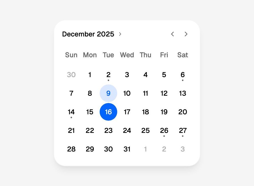
The calendar is controlled: the day drawn as picked is always value, so a
handler that does not store what it is given leaves the page as it was.
Pressing the picked day again does nothing, as in Flutter, which has no
deselect. A press on a neighbouring month's day (the greyed ones at the
edges) picks it and moves to its month.
Several days
multiple=True makes the value a list, and a press adds or removes that
day. The list is always ascending, each day once, whatever order the days
were pressed in, so it can be compared and stored as it is:
from workpeg.ui import App, CalendarDatePicker, State


class Rota(App):
    shifts = State(["2025-12-16"])

    def set_shifts(self, days):
        self.shifts = days          # ["2025-12-03", "2025-12-16"]

    def build(self):
        return CalendarDatePicker(value=self.shifts, on_change=self.set_shifts,
                                  multiple=True)
multiple must be a literal True or False: it decides the shape of the
value, so it cannot come from state.
Which days can be picked
Four rules, and a day must pass all of them:
| Keyword | Takes | Disables |
|---|---|---|
first_date, last_date |
a date (default "1900-01-01", "2100-12-31") |
every day before the first or after the last; both are inclusive. One given alone on the far side of the other's default leaves that side open: last_date="1899-12-31" alone reaches back to 0001-01-01, first_date="2150-01-01" alone on to 9999-12-31 |
disabled_weekdays |
a list of ISO weekdays, each once | those weekdays: [6, 7] is the weekend, [dates.SUNDAY] every Sunday |
disabled_dates |
a list of dates, at most 5,000 | those days: a holiday list from state, say |
selectable_day_predicate |
lambda d: …, a method, or a callable prop |
every day it answers falsy for. It is called with each day drawn, as an ISO date |
from workpeg.ui import App, CalendarDatePicker, State, dates


class Clinic(App):
    day = State(None)
    holidays = State(["2025-12-25", "2025-12-26"])
    open_wednesdays = State(["2025-12-10"])

    def set_day(self, value):
        self.day = value

    def is_open(self, d):
        return dates.weekday(d) != dates.WEDNESDAY or d in self.open_wednesdays

    def build(self):
        return CalendarDatePicker(
            value=self.day, on_change=self.set_day,
            first_date="2025-12-01", last_date="2026-03-31",
            disabled_weekdays=[dates.SATURDAY, dates.SUNDAY],
            disabled_dates=self.holidays,
            selectable_day_predicate=self.is_open)
A disabled day is drawn greyed, and pressing it does nothing. It can still be focused from the keyboard, so a screen reader can say it is unavailable rather than skipping it. A predicate that raises disables the day it was asked about and writes one console warning. A value outside the bounds is still drawn as picked; the bounds limit what can be pressed, they never rewrite the value.
Markers
A dot under a day marks something on it. markers is a list of days with
one dot each, or a dict of day to a count; event_loader is a function
from a day to a list, whose length is the count. Use one or the other, not
both: the compiler refuses the two in one call, and where they can only
meet in the page (a panel handing on a
page's markers and event_loader), the loader's counts are drawn and
the console says the markers were not. Dots are capped at
markers_max_count, 1 to 4 (the design draws one):
from workpeg.ui import App, CalendarDatePicker, State


class Agenda(App):
    events = State({"2025-12-02": 1, "2025-12-16": 3})

    def build(self):
        return CalendarDatePicker(markers=self.events, markers_max_count=3,
                                  current_date="2025-12-09")
A day with dots says ", has events" after its date to a screen reader. At
most 5,000 days are read from markers, and only real ISO dates count as
keys.
The month shown
The first month shown is the value's (the first day's, with multiple),
or else today's, held inside the bounds. After that it is the calendar's
own: the arrows move it a month at a time without re-rendering the page,
and it stays where it was through the re-renders other state changes
cause. When value changes to a day in a month that is not shown (a
"next Friday" button, say), the calendar moves to it. A button that
writes the value the page already holds changes nothing, so the month
stays where it was paged to: a "Today" that must always bring today's
month back sets displayed_month too, as below.
on_displayed_month_changed receives the new month as "YYYY-MM"
whenever the person moves it: the arrows, a key that takes focus past the
month's edge (Keyboard), or a press on a
neighbouring month's day, which calls it before
on_change and re-renders the page once for both. To control the month
instead, pass displayed_month: the calendar then shows exactly that
month, and its arrows only call on_displayed_month_changed, for the page
to store. A button that sets it brings the month back however often it
is pressed, which writing the value the calendar already holds does not:
from workpeg.ui import App, Button, CalendarDatePicker, Column, State, Text, dates


class Planner(App):
    month = State("2025-12")

    def set_month(self, value):
        self.month = value          # "2026-01" after Next

    def this_month(self):
        self.month = dates.today()[:7]

    def build(self):
        return Column(
            CalendarDatePicker(displayed_month=self.month,
                               on_displayed_month_changed=self.set_month),
            Button("Today", on_click=self.this_month),
            Text(self.month),
        )
The previous arrow stops at first_date's month and the next at
last_date's.
The month is kept per calendar, which the page tells apart by where each is
written and, when one spot draws several (a loop, a component used twice),
by their order there. Give each a key= when that order changes between
renders, so a month cannot move from one to the next. In a lazy
ListView.builder, each item's calendars keep their months as the list
scrolls without one.
Today, the week and the language
Today is current_date if given (a demo or a test pins it), else today in
time_zone, else in the viewer's zone, and it moves at midnight in that
zone without a reload. Month and weekday names, the day numbers' digits and
the first day of the week all follow locale (default: the page's
language, as for Formatting); starting_day_of_week sets the
first day outright, 1 (Monday) to 7 (Sunday) or dates.MONDAY …
dates.SUNDAY. dates.week_start(locale) is the day a calendar given that
locale starts on, for a week of your own worked out beside it. The grid
is always Gregorian.
Header, surface and outside days
| Keyword | Values | Draws |
|---|---|---|
header |
"default", "compact", "none" |
The title on the left and the arrows on the right; the title between the arrows; no header |
surface |
"card", "flat" |
The design's card; no card, for a calendar inside something that draws its own |
outside_days_visible |
None, True, False |
None and True show the neighbouring months' days greyed; False leaves their cells blank |
six_week_months_enforced |
False, True |
Always six weeks, so the card never changes height between months |
label |
text | The calendar's name to a screen reader |
disabled |
False, True |
Every day disabled, and both arrows; the keys cannot change the month either |
day_style styles every day and the calendar's own style= takes the
--calendar-* tokens, as below; Customising days has
both in full, and day_builder, for what a day draws.
from workpeg.ui import App, CalendarDatePicker


class Tinted(App):
    def build(self):
        return CalendarDatePicker(
            header="compact", outside_days_visible=False,
            style={"--calendar-day-bg-selected": "#16a34a"},
            day_style={":current": {"font-weight": "700"}})
Several months
months=2 or months=3 draws that many months side by side, as the
design's range does: each flat under a static title, with one Previous
before them and one Next after, which move every month by one. The
months are one Tab stop, and a press in any of them keeps them where they
are. There is no year view and no compact header then (the compiler
refuses header="compact" and initial_calendar_mode="year" beside a
literal months over 1), and a neighbouring month's day is left blank
unless outside_days_visible=True, since it is the same date as a day of
the month beside it; shown, it cannot be pressed.
from workpeg.ui import App, CalendarDatePicker, State


class Season(App):
    days = State([])

    def set_days(self, value):
        self.days = value

    def build(self):
        return CalendarDatePicker(value=self.days, on_change=self.set_days,
                                  multiple=True, months=3,
                                  current_date="2025-12-09")
displayed_month and on_displayed_month_changed name the first month
shown. The first months are the value's, but never so late that they run
past last_date's month for nothing: with last_date="2026-03-31" and
today in March, three months show January to March. There is no month
after December 9999, so months that would run past it are left out: a
value in December 9999 shows that month alone. When the space a range is
given is too narrow for all of them, the months that do not fit are
hidden, the last first: on a phone only the first shows, the arrows still
move a month at a time, and a key that moves past the month in view moves
to the next. That holds inside a Field, a Form, a Container or a
Column that sizes to its content as much as directly in a stretched
Column: the range asks for all its months and takes whatever room is
left. The widths it hides at are the months' own at the default
--calendar-day-size (568 and 868 pixels for two and three), so with
larger days a range can overflow a little before a month hides; and with
less room than one month and its arrows (348 pixels at the default size),
the month is wider than its box and is drawn past it on both sides.
In a form
Inside a Field the calendar
is the field's value: the date (or "" with nothing picked, so required
refuses it), and with multiple, the list, which validators read joined
with commas and on_submit receives as the list. A calendar submits
nothing itself (Enter on a day picks it), so the form needs its submit
button.
from workpeg.ui import (App, Button, CalendarDatePicker, Field, Form, State,
                        Text, required)


class Request(App):
    day = State(None)
    sent = State("")

    def set_day(self, value):
        self.day = value

    def send(self, values):
        self.sent = values["day"]

    def build(self):
        return Form(
            Field("day", CalendarDatePicker(value=self.day,
                                            on_change=self.set_day),
                  label="Day", validators=[required]),
            Button("Send", kind="submit"),
            Text(self.sent),
            on_submit=self.send)
Every keyword
| Keyword | Type | Default |
|---|---|---|
value |
date or None; a list with multiple, at most 5,000 days |
None |
on_change |
a method, a lambda or a callable prop | |
multiple |
literal bool |
False |
first_date, last_date |
date | "1900-01-01", "2100-12-31" (see Which days can be picked) |
current_date |
date | today in time_zone |
displayed_month |
month | the calendar's own |
on_displayed_month_changed |
a method, a lambda or a callable prop | |
initial_calendar_mode |
"day", "year" |
"day" (see Year view) |
header |
"default", "compact", "none" |
"default" |
months |
1, 2 or 3 | 1 (see Several months) |
surface |
"card", "flat" |
"card" |
outside_days_visible |
bool or None |
None (shown) |
six_week_months_enforced |
bool |
False |
starting_day_of_week |
1 to 7 or None |
the locale's |
selectable_day_predicate |
lambda d: …, a method or a callable prop |
|
disabled_dates |
a list of dates | |
disabled_weekdays |
a list of 1 to 7, each once | |
markers |
a list of dates, or a dict of date to a count | |
event_loader |
lambda d: [...], a method or a callable prop |
|
markers_max_count |
1 to 4 | 1 |
day_builder |
lambda day: <widget>, or a widget helper of one parameter (see Customising days) |
the day's number |
day_style |
a style= dict |
|
year_style |
a style= dict, for every year of the year view |
|
locale |
a BCP 47 tag | the page's language |
time_zone |
an IANA zone | the viewer's |
label |
text | |
disabled |
bool |
False |
style, key, visible |
as on every widget |
Every keyword but multiple may come from state or a prop, which is what
lets a component pass its own through. A literal is checked when the page
is compiled (see What the compiler refuses);
a value from state is checked on every render, and one that is not valid
is the keyword's default, with one console warning naming the calendar and
the keyword.
Year view and YearPicker
A calendar's title is a button. Pressed, it swaps the days for every year
the bounds allow, three to a row in a box that scrolls, with the year shown
picked out and centred. Pressing a year goes back to the days, on the same
month of that year: from 29 February 2024, picking 2025 shows February
2025 with focus on the 28th, since 2025 has no 29th, and a month outside
the bounds is held at them. Pressing the title again, or Escape (from a
year or from the title), goes back without moving. None of it changes
value or re-renders the page; a year
picked moves the month as the arrows do, so on_displayed_month_changed
hears it, and with displayed_month the page decides.
from workpeg.ui import App, CalendarDatePicker, Column, State, Text


class Birthday(App):
    day = State("1990-06-15")

    def set_day(self, value):
        self.day = value

    def build(self):
        return Column(
            CalendarDatePicker(value=self.day, on_change=self.set_day,
                               first_date="1920-01-01",
                               initial_calendar_mode="year",
                               label="Date of birth"),
            Text(self.day),
        )
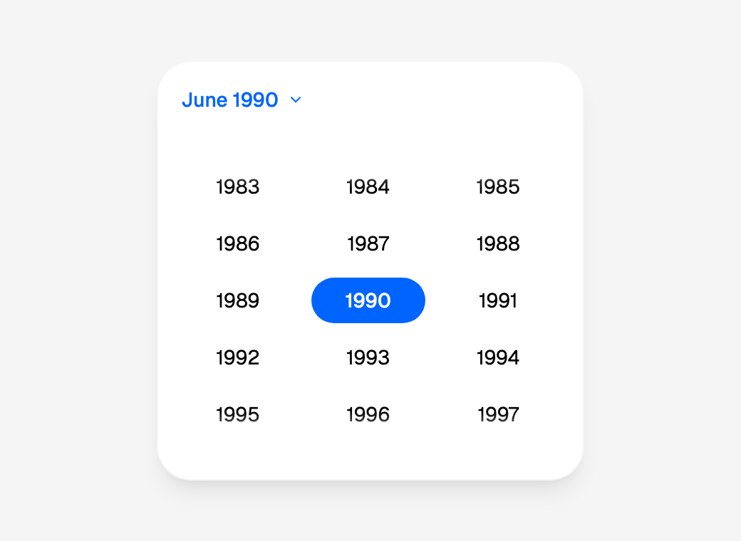
This one opens on its years, which suits a date far from today: pressing
1985 shows June 1985, with focus on the 15th, and pressing a day there
picks it. initial_calendar_mode="year" decides the first view only;
after that the view is the person's, and a later render does not reopen
it. The compact header and header="none" have no title to press; with
them initial_calendar_mode="year" still opens on the years, and a year
picked, or Escape, goes back to the days.
YearPicker is the grid of years on its own, Flutter's YearPicker.
value is a year, a whole number, or None, and on_change receives the
year pressed:
import json

from workpeg.ui import App, Column, State, Text, YearPicker


class Vintage(App):
    year = State(None)

    def set_year(self, value):
        self.year = value

    def build(self):
        return Column(
            YearPicker(value=self.year, on_change=self.set_year,
                       first_date="1950-01-01", last_date="2025-12-31",
                       label="Vintage"),
            Text(json.dumps(self.year)),    # null, then 2019
        )
Pressing the picked year again does nothing, as pressing a calendar's
picked day does not. Inside a Field
the picker is the field's value: validators read "2019", on_submit
receives 2019, and required refuses a picker with no year.
| Keyword | Type | Default |
|---|---|---|
value |
a year from 1 to 9999, or None |
None |
on_change |
a method, a lambda or a callable prop | |
first_date, last_date |
date | "1900-01-01", "2100-12-31": every year from the first's to the last's |
current_date |
date | today; its year is marked as the current one for a screen reader |
surface |
"card", "flat" |
"card" |
year_style |
a style= dict |
|
locale |
a BCP 47 tag | the page's language |
label |
text | the picker's name to a screen reader; the grid of years inside it is always "Choose year" |
disabled |
bool |
False |
style, key, visible |
as on every widget |
In a calendar and alone, at most 300 years are built at a time, around the
year focused: first_date="0001-01-01" with last_date="9999-12-31" is
300 buttons, not 9,999. The 300 go wherever the person goes: a key past
them builds the 300 around the year it reaches
(Keyboard), and scrolling near either end
moves them 150 years on, the years in view staying where they are, so a
mouse or a finger reaches every year in the bounds too. A year the page
sets from outside the grid is focused and brought into view. A year's
label follows locale, digits and all (٢٠٢٥ in ar-EG, 2025年 in
ja), always Gregorian.
year_style styles every year as day_style styles every day, with the
same state keys: ":hover", ":selected" for the year picked,
":current" for this year, which the design leaves unmarked, and
":disabled". The year view's sizes are calendar
tokens.
Ranges: CalendarDateRangePicker
Two days and every day between them: Flutter's CalendarDateRangePicker,
drawn as the design's range. value is {"start": …, "end": …} or
None, and on_change receives the new range:
import json

from workpeg.ui import App, CalendarDateRangePicker, Column, State, Text


class Trip(App):
    stay = State(None)

    def set_stay(self, value):
        self.stay = value

    def build(self):
        return Column(
            CalendarDateRangePicker(value=self.stay, on_change=self.set_stay,
                                    months=2, current_date="2025-12-09",
                                    label="Your stay"),
            Text(json.dumps(self.stay)),
        )
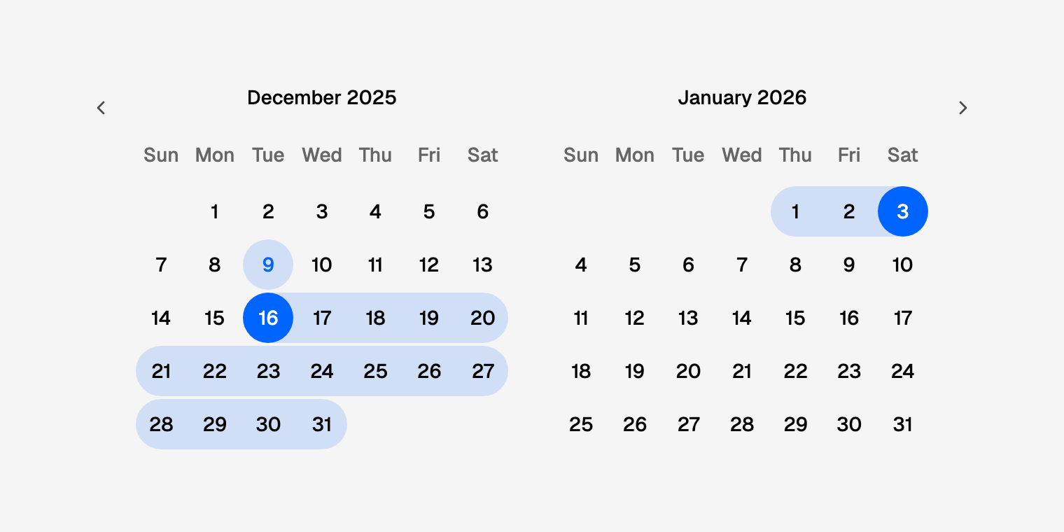
A press does what material's range picker and the design do:
| The range so far | A press on day d |
on_change receives |
|---|---|---|
None, or a complete range |
starts a new range at d |
{"start": d, "end": None} |
open, and d is on or after its start |
ends it at d |
{"start": start, "end": d} |
open, and d is before its start |
starts again at d |
{"start": d, "end": None} |
any, with range_length=n |
picks the whole span | {"start": d, "end": dates.add_days(d, n - 1)} |
So in the example above, pressing December 16 hands over
{"start": "2025-12-16", "end": None}, and then January 3
{"start": "2025-12-16", "end": "2026-01-03"}. Pressing the open range's
own start ends it there, a one-day range. The open end is always there, as
None: test it with not stay["end"] (or stay["end"] is None), and
compare two ranges key by key, since two dicts in a page are equal only
when they are the same dict. A day that cannot be picked may still sit
inside a range, as in Flutter; only the two days pressed must be ones that
can be.
The band. Every day of the range is selected, as a screen reader hears
it, but only its two ends are filled; the days between lie on a band, the
brand blue's lighter tint, that runs across rows and months and is rounded
where it stops, concentric with the day's circle. While a range is open,
the day under the pointer, or the one keyboard focus is on, previews where
it would end, in a lighter tint still; with range_length the preview is
the whole span from the day hovered. Neither the band nor the preview ever
re-renders the page. --calendar-range-bg and
--calendar-range-preview-bg retint them
(Calendar tokens).
A span of fixed length. range_length=7 makes every press the day and
the six after it, and a day whose seven would pass last_date cannot be
picked:
from workpeg.ui import App, CalendarDateRangePicker, State


class Week(App):
    week = State(None)

    def set_week(self, value):
        self.week = value   # {"start": "2025-12-15", "end": "2025-12-21"}

    def build(self):
        return CalendarDateRangePicker(value=self.week, on_change=self.set_week,
                                       range_length=7, last_date="2026-06-30",
                                       current_date="2025-12-09")
Pressing the span already picked again changes nothing.
A predicate that knows the range. selectable_day_predicate may take
three arguments, the day and the range so far (each None when absent),
Flutter's SelectableDayForRangePredicate. This one keeps a booking to
three nights once its start is picked:
from workpeg.ui import App, CalendarDateRangePicker, State, dates


class ShortStay(App):
    stay = State(None)

    def set_stay(self, value):
        self.stay = value

    def short(self, d, start, end):
        return (start is None or end is not None or d < start
                or dates.days_between(start, d) <= 3)

    def build(self):
        return CalendarDateRangePicker(value=self.stay, on_change=self.set_stay,
                                       selectable_day_predicate=self.short,
                                       current_date="2025-12-09")
A lambda or a method takes one argument or three (lambda d, start,
end: …, def short(self, d, start, end)); anything else is refused at
compile time, as Python could not call it. A callable prop is called with
all three and may ignore the last two.
In a form, the picker is the field's value: on_submit receives the
dict, and the validators read the range as "2025-12-16/2025-12-24", or
"" while only the start is picked, so required refuses a range that is
not finished:
from workpeg.ui import (App, Button, CalendarDateRangePicker, Field, Form,
                        State, Text, required)


class Booking(App):
    stay = State(None)
    sent = State("")

    def set_stay(self, value):
        self.stay = value

    def send(self, values):
        self.sent = values["stay"]["end"]

    def build(self):
        return Form(
            Field("stay", CalendarDateRangePicker(value=self.stay,
                                                  on_change=self.set_stay),
                  label="Dates", validators=[required]),
            Button("Send", kind="submit"),
            Text(self.sent),
            on_submit=self.send)
A press says what it made, through the calendar's live region: "Start December 16, 2025. Choose an end date.", then "Selected December 16, 2025 to December 24, 2025". A page that does not store the range hears nothing said.
CalendarDateRangePicker takes every keyword of
CalendarDatePicker but multiple, with these
differences:
| Keyword | Type | Default |
|---|---|---|
value |
{"start": date or None, "end": date or None}, or None |
None |
range_length |
1 to 366, or None |
None: two presses make a range |
selectable_day_predicate |
lambda d: … or lambda d, start, end: …, a method or a callable prop |
|
months |
1, 2 or 3 | 1; see Several months |
A literal value is checked when the page is compiled: exactly the keys
start and end, each a real date or None, the start on or before the
end, and no end without a start. A value from state that is not one is no
range, with one console warning.
Customising days
What a day draws is day_builder; how every day looks is day_style and
the --calendar-* tokens. Both work on CalendarDatePicker and
CalendarDateRangePicker alike.
day_builder
day_builder=lambda day: <widget> draws each day's content in place of
its number. The calendar calls it for every day it draws, with a fresh
dict of that day, and puts what it returns inside the day:
from workpeg.ui import App, CalendarDatePicker, Column, State, Text


class Meetings(App):
    day = State(None)
    events = State({"2025-12-02": ["Standup"],
                    "2025-12-16": ["Planning", "Review", "1:1"]})

    def set_day(self, value):
        self.day = value

    def events_on(self, d):
        return self.events[d] if d in self.events else []

    def day_cell(self, day):
        return Column(
            Text(day["label"]),
            Text(f"{len(day['events'])} ev" if day["events"] else "",
                 style={"font-size": "10px", "line-height": "12px"}),
            gap=0, align="center")

    def build(self):
        return CalendarDatePicker(
            value=self.day, on_change=self.set_day,
            event_loader=self.events_on, day_builder=self.day_cell,
            current_date="2025-12-09",
            style={"--calendar-day-size": "44px",
                   "--calendar-dot-offset": "1px"})
The 16th shows "16" over "3 ev", the 2nd "2" over "1 ev", and every other
day its number. A widget helper of one parameter can be named on its own,
as here: day_builder=self.day_cell is day_builder=lambda day:
self.day_cell(day).
The dict holds:
| Key | Type | Holds |
|---|---|---|
date |
date | The day, "2025-12-16" |
label |
text | What the day shows without a builder: its number in the locale's digits, "16" ("١٦" in ar-EG) |
day |
int | The day of the month, 16, whatever the digits |
weekday |
int | 1 (Monday) to 7 (Sunday), as dates.weekday |
outside |
bool | A neighbouring month's day |
today |
bool | The day is current_date (today, by default) |
selected |
bool | The day is drawn as picked: the value, a day of the list with multiple, or either end of a range |
in_range |
bool | In a range, every day from its start to its end; an open range's start alone |
range_start, range_end |
bool | A range's two ends; a one-day range is both |
disabled |
bool | The day cannot be pressed: a rule rules it out, the calendar is disabled, or beside other months it is a neighbouring month's day |
events |
list | event_loader's list for the day, as it returned it; [] without one |
markers |
int | The day's count: from markers (1 for a list), or how many events it has. The dots stop at markers_max_count; this does not |
The day is still the button. It is what Tab reaches, what a press or Enter
picks and what a screen reader hears, by the same name as without a
builder ("Tuesday, December 16, 2025, has events"); the dots and a range's
band are drawn as before. What the builder draws takes the day's colour,
so text on the day picked turns white with it, but for a Text with
variant="caption" or "muted", or a tone: that keeps its own colour,
which is hard to read on the blue, so make small text small with
style={"font-size": …}, as above. The content is centred in the day,
a --calendar-day-size square: 36 pixels unless raised, so content of two
lines needs more, as above (44, with the dots lowered to clear them).
The builder runs whenever the calendar draws its days: on every render of the page and every month the arrows move to. Keep it to reading the dict and the page's state. If it raises, that day shows its number and the console says so once, naming the calendar but never the value.
What a day can hold
A day is a button, so what it holds is static: a control inside it would be a button inside a button, which HTML does not allow, and a second Tab stop in a grid that has one. The compiler holds a builder to this list, the widget helpers it calls included, and refuses everything else by the name it was written with:
| Widgets | In a day |
|---|---|
Text, Icon, Dot, Tag, FilledTag, OutlineTag, Image, Row, Column, Stack, Positioned, Container, SizedBox, Spacer, Center, Padding |
Allowed |
Align, AspectRatio, Authenticated, Badge, ConstrainedBox, Divider, Expanded, FittedBox, Flexible, FractionallySizedBox, GravatarImage, GridView, IntrinsicHeight, IntrinsicWidth, LimitedBox, Locale, Logo, Offstage, Progress, Spinner, Transform, Wrap |
Refused: nothing to press, but no place in a day |
Accordion, AccordionItem, Adornment, Audio, Button, ButtonGroup, CalendarCard, CalendarDatePicker, CalendarDateRangePicker, CameraView, Canvas, CardInput, ChatInput, Checkbox, Chip, Code, DateInput, DateSegments, DateTimeInput, Demarcation, Dismissible, Draggable, Drawer, DropTarget, Dropdown, EditableText, ElevatedAccordion, ExclusiveAccordion, FileUpload, FileView, Form, FutureBuilder, GestureDetector, HtmlView, Input, Link, LinkInput, ListTile, ListView, Markdown, MarkdownEditor, Menu, Modal, MoneyInput, Outlet, PhoneInput, Pill, PlainAccordion, RadioGroup, Resizable, ScaffoldSlots, ScreenShare, Select, Slider, Step, StreamBuilder, Switch, Table, TableCell, Tabs, TextArea, TextInput, TimeInput, TimePicker, ToggleButton, ToggleGroup, Tooltip, Video, Wizard, YearPicker, and any widget added to the SDK later until it is put in the first row |
Refused: a control |
A Tag with on_dismiss |
Refused: its close button is a control |
An allowed widget with on_mouse_enter, on_mouse_leave, on_double_click, on_focus, on_blur or on_key |
Refused: the calendar draws a day's content again on every press, so a handler there would miss its events or, under a resting pointer, repeat them. Put the behaviour on the calendar's on_change. A title= tooltip is fine |
A Component, a widget a Component was given (self.child), or a list of widgets spread from elsewhere (*self.items) |
Refused: what they hold is not known where the day is. Write the widgets inline, and build a list in place: *[Text(e) for e in day["events"]] |
Should a control reach a day all the same, from a node the compiler never wrote, the calendar removes it before the day is drawn, with one console warning, and a day left with nothing shows its number.
A builder is written where its calendar is: a Component cannot take one as
a prop and pass it on, so a panel of your own with custom days is a
CalendarDatePicker with a
day_builder, composed in your page (see
Composing your own).
day_style and the tokens
day_style is a style= dict
applied to every day, its state keys included: ":hover", ":selected"
for the day picked (in a range, every day of it, as a screen reader hears
it), ":current" for today, ":disabled" for a day that cannot be picked,
and ":focus-visible". Each state's rule is written once for the whole
calendar, however many days it has. year_style does the same for every
year of the year view.
from workpeg.ui import App, CalendarDatePicker, State


class Shifts(App):
    day = State("2025-12-16")

    def set_day(self, value):
        self.day = value

    def build(self):
        return CalendarDatePicker(
            value=self.day, on_change=self.set_day, current_date="2025-12-09",
            day_style={"font-variant-numeric": "tabular-nums",
                       ":current": {"font-weight": "700"},
                       ":disabled": {"text-decoration": "line-through"}},
            disabled_weekdays=[6, 7])
The calendar's own style= takes the --calendar-* tokens, which retint
or resize one calendar, or every calendar inside a Container that sets
them: the picked day's fill, today's, the band's, a day's size and the
dots'. The full list, each with its default, is Calendar
tokens.
TimePicker
TimePicker is the calendar's time wheel, the design's Time Picker: an
hour, a minute and, on a 12-hour clock, AM/PM, each a column that scrolls
past a fixed ring, the cell under the ring the one picked. It takes
Cupertino's names, and hands its on_change a time in 24 hours once the
wheel comes to rest:
import json

from workpeg.ui import App, Column, State, Text, TimePicker


class Alarm(App):
    at = State("07:30")

    def set_at(self, value):
        self.at = value

    def build(self):
        return Column(
            TimePicker(value=self.at, on_change=self.set_at, locale="en-US",
                       label="Wake up at"),
            Text(json.dumps(self.at)),      # "07:30", then "19:30" for PM
        )
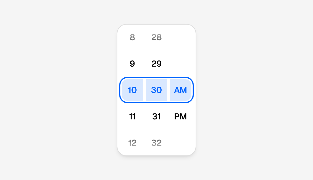
A scroll, a flick, a press on a cell or a key moves the wheel; pressing
PM here shows 7:30 PM, and the page hears "19:30". Until the wheel comes
to rest nothing is said: a flick through forty minutes is one on_change
and one render, not forty, and the scroll is never cut short by a render
of its own. The wheel is at rest when the browser says its scroll has
ended, or, in a browser that does not say (Safari), 120 ms after the last
scroll event; never while a finger is still on it. A press on the cell
already under the ring, Enter or Space is the choice at once. The render
that follows draws each column exactly where it was, so nothing moves on
screen, and focus stays on the column it was in, whether a key or a
scroll moved it. A wheel in part of the page not shown yet, such as a
Tabs panel, is laid out when it is shown.
value is "HH:MM", or "HH:MM:SS" with seconds=True, always in 24
hours whatever the wheel shows. With value=None no cell is picked and
the wheel rests on first_time, or midnight; the first move picks the
cell under the ring in every column. Inside a
Field the wheel is the
field's value: validators read the time, or "" with none, so required
refuses an empty wheel, and on_submit receives the string.
12 or 24 hours, and the locale
use_24h_format=None, the default, follows the locale: en-US counts
1 to 12 with AM and PM, en-GB and de 00 to 23. True or False
decides it. The 12 hours run 1 to 12, as the design draws them, and hour
00 is 12 AM, hour 12 is 12 PM. The columns come in the order the locale
writes a time, so ko and ja put AM/PM first, and AM and PM are the
locale's own words (am and pm in en-GB, 오전 and 오후 in ko). A
word wider than the design's column widens its own column rather than
being cut: sq counts 12 hours, in "e paradites" and "e pasdites". The
numbers are written in Latin digits, the minutes and seconds with two.
Steps, bounds and seconds
import json

from workpeg.ui import App, Column, State, Text, TimePicker


class Shift(App):
    starts = State("09:00")

    def set_starts(self, value):
        self.starts = value

    def build(self):
        return Column(
            TimePicker(value=self.starts, on_change=self.set_starts,
                       minute_interval=15, first_time="08:30",
                       last_time="17:45", use_24h_format=True,
                       label="Shift starts"),
            Text(json.dumps(self.starts)),
        )
minute_interval=15 gives the minutes 00, 15, 30 and 45; it is any whole
number that divides an hour (1, 2, 3, 4, 5, 6, 10, 12, 15, 20 or 30). A
value between the steps, "10:07" at 5, is shown as it is, on a cell of
its own, and the next move of the minutes lands back on a step: the
wheel never rewrites a value nobody touched.
first_time and last_time bound the day, both included. A cell
outside them is disabled, by what is picked in the columns it depends
on: here 07 and before are out, and 18 and after, and at hour 08 so is
every minute before :30, while at 09 every minute is in; on a 12-hour
clock AM or PM can be out, and the hours follow it. The keys skip a disabled cell, and a wheel
left on one (a flick past the bound) comes to rest on the nearest time
inside, on a step: flicked to 07 this one settles on 08:30, and past
17:45 on 17:45. It moves back there itself, so it does so even when that
time is the value already and on_change has nothing to say. A value
outside the bounds is drawn as it is.
seconds=True adds a column of seconds, and the value is "HH:MM:SS".
A value with seconds on a wheel without them is shown, and kept until
the wheel moves, which hands back "HH:MM".
| Keyword | Type | Default |
|---|---|---|
value |
a time, "HH:MM" or "HH:MM:SS" in 24 hours, or None |
None |
on_change |
a method, a lambda or a callable prop | |
seconds |
bool |
False |
use_24h_format |
bool or None |
None: the locale's |
minute_interval |
1, 2, 3, 4, 5, 6, 10, 12, 15, 20 or 30 |
1 |
first_time, last_time |
time | the whole day |
locale |
a BCP 47 tag | the page's language |
label |
text | the wheel's name to a screen reader; "Time" without one |
disabled |
bool |
False: with True nothing is picked, by a key, a scroll or a press |
style, key, visible |
as on every widget |
The card is the design's, 132px wide for three columns and 40px more or
less for each column more or fewer (and wider where the AM/PM word is),
and 220px high, never squeezed by a column of content taller than the
page. Its sizes are
--time-picker-* tokens, set on its
style=; a token that resizes the cells keeps them centred, since the
distance between two cells is read from the page as it is drawn. The
picked row's tint follows --calendar-range-bg, and its text and the
ring around it --calendar-day-bg-selected, so a calendar and its wheel
retint together.
Date and time fields
DateInput, TimeInput and DateTimeInput are the design's Date & Time
field (inputs.html): a date or a time typed a part at a time, month, day
and year, hour, minute and AM/PM, each part its own little box, the way a
native date field has them. They are field recipes,
the same box, label, hint and message as every other field, with the
parts fused in:
import json

from workpeg.ui import App, Column, DateInput, State, Text


class Booking(App):
    due = State(None)

    def set_due(self, value):
        self.due = value

    def build(self):
        return Column(
            DateInput(value=self.due, on_change=self.set_due, locale="en-US",
                      label="Due", hint="The day it is due"),
            Text(json.dumps(self.due)),     # null, then "2025-12-16"
        )
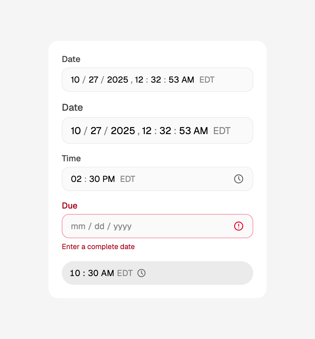
Click the month and type 12162025: focus moves to the day after the
12, to the year after the 16, and the page hears "2025-12-16" once,
when the fourth digit of the year is in, with one render. Nothing typed is
the page's until it is a whole value: on_change gets an ISO string as
soon as every part is filled and it names a real date inside the field's
bounds, and None once if the field had a value and stops naming one (a
part cleared). A part that is always written in full waits until it is:
typing 2026 over the year is one on_change, not one for each digit,
and a minute's or a second's two digits are one too. A month, a day or an
hour, often written with one digit, is handed on at each one: 1 then
1 over December's month is January, then November. What is typed in
between is the field's own, kept through any render the page does
meanwhile (a page that keeps its value when it is handed None, as the
calendar panels do, keeps what is typed too), and the page renders once
for each value however many states its handler writes; a value the page
sets from outside replaces it. What nobody typed is never handed on:
focus passing through a field, Escape from its picker, or Enter on a
wheel nothing moved leave the page's value as it was, even one the parts
would write differently ("14:30:15" in a field without seconds, a day
outside its bounds).
TimeInput's value is "14:30" ("14:30:15" with seconds=True),
always in 24 hours whatever the field shows, and DateTimeInput's
"2025-12-16T14:30", wall-clock time with no offset, as a native
datetime-local holds it. show_zone=True adds the zone's short name
after the time, for the value's own date, named in the field's locale:
EST in December and EDT in July for time_zone="America/New_York" in
en-US (a time field's, and an empty field's, is now's; a zone without
an abbreviation shows its offset, GMT+1).
Typing
The parts come in the order the locale writes a date: en-US
month/day/year, en-GB day/month/year, ja-JP and ko year/month/day,
with the locale's own separators, and the hours on its 12- or 24-hour
clock (use_24h_format=None follows it). A part holds digits only, and
moves on by itself once no further digit could fit, as react-aria's
fields do:
- Month:
0or1waits for a second digit;2to9is the month. A second digit that would pass 12 starts the month again from it, so1,3is March. - Day:
0to3waits;4to9is the day. The most is the month's length once the month is typed (February's 29 until the year is), so3in a February moves straight on. - Year: four digits, so
0025is 25 AD. - Hour: on a 12-hour clock
0or1waits; on a 24-hour clock0to2. Minute and second:0to5waits. - AM/PM:
aorpin every locale, or the first letter of the locale's own word for one of them when the other's does not start with it too (下for zh's 下午; ja's 午前 and 午後 share theirs). It shows AM until it is set, and an hour typed with it untouched is in the morning. - Separators:
/,.,-,:,,or a space ends the digits waiting in a part and moves on, so1/5/2026is January 5 and1:05is five past one; after a part that moved on by itself (12/16/2025) it is nothing.
Digits typed into a part are shown as typed until focus moves on, then in
full (1 becomes 01). Leaving the field with a part still waiting (a
year's 202, a minute's 4) finishes it (0202, :04) and hands on
what it makes: Tab does so before focus moves, and a press elsewhere once
the click it makes has landed, so neither loses the focus or the click.
An input method's full-width digits (0–9, a CJK input method's
default) and an Arabic or Persian keypad's (٠–٩, ۰–۹) are typed as
the digits they stand for; a value the page gives, and a paste, take
ASCII digits only. A date that does not exist (02/29/2025) is not
handed on; the field is incomplete until it is fixed. A paste of a whole
value of the field's kind (2025-12-16 into a date) fills every part, and
any other paste is ignored. What a phone's keyboard or an input method
sends instead of keys is typed the same way (several characters at once,
a keyboard's suggestion, go on through the parts and are one change), and
nothing the browser would
write itself reaches a part, so it holds only digits. Each part is
inputmode="numeric", so a phone shows its number pad. The keys are in
the keyboard table.
In a form, and what it says when it is wrong
Inside a Field the field is
the field's value: validators read the date, the time or the datetime, or
"" while there is none, so required refuses an empty one, and
on_submit receives the string. min_date and the other rules read it as
they read any date.
import json

from workpeg.ui import (App, Column, DateTimeInput, Field, Form, State,
                        Text, required)


class Appointment(App):
    sent = State("")

    def submit(self, values):
        self.sent = json.dumps(values)

    def build(self):
        return Column(
            Form(
                Field("when", DateTimeInput(locale="en-US", label="When",
                                            first_date="2025-01-01",
                                            minute_interval=15),
                      validators=[required]),
                on_submit=self.submit,
            ),
            Text(self.sent),        # {"when": "2025-12-16T09:30"}
        )
A field left half typed is not empty, and not a value either. Once the
person leaves it, it says error_format_text ("Enter a complete date",
or "Enter a complete time" for a TimeInput) in its message row, where
the hint was, its box turns red, and it is marked invalid to a screen
reader; a whole date its bounds or day rules refuse says
error_invalid_text ("Choose a date in range"). Each goes as soon as the
field holds a value it accepts. A Form will not submit while a field
says either, and puts focus on its first part. A message= the page gives
the field wins over both. Both default words are
Translations tokens: calendar.invalid_date,
calendar.invalid_time, calendar.out_of_range and
calendar.time_out_of_range.
The rules are a calendar's and a wheel's: first_date, last_date
(1900-01-01 to 2100-12-31 by default), disabled_weekdays,
disabled_dates and selectable_day_predicate for a date, and
first_time and last_time for a time of day, both included; a
datetime's time is held to them on every day. The calendar a part opens
(below) reads the same rules, with current_date for its today and
starting_day_of_week for its weeks.
Picking from a calendar or a wheel
A press on the month or the day opens the field's calendar beneath it,
and a press on the year opens it on its years; a time field's clock,
after its parts, opens its wheel. Alt+↓ on any part opens the one that
part stands for (the calendar from a date part, the wheel from a time
part). A DateTimeInput has no clock, as the design draws it: a press on
its time opens the wheel instead, focus left on the part as a press on
its date leaves it, which is the one way a mouse or a phone with no
keyboard has to it. A TimeInput's parts open nothing: its clock does.
The calendar is the month view
with its compact header, always six weeks so it never changes height,
and it keeps every rule of the field: first_date and last_date, the
weekdays, dates and predicate it rules out, current_date for today,
starting_day_of_week and locale for its weeks, and its zone. The
wheel is the TimePicker, on the field's clock, step,
seconds and bounds.
import json

from workpeg.ui import App, Column, DateInput, State, Text, TimeInput


class Visit(App):
    day = State("2025-12-16")
    at = State("10:30")

    def set_day(self, value):
        self.day = value

    def set_at(self, value):
        self.at = value

    def build(self):
        return Column(
            DateInput(value=self.day, on_change=self.set_day, locale="en-US",
                      label="Day", disabled_weekdays=[6, 7]),
            TimeInput(value=self.at, on_change=self.set_at, locale="en-US",
                      label="At", minute_interval=15),
            Text(json.dumps([self.day, self.at])),  # ["2025-12-18", "10:45"]
        )
Press the month and the calendar opens on December 2025 with the 16th
picked; press the 18th and the field shows 12/18/2025, on_change gets
"2025-12-18" once, with one render, the calendar closes and focus is
back on the month. A press leaves focus on the part, so typing still
works, and the first key typed puts the calendar away (a key that types
nothing, Shift before a capital or Caps Lock, leaves it). Alt+↓ takes focus
into it instead, onto the day picked (or today): its keys are the
calendar's, Tab goes round its arrows and
its days without leaving it, and Escape closes it with nothing picked (from
its years, Escape goes back to its days first). Picking a year goes back to
its days on that year, still open. A date picked into a DateTimeInput
whose time is not typed yet fills the date and waits for the time.
The wheel is a draft. Press the clock and focus is on the hour; what the
wheel settles on is shown in the parts at once, but the page is told
nothing and nothing re-renders until you are done with it: Enter, Tab or
the clock again hands on_change the time once, "10:45" here after one
step down the minutes, and Escape puts the parts back as they were. A
press anywhere else keeps the draft too, a press on one of the field's
own parts included. The parts, and what a Form or the field's
on_submit reads from them, are the draft at once; on_change hears it
once that press has lifted and its click has landed, so a Save button
pressed straight from the wheel still runs (its handler sees the page's
state as it was before the press, as from a half-typed part, while a
Form that press submits sends the time the field shows). A press that
opens a picker, in this field or another, hands a draft or a half-typed
part on first and then opens, so the one render that costs never closes
what the press opened.
The popover hangs 8px below the field's box (the whole Input's, for a
recipe), or above it when the room below is too short and there is more
above, and follows the field when the window is resized or anything
scrolls. A calendar starts where the field does, at its left edge, or its
right edge on a right-to-left page, where the parts are; a time field's
wheel ends where its clock does, as the design opens it (right to left,
starts there). It sits above a Modal, so a field in a dialog
opens its picker over it (as a phone's sheet too), and one panel is open on a page at a time: a
second field's picker, or a Dropdown, closes the first. A background
render (a chart's tick) waits while it is open, and a render that rebuilds
the field closes it, focus going back to the part or the clock it opened
from. Opened from a field inside a card that dims, as the calendar
panels' card will, the wheel veils the card and opens above the field,
centred on it.
The popover sits on the page's <body>, outside the field and whatever
is around it, so it inherits none of the field's styles. The
calendar and wheel tokens are the exception:
the ones set on a Container around the field, or on its own style=,
are copied onto the popover as it opens, through the same checks a
style= value goes through, so a page that tints its calendars tints the
calendar its date fields open too. The copy is taken as it opens: a token
changed while it is open (a theme switched underneath it) shows the next
time it opens.
Inside a Field, focus
going into the popover is not leaving the field: the Field checks it once
the popover has closed with focus outside the field, so required says
nothing while a day is being picked, and a pick answers a complaint it
was already showing.
picker=False turns all of it off: the parts are typed only, a time has
no clock, and Alt+↓ is the browser's. DateInput always has its
calendar.
On a phone
Below 480px wide the same calendar or wheel opens as a bottom sheet instead: full width along the bottom of the screen over a dimmed scrim, the page beneath held still until it closes, and focus in the sheet, the way a phone's own date field opens its picker. Picking a day, Enter or Escape closes it as on a larger screen, and so does a tap on the scrim, which keeps a time's draft as a press elsewhere does and gives focus back to the part or the clock it opened from, as Escape does.
DateSegments, written out
The parts themselves are DateSegments, which the three recipes are
built from, with kind="date", "time" or "datetime" (a literal: it
decides what the value is). On its own it is the design's standalone
field, 40px high, its own box; written inside an
Input it fuses into the Input's
box, takes its label for its name, and says what is wrong in its message
row, which is how the recipes are made:
from workpeg.ui import App, Column, DateSegments, Icon, Input, State


class Trip(App):
    leaves = State("2025-12-16")
    at = State("09:30")

    def set_leaves(self, value):
        self.leaves = value

    def set_at(self, value):
        self.at = value

    def build(self):
        return Column(
            Input(Icon("calendar"),
                  DateSegments(value=self.leaves, on_change=self.set_leaves,
                               locale="en-GB"),
                  label="Leaves", hint="Day first, as en-GB writes it"),
            DateSegments(kind="time", appearance="pill", value=self.at,
                         on_change=self.set_at, show_zone=True,
                         time_zone="Europe/London", label="Departs"),
        )
An Input fuses one DateSegments, with icons beside it but no
TextInput, Dropdown or Select: one field, one value.
appearance="pill" is calendar.html's time read-out, the rounded pill a
time row draws beside its label. On its own a DateSegments marks itself
invalid when left half typed (a red box), and inside a Field its words
are the field's error; label names it for a screen reader.
kind="time" refuses a date's keywords and kind="date" a time's, by
name, rather than ignoring them.
| Keyword | Type | Default |
|---|---|---|
kind |
"date", "time" or "datetime", a literal |
"date" |
value |
an ISO date, time or datetime, by kind, or None |
None |
on_change |
a method, a lambda or a callable prop | |
appearance |
"field" or "pill" |
"field" |
picker |
bool |
True: a press on a date part (or a datetime's time part), Alt+↓ or the clock opens the calendar or the wheel |
seconds |
bool |
False |
use_24h_format |
bool or None |
None: the locale's |
minute_interval |
1, 2, 3, 4, 5, 6, 10, 12, 15, 20 or 30: what ↑ and ↓ step the minutes by |
1 |
show_zone |
bool |
False |
time_zone |
an IANA zone | the viewer's |
locale |
a BCP 47 tag | the page's language |
first_date, last_date |
date | 1900-01-01 and 2100-12-31 |
current_date |
date | today in time_zone |
selectable_day_predicate |
lambda d: bool, a method or a callable prop |
|
disabled_dates |
a list of dates | |
disabled_weekdays |
a list of ISO weekdays, 1 to 7 | |
starting_day_of_week |
1 to 7, or None for the locale's |
None |
first_time, last_time |
time | the whole day |
error_format_text, error_invalid_text |
text | "Enter a complete date" ("… time"), "Choose a date in range" ("… time …") |
label |
text | its name to a screen reader, standing alone |
disabled |
bool |
False |
style, key, visible |
as on every widget |
The recipes take the field's own keywords, label, hint, message,
status, size ("md" 40px or "lg" 44px) and disabled, with
value, on_change and on_submit (Enter in any part), and no
placeholder; DateInput adds the date's keywords above, TimeInput
the time's (seconds, use_24h_format, minute_interval, first_time,
last_time, show_zone, picker), both time_zone, locale and the
two error texts, and DateTimeInput all of them. The standalone field's
box is the --date-input-* tokens; the
recipes' is the Input's, so style={"--pg-field-bg":
"var(--color-surface-default)"} gives one the design's white "primary"
look and var(--color-surface-raised) its "secondary" one.
ButtonGroup and CalendarCard
A composed date picker, the design's picker panel, is a card holding a row
of quick dates above a flat month. Both are widgets of their own:
ButtonGroup is the row, Buttons fused into one bar, and CalendarCard
is the card, the calendar's own chrome around whatever it holds.
from workpeg.ui import (App, Button, ButtonGroup, CalendarCard,
                        CalendarDatePicker, Column, State, Text, dates)


class QuickDates(App):
    day = State("2025-12-16")

    def set_day(self, value):
        self.day = value

    def today(self):
        self.day = dates.today()

    def next_week(self):
        self.day = dates.add_days(dates.today(), 7)

    def next_monday(self):
        self.day = dates.next_weekday(dates.today(), dates.MONDAY)

    def build(self):
        return Column(
            CalendarCard(
                ButtonGroup(
                    Button("Today", on_click=self.today),
                    Button("Week", on_click=self.next_week),
                    Button("Monday", on_click=self.next_monday),
                    variant="tertiary-gray", rounded=True,
                    label="Quick dates",
                ),
                CalendarDatePicker(value=self.day, on_change=self.set_day,
                                   surface="flat"),
            ),
            Text(self.day),
        )
Each quick date is an ordinary Button with its own on_click, which
writes the day; the calendar moves to a day the page sets, so a press on
"Monday" moves the month to it. Pressed again once the month has been
paged away, it writes the day already held, which changes nothing, and
the month stays (The month shown); a page that wants
its button to bring the month back controls the month. The row spans the
card, its three buttons sharing the width, and the card hugs the 300px
month.
The design's whole panels are ready made in the
calendar library: DatePickerPanel
(this card with a time row, as one datetime), DateRangePickerPanel
(the range picker with its times, durations and summary) and
PresetDatePicker (a preset list beside the month).
ButtonGroup
A ButtonGroup's children are Buttons, each with its own label and its
own on_click, fused into one bar with a hairline between each pair and
only the two outer ends rounded. It is a row of actions, not a choice:
nothing in it stays pressed. For buttons that do, use a
ToggleGroup.
variant, size and rounded set on the group reach every button that
does not set its own, so Button("Week", variant="primary") in a grey
group stays primary, and Button("Week", rounded=False) keeps square
corners. A disabled group disables every button in it, whatever each says.
variant takes any family a Button takes, and one more that exists only
in a group: "tertiary-gray", the design's quick-range look, a grey pill
on the page's sunken surface, shaded under the pointer and ringed when
focused. A Button standing alone cannot name it; the page does not
compile. Inside a group, a button may name it itself. Whatever the family,
the bar reads as one control: behind a filled family (the default
"primary", "secondary-gray", an error=True button) the bar is the
buttons' own fill, so no stripe of the page shows beside a hairline, and an
outlined family's line runs unbroken past each one. A disabled group's bar
takes its buttons' disabled fill. A group of two families wears the later
one's, as the design does.
fill=True stretches the group across its container and splits it
evenly between the buttons; a group in a CalendarCard's column does this
on its own, as the design's quick-range row does. label names the group
for a screen reader. Each button is its own Tab stop, as the buttons of a
toolbar of actions are; there are no arrow keys to learn.
A button pressed from the keyboard keeps focus through the render its
press causes, found again by its group's label and its own name wherever
the render moved it. Where several buttons share both, as every row's
"Delete" does in rows of the same group, focus stays only when the press
moved nothing; a press that deletes or reorders a row leaves focus where
a plain Button's goes, rather than on the next row's "Delete", where a
second Enter would delete a row nobody chose. Give each row's group a
name of its own, label=f"Actions for {row['name']}", and focus follows
the button pressed when its row moves.
A Component can hand a group the buttons it was given, so a reusable row takes the page's own buttons and handlers:
from workpeg.ui import App, Button, ButtonGroup, Column, Component, State, Text


class QuickRow(Component):
    def __init__(self, *children, label="Quick dates"):
        self.children = children
        self.label = label

    def build(self):
        return ButtonGroup(*self.children, variant="tertiary-gray",
                           rounded=True, label=self.label)


class Page(App):
    picked = State("")

    def pick_today(self):
        self.picked = "today"

    def pick_tomorrow(self):
        self.picked = "tomorrow"

    def build(self):
        return Column(
            QuickRow(Button("Today", on_click=self.pick_today),
                     Button("Tomorrow", on_click=self.pick_tomorrow)),
            Text(self.picked),
        )
Each press runs the page's own method. The compiler cannot see what such a
spread holds, so the runtime checks it: anything that is not a Button
is left out of the bar, with one console warning naming what it was.
| Keyword | Type | Default |
|---|---|---|
*buttons |
Buttons, written out, from a comprehension, a conditional or a Component's spread |
|
variant |
any Button family, or "tertiary-gray"; a literal |
each button's own |
size |
"sm", "md" or "lg"; a literal |
each button's own |
rounded |
bool |
False |
fill |
bool |
False |
label |
text | no name |
disabled |
bool |
False |
style, key, visible |
as on every widget |
CalendarCard
A CalendarCard draws the calendar's card (its fill, border, shadow, 24px
corners and 16px padding) around any widgets, so a calendar inside it is
written surface="flat". direction="column", the default, stacks them
16px apart, the design's picker panel; direction="row" lays them side by
side 20px apart, the design's preset picker. gap replaces either, in
pixels, and may come from state. The card hugs what it holds wherever it
is put.
Its chrome is the calendar tokens:
--calendar-card-bg, --calendar-card-border, --calendar-card-shadow,
--calendar-radius and --calendar-pad, set with its style= or on any
box around it, and reaching any calendar inside it too. Inside a card,
--calendar-row-max is 300px, one month's width: the rows the
calendar library builds read it, so a time row under
three months keeps its label and its pill together.
A field's time wheel opened from inside a card dims the whole card while it is open, as the design's popover does: the card is the host the wheel looks for.
| Keyword | Type | Default |
|---|---|---|
*children |
any widgets | |
direction |
"column" or "row"; a literal |
"column" |
gap |
pixels, 0 or more | 16 in a column, 20 in a row |
style, key, visible |
as on every widget |
Keyboard and screen readers
A calendar can be used from the keyboard alone, the way the WAI-ARIA date picker pattern describes. The whole grid is one Tab stop: Tab reaches the header's title and arrows first (when it has them), then the grid, and one more Tab leaves it. Inside, the keys move focus from day to day; only Enter and Space pick.
| Key | Does |
|---|---|
| ← / → | The previous / next day. In a right-to-left page they swap, so each still points the way focus moves on screen |
| ↑ / ↓ | The same weekday a week earlier / later |
| Home / End | The first / last day of that week, by starting_day_of_week or the locale's first day |
| PageUp / PageDown | The same day of the previous / next month, moved to the month's last day when it has fewer (Jan 31 → Feb 28, Mar 31 → Apr 30) |
| Shift+PageUp / Shift+PageDown | The same day of the previous / next year (Feb 29 → Feb 28) |
| Enter / Space | Pick the focused day (each day is a real button) |
| Escape | Nothing: it is left to whatever holds the calendar, such as a dialog that closes on it, or a date field's popover, which closes with nothing picked |
| Tab / Shift+Tab | Leave the grid. Tab reaches the title first, then the arrows, then the grid |
A key that takes focus past the month's edge moves the month with it,
without re-rendering the page, and calls on_displayed_month_changed as
the arrows do. With several months they are one grid to
the keys: a key into the next month shown moves focus there and leaves the
months where they are; a key past the first or the last month shown moves
them by as little as shows the new day (PageDown from the last month moves
them by one, Shift+PageDown by a year, the new day in the last month). On
a narrow screen, where only the first month is drawn, a key into a month
that is hidden moves to it. Tab reaches Previous first, then the days,
then Next. No key ever changes value. The grid's keys never scroll
the page, and a key pressed with Alt, Ctrl or Meta is left to the browser
(Ctrl+PageDown changes tab, Alt+← goes back).
With displayed_month the page decides: the key asks through
on_displayed_month_changed, and when the month does not move (the page
stores nothing, or there is no callback to ask) focus stays on the day it
was on, as it does at a bound. A disabled calendar's month does not move
from the keyboard, just as its arrows are disabled: the keys still move
focus among the month's days, so a screen reader can read each one, but a
key whose day lies in another month leaves focus where it is, and
on_displayed_month_changed is not called.
Focus never leaves first_date … last_date: a key that would cross a
bound stops on it, and from a day outside them (a picked day the bounds
exclude, reached with the mouse) any key lands on the nearer bound. A day
that cannot be picked still takes focus, so a screen reader can say it is
unavailable rather than skipping it; pressing it does nothing. Focus
stays on its day through any re-render, including the one a pick causes.
The Tab stop is the day last focused, else the picked day (the first one
in the month, with multiple), else today, whichever of them is in the
month and inside the bounds; else the month's first day that can be
picked, else its first day inside the bounds. Looking for a day that can
be picked stops after 366 days, so a selectable_day_predicate that
refuses everything costs a year of calls at most, never a hung page.
from workpeg.ui import App, CalendarDatePicker, Column, State, Text, dates


class Leave(App):
    start = State("2025-12-17")

    def set_start(self, value):
        self.start = value

    def build(self):
        return Column(
            CalendarDatePicker(value=self.start, on_change=self.set_start,
                               starting_day_of_week=dates.MONDAY,
                               current_date="2025-12-09",
                               label="First day of leave"),
            Text(self.start),
        )
Tab into this grid and focus is on Wednesday 17 December. Home goes to Monday the 15th and End to Sunday the 21st, the week this calendar draws; PageDown then goes to Wednesday 21 January, and Shift+PageDown to 21 January 2027. Enter picks the day focused.
The year view's grid is one Tab stop too, after the title, on the year last focused, else the year picked, else this year:
| Key | Does |
|---|---|
| ← / → | The previous / next year, swapped right to left as the grid's columns are |
| ↑ / ↓ | Three years back / on: the year above or below |
| Home / End | The first / last year the bounds allow |
| PageUp / PageDown | Fifteen years back / on: five rows |
| Enter / Space | Pick the focused year |
| Escape | Back to the days, from a year or from the title, focus on the title, nothing picked. A YearPicker leaves it to whatever holds it |
| Tab / Shift+Tab | Leave the grid |
A key stops at the first or last year, and a key past the 300 years built builds the 300 around the year it reaches, so End from 2025 in a calendar open to 9999 lands on 9999. A scroll that carries the 300 past the year last focused moves the Tab stop to the nearest year still built, and focus with it when it was there, without scrolling back. No key re-renders the page or picks a year. Escape in a calendar's years is the calendar's alone: a dialog, drawer or menu around it stays open, and the next Escape, from the days, reaches it.
Each column of a TimePicker is one Tab stop, on its
picked cell, so Tab goes through the hours, the minutes and AM/PM in the
order they are drawn. Focus picks: the cell a key moves to is the one
picked, scrolled under the ring, and the wheel settles there as it does
after a scroll.
| Key | Does |
|---|---|
| ↑ / ↓ | A step back / on, never wrapping, past the cells a bound rules out |
| PageUp / PageDown | Five steps back / on |
| Home / End | The first / last cell the bounds allow |
| ← / → | The column beside it on screen, on its picked cell, swapped right to left |
| Digits | Type ahead: within a second 4 then 5 is 45, and a digit that extends nothing starts again; a letter picks AM or PM by its word |
| Enter / Space | Commit now, without waiting for the wheel to stop. In a field's popover, Enter also hands the time to the field's on_change and closes it |
| Escape | Nothing on its own; in a field's popover, put the field's parts back as they were and close it |
| Tab / Shift+Tab | The next / previous column, then out of the wheel; in a field's popover, hand the time on, close it and move on from the clock |
No key re-renders the page until the wheel settles, and a typed number
is one commit: the wheel waits out type-ahead's second before it settles,
so 4 then 5 hands on_change "10:45" once, never "10:04" first. A
key with Alt, Ctrl or Meta is left to the browser.
Each part of a date or time field is its own Tab stop, as in a native date field, so Tab goes through them in the order they are drawn and then out of the field. A part is a spinbutton:
| Key | Does |
|---|---|
| Digits | Type, moving on by itself once no further digit could fit (see Typing) |
| ↑ / ↓ | One more / less, wrapping round within the part (December to January, 59 to 00); a year stops at 1 and 9999; the minutes step by minute_interval; an empty part starts at today's (midnight for a time) |
| PageUp / PageDown | A month 3, a day 7, a year 10, an hour 2, a minute or a second 10 |
| Home / End | The part's least / most (the day's most is its month's length) |
| Backspace / Delete | Clear the part; on an empty part, go back to the one before |
| ← / → | The part before / after, as drawn: swapped right to left |
a / p |
AM / PM, on the AM/PM part |
/ . - : , Space |
End the digits waiting in the part and move to the next (1/5/2026) |
| Enter | The browser's: a Form submits, and a recipe's on_submit hears the value |
| Alt+↓ | Open the picker the part stands for, focus inside it: the calendar from a date part (on its years from the year), the wheel from a time part |
| Tab / Shift+Tab | The next / previous part, then out of the field, handing on first what the part's waiting digits make |
No key re-renders the page but one that makes a new whole value. Any other key with Alt, Ctrl or Meta is left to the browser; any other character is refused, so it never reaches a part. A key typed into a part puts away the calendar a press on it opened.
A ButtonGroup has no keys of its own: each button is a
native button and its own Tab stop, pressed with Enter or Space.
In a right-to-left page the arrows follow the screen. The direction is
read when the key is pressed, from the page: a Peg whose active
Translations language is Arabic, Hebrew, Persian or
Urdu sets dir="rtl" on it. Home, End and the Page keys mean the same in
either direction. The header's month arrows follow the screen too: "Next
month" sits on the left there, and its chevron points left.
| Element | What a screen reader is told |
|---|---|
| The calendar | a group, named by label; disabled with disabled=True |
| The month | a grid named by its title ("December 2025"), multiselectable with multiple and in a range picker; with several months, one grid each, all in the one group |
| The weekday row | a row of column headers, each named in full ("Tuesday") |
| A week | a row |
| A day | a grid cell named by its full date, then ", today", ", start date", ", end date" and ", has events" where they apply; selected or not (in a range picker every day of the range is selected); disabled where a rule says so. A day_builder's content does not change the name, and is not read out besides it |
| The title | a button named by the month ("December 2025"), expanded while the years show, controlling the year grid; disabled with disabled=True |
| The arrows | buttons named "Previous month" and "Next month", disabled at the bounds; with several months one pair, "Previous" and "Next" |
| The years | a radio group named "Choose year", each year a radio button named by its label, checked when picked, the current year marked current, disabled with disabled=True. A YearPicker is a group named by label holding it |
| A new month | said aloud ("January 2026") whenever the month shown changes, by the arrows, a key or a value from outside; with several months, the span ("January – February 2026") |
| A range pressed | said aloud: "Start December 16, 2025. Choose an end date.", then "Selected December 16, 2025 to December 24, 2025" |
| A time wheel | a group named by label, or "Time", holding a listbox per column named "Hours", "Minutes", "Seconds" or "AM/PM"; each cell an option, selected when picked (none while there is no value), disabled where a bound rules it out |
| A date or time field | a group, named by its Input's label (or label) and described by its hint or message, invalid while it is left half typed or out of range; each part a spinbutton named "Month", "Day", "Year", "Hour", "Minute", "Second" or "AM/PM", with its least, its most and its value ("12", or the month's name, "December"), or "Empty"; with its picker, each part also says it opens a dialog, expanded while it is open |
| The clock | a button named "Choose time" that opens a dialog, expanded while it is open; disabled with the field |
| A field's picker | a dialog named "Choose date" or "Choose time", holding the calendar or the wheel as above; modal while focus is in it (opened with Alt+↓ or the clock, or as a phone's sheet), when Tab stays inside the calendar's, and not modal when a press opened it and left focus on the part |
| A button group | a group, named by label, of buttons each named by its text; disabled with the group |
| The dots, the chevrons, a wheel's ring, a field's separators and a button group's hairlines | hidden |
The new month is said through a polite live region, so it waits until the screen reader has finished with the day focus moved to. The first month a page shows is not said; the page has only just appeared.
In Windows High Contrast (forced colours) the calendar draws with the
system's own colours: the picked day in Highlight, today outlined, a day
that cannot be picked and a neighbouring month's day in GrayText, and
the focused day, year, title or arrow ringed in CanvasText, since the
usual ring is a shadow that forced colours remove. A picked year is
Highlight too, and so are a range's two ends; the band between them,
whose fill forced colours drop, is drawn as Highlight lines along its
top and bottom and around its rounded ends. A time wheel's picked cells
and the ring around them are Highlight as well.
The fixed words are Translations tokens with English
defaults, so a Peg can say them in its own languages: calendar.previous_month,
calendar.next_month, calendar.previous ("Previous") and
calendar.next ("Next") for several months, calendar.today (", today"),
calendar.range_start (", start date"), calendar.range_end
(", end date"), calendar.has_events (", has events"),
calendar.pick_end ("Start {start}. Choose an end date."),
calendar.selected_range ("Selected {start} to {end}") and
calendar.choose_year ("Choose year"), and for a time wheel
calendar.time ("Time"), calendar.hours ("Hours"), calendar.minutes
("Minutes"), calendar.seconds ("Seconds") and calendar.period
("AM/PM"), and for a date or time field calendar.month ("Month"),
calendar.day ("Day"), calendar.year ("Year"), calendar.hour
("Hour"), calendar.minute ("Minute"), calendar.second ("Second"),
calendar.empty ("Empty"), its placeholders calendar.placeholder_month
("mm"), calendar.placeholder_day ("dd"), calendar.placeholder_year
("yyyy") and calendar.placeholder_time ("—"), its complaints
calendar.invalid_date, calendar.invalid_time, calendar.out_of_range
and calendar.time_out_of_range, and its picker's names
calendar.choose_date ("Choose date") and calendar.choose_time
("Choose time"); {start} and {end} are the
days, written out in the calendar's locale. The month and day names, and the
month said aloud, come from the calendar's locale.
Time zones and daylight saving
A datetime is wall-clock time: "2025-12-16T14:30" is half past two on the
clock on the wall, wherever that wall is. The zone is context, given where it
matters as an IANA name ("America/New_York", "Asia/Kathmandu") or left as
None for the viewer's own zone. A name is read in any case
("america/new_york" is New York, in the page and in Python alike). An
offset is not a zone: "+05:30" or "-08" is refused, with one console
warning, and the viewer's zone is used, because some browsers read it as a
fixed offset and others as nothing. Name the place instead ("Asia/Kolkata").
The zone decides three things:
- today and now:
dates.today(zone)anddates.now(zone); - instants:
dates.to_epoch(dt, zone)anddates.from_epoch(ms, zone); - the zone's name:
dates.zone_name(v, zone).
Date arithmetic never involves a zone. add_days, weekday and the rest
count days as integers, so they are right on the days a clock jumps: São
Paulo once skipped from 23:59 to 01:00, so that day had no midnight, and
Samoa skipped 30 December 2011 entirely. A calendar built on the browser's
local Date gets both of them wrong for viewers in those zones; dates
gives every viewer the same grid.
Instants are read the way the Temporal proposal's "compatible" option
reads them, when a wall-clock time is ambiguous:
- A time in a spring-forward gap moves forward by the gap. New York skipped
from 02:00 to 03:00 on 9 March 2025, so
"2025-03-09T02:30"is 07:30 UTC, which New York calls 03:30. - A time in a fall-back overlap takes the earlier instant. 01:30 happened
twice in New York on 2 November 2025, and
"2025-11-02T01:30"is the first, 05:30 UTC.
from_epoch always gives seconds ("2025-03-09T07:30:00"). A date with no
time is read as its midnight.
start = dates.to_epoch("2025-03-09T02:30", "America/New_York")
utc = dates.from_epoch(start, "UTC")                          # "2025-03-09T07:30:00"
back = dates.from_epoch(start, "America/New_York")            # "2025-03-09T03:30:00"
winter = dates.zone_name("2025-12-16", "America/New_York")    # "EST"
summer = dates.zone_name("2025-07-16", "America/New_York")    # "EDT"
lagos = dates.zone_name("2025-12-16", "Africa/Lagos")         # "GMT+1"
The zone's name is the one in force on the value's own date, read at noon for a date, or now when there is no value. It is what the browser calls it in the page's language, so it is not always letters: en-US says EST for New York and GMT+1 for Lagos.
12 or 24 hours follows the locale: "time" is 2:30 PM in en-US and 14:30
in en-GB. The value itself is always 24-hour.
Week starts come from a table bundled with the runtime, generated from the Unicode CLDR data, and read in the order the browser's own data reads them:
- a first day the locale names outright:
en-US-u-fw-monstarts on Monday; - else the locale's region: its
-u-rg-region (en-US-u-rg-gbzzzzreads as Britain), then its own (en-USstarts on Sunday,en-GBon Monday,ar-EGon Saturday); - else the usual region of its language, through its script where the
script moves it:
aris Egypt's,zhis China's (Monday) butzh-Hantis Taiwan's (Sunday); - else Monday.
The table is bundled rather than read from the browser because Firefox cannot tell a page which day a week starts on, and two browsers must not draw the same month two ways.
What is validated
Dates often come from a table row someone else wrote, so nothing in one is trusted.
- One strict parser reads every value: the exact shapes in the value
contract, with ASCII digits only and real ranges
(month 1 to 12, a day that exists in that month, hour 0 to 23). Anything
else is no value.
"2025-01-01"is not 2025 here, though some date parsers read it as 2001 and Python'sint()as 2025. - Length first. Nothing longer than 32 characters reaches the parser at all, so a megabyte of text costs one comparison.
- Output is rebuilt from integers. A value is never passed through: what comes out of a function was written by it.
- The browser only names things. Month and weekday names, digits and
zone names come from the browser's
Intl, always with the Gregorian calendar; the numbers a zone's clock shows are read in ASCII digits and checked one by one before any of them is arithmetic. Display text reaches the page as text, never as markup. - A bad locale or zone is the default, with one console warning. The
warning names the argument (
locale,time_zone,style) and never repeats the value, which may be someone else's input. A locale must look like a BCP 47 tag of at most eight subtags, and a zone must start with a letter; both are at most 64 characters, and only then is the browser asked. The answer for the last 64 is remembered, so a locale or zone that comes from table rows costs memory for 64 of them at most, and a longer string is never kept at all. - Literals are checked when the page is compiled.
dates.add_days(
  "2025-02-30", 1)
does not build, so a date that cannot exist is found by whoever wrote it, not by whoever opens the page. - A calendar reads its keywords with the same parser. A value, a
bound or a marker from state that is not a real ISO date is no date; a
header, a weekday or a count that is not one the keyword takes is its default. Each warns once per calendar and keyword, naming both and never the value.markersanddisabled_datesare read into maps with no prototype, keyed only by real dates (so"__proto__"is no key), and at most 5,000 of each; so is amultiplevalue, whose first 5,000 days are kept (with the warning), each once, anddisabled_weekdaysis at most the seven, each once, or nothing, as the compiler holds a literal. Each is read once a render, never once a day drawn: 5,000 days from state cost a render milliseconds. Anevent_loader's answer is asked only whether it is a list and how long. Dots stop atmarkers_max_count, never more than four. - A day's own content is compiled code. A
day_builderis a lambda or a widget helper the compiler has read, never text from anywhere; it may draw only static widgets (a control is refused by name when the page is compiled), it is handed a fresh frozen dict of the day, and whatever it draws from data (an event's title, say) reaches the page as text. Should a control reach a day all the same, the calendar removes it, with one warning. A builder that raises leaves its day showing the number, with one warning that does not repeat the value. - A range is read the same way. Its own
startandendkeys only (a key some other script put on every object is no one's), each a real date orNone, in order, with no end without a start; anything else is no range, with a warning.monthsfrom state is 1, 2 or 3 andrange_length1 to 366, or the default. - A time wheel reads its keywords the same way. A value or a bound
that is not a strict 24-hour time (
"24:00","9:30", other-script digits) is none, aminute_intervalfrom state that does not divide an hour is 1, and a pair of bounds in the wrong order bounds nothing, each with one warning naming the wheel and the keyword, never the value. Its labels and its words for AM and PM reach the page as text. - A date or time field takes digits only. Every key, paste and input method's text is read by the field and the part's text written back by it, so nothing the browser would insert, markup included, reaches a part. A paste is the strict parser's, whole value or nothing; the parts' numbers are checked against the part's range and the value rebuilt from them, so a typed 02/29/2025 is no date. Its words, its zone's name and a complaint the page writes reach the page as text. The calendar or wheel it opens holds nothing the page wrote: it is built from the field's options as already read, its names are Translations words set as text, and where it sits is numbers measured from the page.
- A form's date rules read with the same parser.
is_daterefuses"2025-02-30"and other-script digits, andmin_date/max_datecompare whole days, so a value lands on the same side of its bound in every time zone. See Dates in a form.
Coming from Flutter
The widgets take Flutter's material names where Flutter has them, and table_calendar's where it does not:
| Flutter | Workpeg |
|---|---|
CalendarDatePicker(initialDate:, firstDate:, lastDate:, onDateChanged:) |
CalendarDatePicker(value=, first_date=, last_date=, on_change=) |
currentDate |
current_date |
selectableDayPredicate |
selectable_day_predicate, with disabled_dates and disabled_weekdays for the rules a list can say |
initialCalendarMode: DatePickerMode.year |
initial_calendar_mode="year" |
onDisplayedMonthChanged |
on_displayed_month_changed, and displayed_month for a page that holds the month |
YearPicker(selectedDate:, firstDate:, lastDate:, onChanged:) |
YearPicker(value=, first_date=, last_date=, on_change=) |
CalendarDateRangePicker(initialStartDate:, initialEndDate:, onStartDateChanged:, onEndDateChanged:) |
CalendarDateRangePicker(value={"start": …, "end": …}, on_change=), one callback for both ends |
DateTimeRange(start:, end:) |
{"start": "2025-12-16", "end": "2025-12-24"} |
SelectableDayForRangePredicate(day, selectedStartDay, selectedEndDay) |
selectable_day_predicate=lambda d, start, end: … |
table_calendar's rangeSelectionMode, onRangeSelected(start, null) |
CalendarDateRangePicker, whose on_change gets {"start": d, "end": None} on the first press |
table_calendar's eventLoader, CalendarStyle.markersMaxCount |
event_loader, markers_max_count, and markers for a list or a dict of counts |
table_calendar's startingDayOfWeek, outsideDaysVisible, sixWeekMonthsEnforced |
starting_day_of_week, outside_days_visible, six_week_months_enforced |
table_calendar's calendarBuilders (defaultBuilder, todayBuilder, selectedBuilder, rangeStartBuilder, outsideBuilder, disabledBuilder, …) |
day_builder=lambda day: …, one builder whose dict says which of those the day is (see Customising days) |
DateTime.monday … DateTime.sunday |
dates.MONDAY … dates.SUNDAY, 1 to 7 as in Dart |
DateUtils.addMonthsToMonthDate, getDaysInMonth, monthDelta |
dates.add_months, dates.days_in_month, dates.month_delta |
DateUtils.isSameDay, isSameMonth, dateOnly |
dates.is_same_day, dates.is_same_month, dates.date_of |
CupertinoDatePicker(mode: CupertinoDatePickerMode.time, initialDateTime:, onDateTimeChanged:) |
TimePicker(value=, on_change=) |
minuteInterval, use24hFormat |
minute_interval, use_24h_format (None follows the locale) |
minimumDate, maximumDate, read for their times |
first_time, last_time |
TimeOfDay(hour: 14, minute: 30) |
"14:30" |
InputDatePickerFormField(firstDate:, lastDate:, onDateSubmitted:, errorFormatText:, errorInvalidText:) |
DateInput(first_date=, last_date=, on_change=, error_format_text=, error_invalid_text=), in a Field |
fieldLabelText, fieldHintText |
label, hint (the parts show their own placeholders) |
DatePickerEntryMode.calendar / .input, and showDatePicker from a field |
one DateInput: typed a part at a time, or picked from the calendar its month, day or year opens, with no dialog to await |
Where Flutter is not mirrored:
- No value objects. A day is an ISO string (
"2025-12-16") and a year a whole number, so a value compares with<, sits inStateand survives JSON as it is. valuereplacesinitialDate. The page holds the day picked and the calendar draws whatevervaluesays; it never keeps a choice of its own the page has not stored.- Pressing the picked year again does nothing. Flutter's
YearPickercallsonChangedon every tap; here a press that changes nothing tells the page nothing, as pressing a calendar's picked day does not. - Months, not weeks. One, two or three months (
months=); there is nocalendarFormat(table_calendar's week and two-week views) and no week numbers. - A builder returns a day's content, not the day. table_calendar's
builders return the whole cell; here the day is always the calendar's
own button, focused, pressed and named as without a builder, and
day_builderdraws inside it, static widgets only. There is one builder, not one per state: its dict says whether the day is today, picked, in a range, outside the month or disabled. - A day before an open range's start starts again from it, as material's range picker and the design do; table_calendar swaps the two ends instead.
- A wheel says its time once, when it settles. Cupertino's
onDateTimeChangedfires as each column comes to rest; here the page hears once for the whole wheel, after every column is still, and a value is a time of day, not aDateTimewhose date is ignored. - A field is typed a part at a time. Flutter's input field is one text box read against the locale's pattern when it is submitted; here each part is its own box that takes its digits and moves on, and the page hears the value as soon as it is whole.
- No dial. Material's clock-face time picker is not drawn; the design draws a wheel.
- Gregorian only. A locale with another calendar (
en-u-ca-hebrew) names the months and weekdays in its language over Gregorian months and years.
What the compiler refuses
| Message | Cause |
|---|---|
dates.{fn} is not a dates function (add_days, …) |
A function or constant dates does not have |
dates.{fn} must be called: dates.{fn}(…) |
A function used without calling it |
dates.{fn}() takes {n} arguments; got {m} |
The wrong number of arguments; a range is written 1–4 |
dates.{fn}() takes positional arguments only |
A keyword argument, or a * spread |
dates.{fn}: '{v}' is not a valid ISO {kind} |
A literal value that does not exist, or is of a kind the function does not take |
dates.format style must be one of full, long, …; got '{v}' |
A literal style the table does not list (format_range lists its own six) |
import the dates capability itself: from workpeg.ui import dates |
from workpeg.ui.dates import …: the module is Python's copy of the capability, not a library of widgets |
min_date needs an ISO date 'YYYY-MM-DD'; got '{v}' |
A form validator's bound (min_date or max_date) that is not a real ISO date, such as "12/31/2025" or "2025-02-30" |
Unsupported CalendarDatePicker keyword: '{kw}' (value, on_change, …) |
A keyword the calendar does not take; the message lists every one it does |
CalendarDatePicker() takes keyword arguments only |
A positional argument |
CalendarDatePicker {kw} must be an ISO date 'YYYY-MM-DD' (a real day from 0001-01-01 to 9999-12-31); got '{v}' |
A literal first_date, last_date, current_date or disabled_dates entry that is not a real date |
CalendarDatePicker displayed_month must be an ISO month 'YYYY-MM'; got '{v}' |
A literal month that is not one |
CalendarDatePicker first_date '{a}' is after last_date '{b}' |
Literal bounds in the wrong order |
CalendarDatePicker {kw} must be one of 'default', 'compact', 'none'; got {v} |
A literal header (or surface: 'card', 'flat'; initial_calendar_mode: 'day', 'year') it does not have |
CalendarDatePicker(multiple=…) takes a literal True or False |
multiple from state, or not a bool |
CalendarDatePicker {kw} must be True or False; got {v} |
A literal flag that is not a bool |
CalendarDatePicker starting_day_of_week must be 1 (Monday) … 7 (Sunday), dates.MONDAY … dates.SUNDAY, or None for the locale's |
A first day that is not an ISO weekday |
CalendarDatePicker disabled_weekdays must be a list of ISO weekdays 1 (Monday) … 7 (Sunday) with no repeats |
A literal disabled_weekdays that is not one |
CalendarDatePicker {kw} holds {n} dates; the limit is 5000 |
A literal disabled_dates or markers longer than the runtime reads |
CalendarDatePicker markers must be a list of ISO dates or a dict of ISO date to a count |
A literal markers of another shape, or a count that is not a whole number |
CalendarDatePicker takes markers= or event_loader=, not both |
Both in one call. A Component handing on two props of its own (markers=self.markers, event_loader=self.event_loader) compiles: only the page using it knows which it gives |
CalendarDatePicker markers_max_count must be 1 to 4; got {v} |
A literal count outside 1 to 4 |
CalendarDatePicker value must be an ISO date or None |
A literal value of the wrong shape (multiple: … value must be a list of ISO dates) |
CalendarDatePicker {kw} must be a lambda d: …, a method (self.is_open) or a callable prop |
A predicate, loader or callback that is none of those |
CalendarDatePicker {kw} takes 1 argument (day); got {n} |
A predicate or loader, a lambda or a method of the class, with the wrong number of parameters (a callback takes 0 or 1; a method's self is not counted) |
CalendarDatePicker locale must be a BCP 47 tag like 'en-GB' (letters, digits and hyphens, at most 64); got '{v}' |
A literal locale of the wrong shape |
CalendarDatePicker time_zone must be an IANA zone like 'America/New_York'; got '{v}' |
A literal zone of the wrong shape, or one the tz database does not have |
CalendarDatePicker months must be 1, 2 or 3; got {v} |
A literal months outside 1 to 3, or not a whole number |
CalendarDatePicker header='compact' draws one month's own nav; with months > 1 use header='default' (static titles, one outer pair) or 'none' |
header="compact" beside a literal months over 1 |
CalendarDatePicker initial_calendar_mode='year' needs months=1 |
initial_calendar_mode="year" beside a literal months over 1 |
Unsupported CalendarDateRangePicker keyword: '{kw}' (value, on_change, range_length, …) |
A keyword the range picker does not take, such as multiple; the message lists every one it does |
CalendarDateRangePicker value must be {"start": date or None, "end": date or None} with start ≤ end, and no end without a start |
A literal value of another shape: a string, a list, other keys, an impossible date, the ends in the wrong order, or an end with no start |
CalendarDateRangePicker range_length must be 1 to 366, or None; got {v} |
A literal range_length outside 1 to 366, or not a whole number |
CalendarDateRangePicker selectable_day_predicate takes 1 argument (day) or 3 (day, start, end); got {n} |
A predicate lambda or method with two parameters, or none, or four |
Unsupported YearPicker keyword: '{kw}' (value, on_change, …) |
A keyword the year picker does not take, such as a month view's header or multiple; the message lists every one it does |
YearPicker value must be a year from 1 to 9999 |
A literal value that is not a whole number in that range ("2025" and 2025.0 included) |
day_builder must be a lambda taking one argument: lambda day: <widget>, or a widget helper of one parameter (self.day_cell) |
A day_builder that is a string, a method that is not a widget helper, a callable prop, or a lambda of other than one plain argument |
day_builder=self.{name} needs a widget helper of one parameter, the day: def {name}(self, day): return <widget>; it takes {n} |
A widget helper named as the builder that takes no day, or more than one argument |
day_builder cannot contain {Widget}: a day is already a button, so a control inside it is invalid HTML and a second Tab stop. Use Text, Icon, Dot, Tag, FilledTag, OutlineTag, Image, Row, Column, Stack, Positioned, Container, SizedBox, Spacer, Center or Padding. |
A control in a day, in the builder or a helper it calls: every widget the table refuses as one, and a Tag with on_dismiss (named Tag(on_dismiss=…)) |
day_builder cannot give {Widget} {kw}=: a day is already a button, so what it draws is static. Put the behaviour on the calendar (on_change) |
on_mouse_enter, on_mouse_leave, on_double_click, on_focus, on_blur or on_key on a widget in a day, in the builder or a helper it calls |
day_builder cannot contain {Widget}: a day's content is drawn inside its button, where only small, static widgets fit. Use Text, Icon, … |
A widget with nothing to press that has no place in a day, such as Divider or Expanded |
day_builder cannot contain a Component ({Name}); write its widgets inline |
A Component in a day |
day_builder cannot contain self.{name}, a widget passed in from outside: it could be a control. Write the day's widgets inline |
Inside a Component, a widget it was given, drawn in a day |
day_builder cannot spread a list of widgets built elsewhere (*…): it could hold a control. Build them in place: *[Text(e) for e in day["events"]] |
*self.items or another list of widgets in a day; a comprehension written there is fine |
day_builder's parameter cannot be named '{name}': the page runs as JavaScript, where '{name}' is reserved. Rename it, e.g. '{name}_' |
lambda new: …, or another word JavaScript reserves, arguments, eval or Workpeg; every lambda, parameter, local and loop variable is held to the same list |
Unsupported TimePicker keyword: '{kw}' (value, on_change, …) |
A keyword the time wheel does not take, such as a calendar's first_date; the message lists every one it does |
TimePicker {kw} must be an ISO time 'HH:MM' or 'HH:MM:SS'; got '{v}' |
A literal value, first_time or last_time that is not a 24-hour time: "24:00", "9:30", "10:30:60", a date |
TimePicker first_time '{a}' is after last_time '{b}' |
Literal bounds in the wrong order, compared as times ("17:00" and "17:00:00" are the same) |
TimePicker minute_interval must divide 60 (1, 2, 3, 4, 5, 6, 10, 12, 15, 20, 30); got {v} |
A literal step that does not divide an hour |
Unsupported DateSegments keyword: '{kw}' (kind, value, on_change, …) |
A keyword the field does not take, such as a calendar's header; the message lists every one it does |
DateSegments(kind=…) must be a literal — one of 'date', 'datetime', 'time'. It picks the widget's class when the page is compiled, so it cannot come from state. |
kind from state |
DateSegments value must be an ISO date or None |
A literal value that is not a real date, for kind="date" (kind="time" says the TimePicker's words) |
DateSegments value must be an ISO datetime 'YYYY-MM-DDTHH:MM' or 'YYYY-MM-DDTHH:MM:SS'; got '{v}' |
A literal value that is not a wall-clock datetime, for kind="datetime": a date alone, "24:00", a space for the T |
DateSegments {kw} needs kind='date' or 'datetime': a time of day has no day to hold it to |
A date's keyword (first_date, disabled_weekdays, …) on kind="time" |
DateSegments {kw} needs kind='time' or 'datetime': a date has no time of day to hold it to |
A time's keyword (seconds, minute_interval, first_time, …) on kind="date" |
Input can fuse one DateSegments, with no TextInput, Dropdown or Select beside it |
Two DateSegments, or one beside a text control, in one Input |
DateInput has no placeholder: its segments show mm/dd/yyyy, from the locale |
placeholder= on a date recipe (TimeInput and DateTimeInput name what theirs show) |
Unsupported DateInput keyword: '{kw}' (value, on_change, label, …) |
A keyword the recipe does not take, such as a time's seconds on a DateInput; the message lists every one it does (the same for TimeInput and DateTimeInput) |
ButtonGroup child {i} is a {Widget}: a button group holds Buttons only |
A child that is not a Button, by its position (a Component's adds where to put the Button instead) |
ButtonGroup() needs at least one Button(...) |
A group with nothing in it |
ButtonGroup() takes widgets as its content, not a bare string — wrap the text: ButtonGroup(Button(...)) |
ButtonGroup("Today") |
ButtonGroup variant must be one of 'ghost', …, 'tertiary-gray', …; got '{v}' |
A family no Button has, and not "tertiary-gray" |
ButtonGroup(variant=…) must be a literal — one of …. It picks the widget's class when the page is compiled, so it cannot come from state. |
variant from state (size says the same, with 'lg', 'md', 'sm') |
ButtonGroup size must be one of 'lg', 'md', 'sm'; got '{v}' |
A size Button does not have |
Unsupported ButtonGroup keyword: '{kw}' (variant, size, rounded, fill, label, disabled, style, key, visible, title, on_double_click, on_mouse_enter, on_mouse_leave, on_focus, on_blur, on_key) |
A keyword the group does not take, such as a ToggleGroup's direction |
Button variant 'tertiary-gray' exists only inside a ButtonGroup, which draws its fused bar: ButtonGroup(Button(...), variant='tertiary-gray') |
The group's own family on a Button standing alone |
CalendarCard(direction=…) must be a literal — one of 'column', 'row'. It picks the widget's class when the page is compiled, so it cannot come from state. |
direction from state |
CalendarCard direction must be one of 'column', 'row'; got '{v}' |
Any other direction |
CalendarCard gap must be a whole number of pixels, 0 or more; got {v} |
A literal or module-constant gap that is negative, a fraction, a bool, text or a list |
Unsupported CalendarCard keyword: '{kw}' (direction, gap, style, key, visible, title, on_double_click, on_mouse_enter, on_mouse_leave, on_focus, on_blur, on_key) |
A keyword the card does not take, such as padding (set --calendar-pad in its style=) |
CalendarDateRangePicker shares every other CalendarDatePicker row
under its own name, months and its two neighbours included, and takes a
day_builder held to the same rows.
YearPicker shares the calendar's other rows, under its own name: a bad
literal date, bounds in the wrong order, a surface it does not have, a
callback that is not one, a flag that is not a bool, a locale of the wrong
shape, and year_style, which holds the style= rules as day_style
does. TimePicker shares the positional-argument row, the flag, callback
and locale rows, and style='s rules, under its own name. DateSegments
shares the calendar's and the wheel's rows (a bad literal date or time,
bounds in the wrong order, a step, a choice, a flag, a callback, a locale,
a zone, style=) under its own name, and the recipes share them under
theirs, with the field's own rows for size and status.
A local variable, a parameter or a module-level constant named dates hides
the capability, as it would in Python, so code that already had something
called dates keeps compiling.
See also: Core concepts · Reference